Boosting Zepto’s product
discoverability with
strategic design

Zepto is India’s fastest grocery delivery app and it became India’s first unicorn of 2023 with its quick commerce model ensuring 10-mins deliveries.
- Q-Commerce
- App design
- Iconography
- Illustration
- Motion design
Zepto transformed grocery delivery with their 10-minute promise but needed an intuitive user experience. We applied our strategic UX/UI expertise from partnerships with Titan and Plum, enhancing Zepto’s growth and market competitiveness.
The main challenge was creating a grocery shopping interface that felt engaging and intuitive, aligning usability with clean architecture. Ensuring quick discoverability of key features was crucial to maintaining efficiency.
We also aimed to make Zepto stand out from its competitors by developing a unique user experience. Additionally, we needed to design an information architecture (IA) that was flexible enough to adapt to evolving user needs and behavior, while also being scalable to support Zepto’s future business growth and goals.
We identified key requirements to enhance customer experience, focusing on understanding user needs, improving product discoverability, and enabling faster ordering with higher cart value.
Our design prioritized a dynamic, scalable homepage, boosting engagement while offering subscription options for scheduled deliveries.
We also ensured clear communication of value perception and delivery ETA. Overall, the design aimed for scalability, adaptability, and seamless integration with Zepto’s future business goals, ensuring a delightful user experience and optimized platform performance for evolving needs.


At Brucira, we don’t just design interfaces, we craft experiences. Our design process that is iterative, user-centric, and visually driven is the cornerstone of our success. Partnering with Zepto, we embarked on a collaborative journey that yielded a user experience that is functional, intuitive, delightful, and visually engaging.


To design effective solutions, we first focused on understanding the real problems users face.
After identifying their pain points, we framed the requirements and held design collaboration sessions to explore and develop the best possible solutions.

During the above phase, we initiated prototyping to test and refine our solutions. After a few iterations when all the feedback was incorporated in the designs, we moved on to converting the prototypes into high fidelity designs by introducing the UI elements such as typography, illustrations, animation along with other details.

Creating the final screens involved mapping out user flows and navigation. We crafted a roadmap to plan how users would interact with the app, defining the hierarchy and organizing content into screens based on their importance and structure.

We incorporated modern design trends and best practices, maintained a consistent look and feel, and simplified navigation.


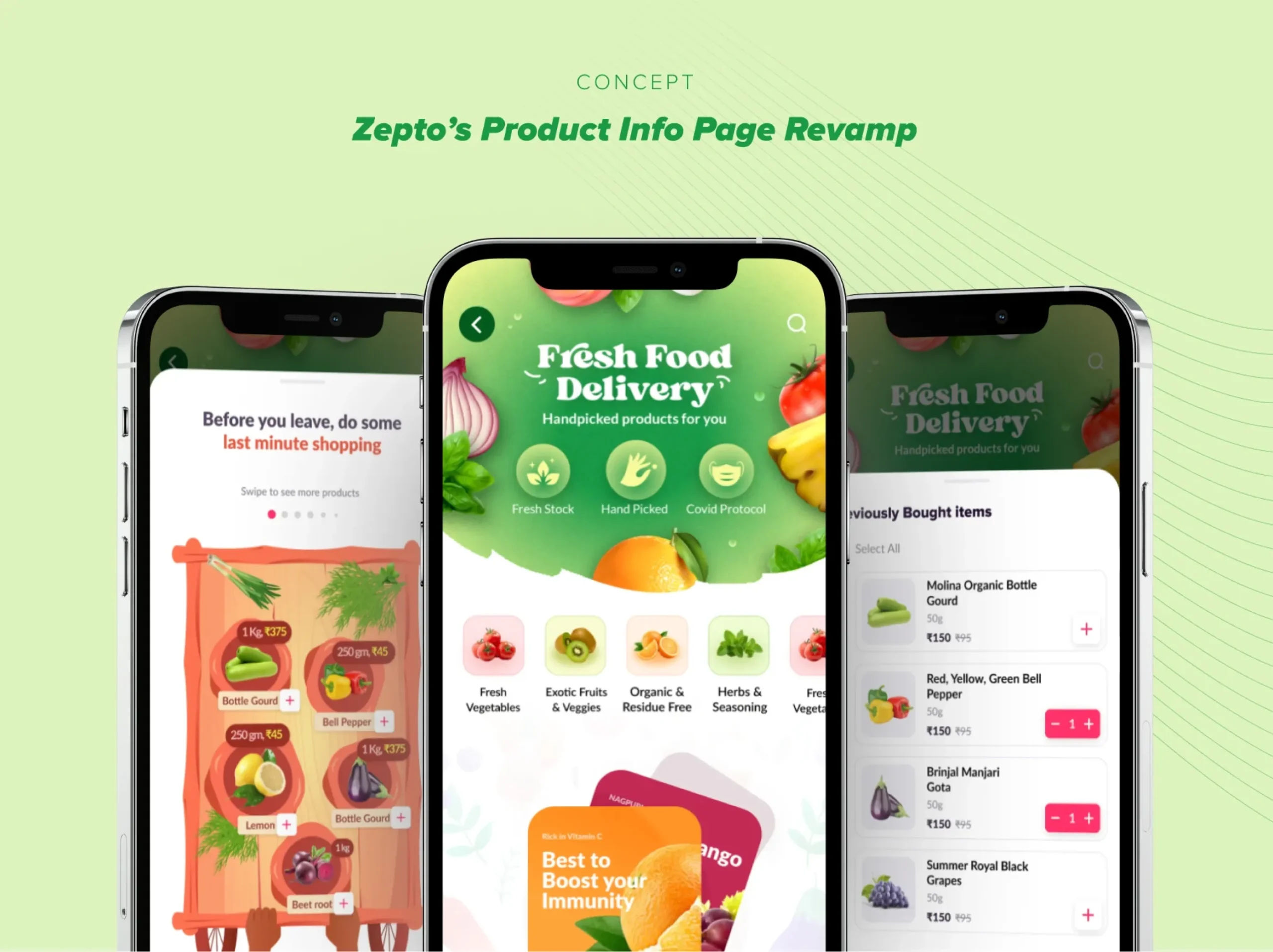
We added a category list on the home screen for quick navigation and a product suggestion section. Additionally, we developed a dedicated category screen with clear visibility of promotions and new product launches. These features enhanced the browsing experience and improved customer engagement as well as discoverability of new products for Zepto.

To cater to the changing needs of users and businesses, we focused on creating a homepage that is both scalable and dynamic (allowing for the easy addition of new features and functionalities as required). This involved taking into account local, seasonal, and festival-related requirements to ensure that the platform stays relevant throughout the year. We also prioritized creating a seamless browsing experience, ensuring that users can easily navigate the homepage to find what they need.

Our Role
We enhanced Zepto’s app with distinct UI elements, conducted user research, and incorporated engaging animations, illustrations, and accessible design for a seamless experience.
Product Design
Development
Content


