Building a Unified and scalable brand family under VI
Building a Unified and scalable brand family under VI

VI (Vodafone Idea), India’s leading telecom provider, partnered with Brucira to transform its master brand into a cohesive family of sub-brand logos.
- Telecommunications
- Brand Identity
- Graphic System
- Logo Design
- Visual Identity
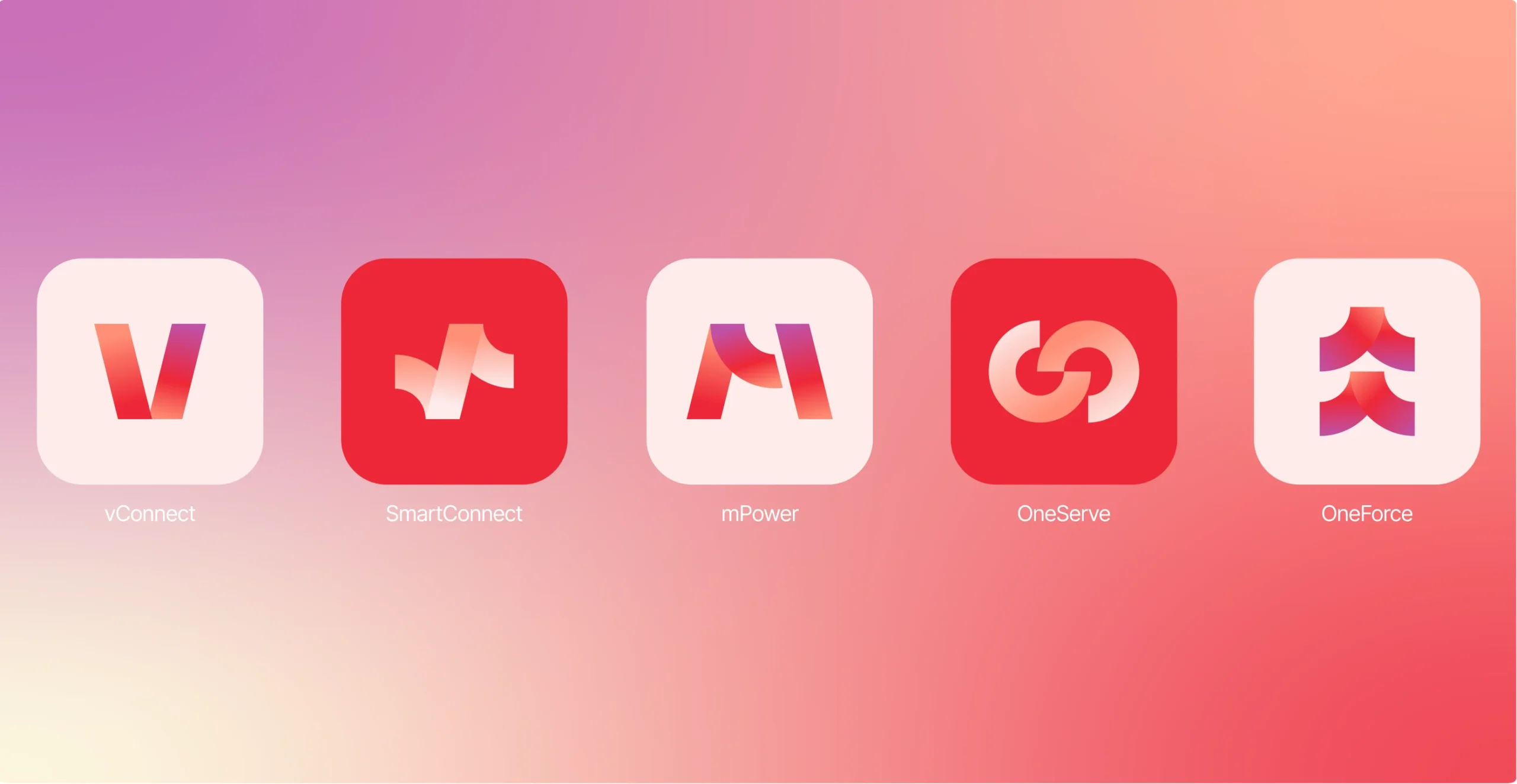
VI (Vodafone Idea), India’s top telecom company, partnered with Brucira to unify its master brand with sub-brand logos distinguishing retail, corporate, and field use, while keeping VI instantly recognizable everywhere from apps to gear.
VI faced logo sprawl across diverse audiences, risking brand confusion. Sub-brands needed legibility from 16px mobile icons to large-format signage in high-glare outdoor and low-light conditions. Visual cues had to differentiate retail, corporate, and field without new fonts or off-palette colors. Finally, simple rules were essential for vendors to apply consistently under tight timelines.
We crafted a user-centric, scalable system through iterative design
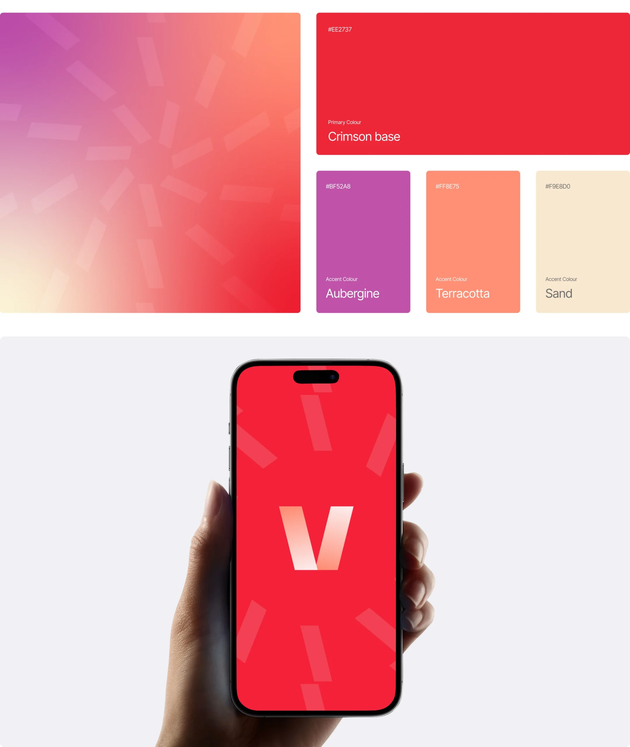
Conducted deep discovery sessions to map audience needs and touchpoints. Developed modular lockups pairing the VI mastermark with icons. Defined color logic using VI palette extensions, with hierarchy rules. Established typography guidelines using the single VI font family for instant hierarchy. Prototyped and tested across scales, glare simulations, and production mocks.
VI (Vodafone Idea), India’s leading telecom giant, approached Brucira with a bold vision: expand the iconic VI master brand into a unified family of sub-brand logos tailored for retail consumers, corporate clients, and field teams.
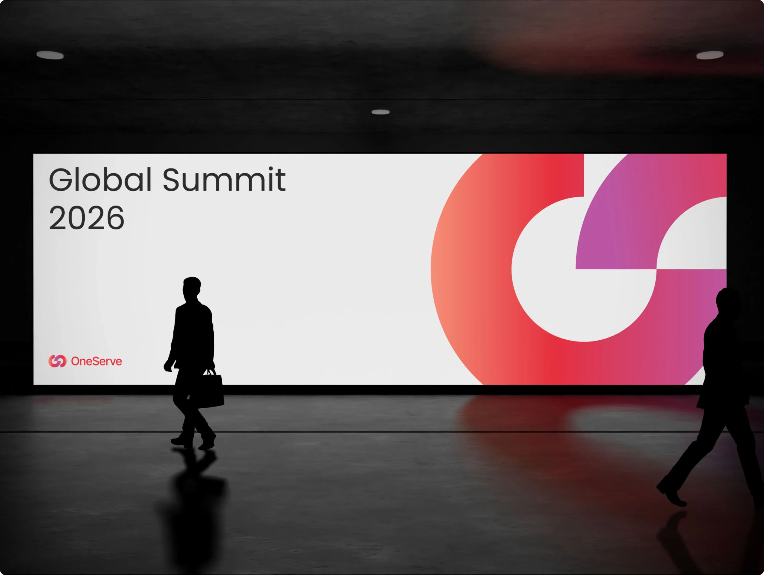
The brief demanded instant recognition across all touchpoints, from 16px app icons to enterprise decks and rugged on-site gear, without splintering the core brand story. Success hinged on a scalable system with clear color logic, typography rules, and lockups that vendors could execute flawlessly under tight deadlines, ensuring legibility in high-glare outdoor and low-light conditions while maintaining unmistakable VI DNA.
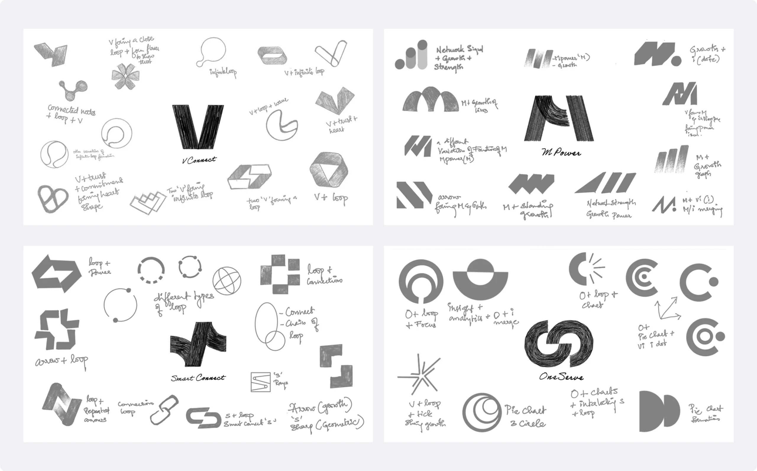
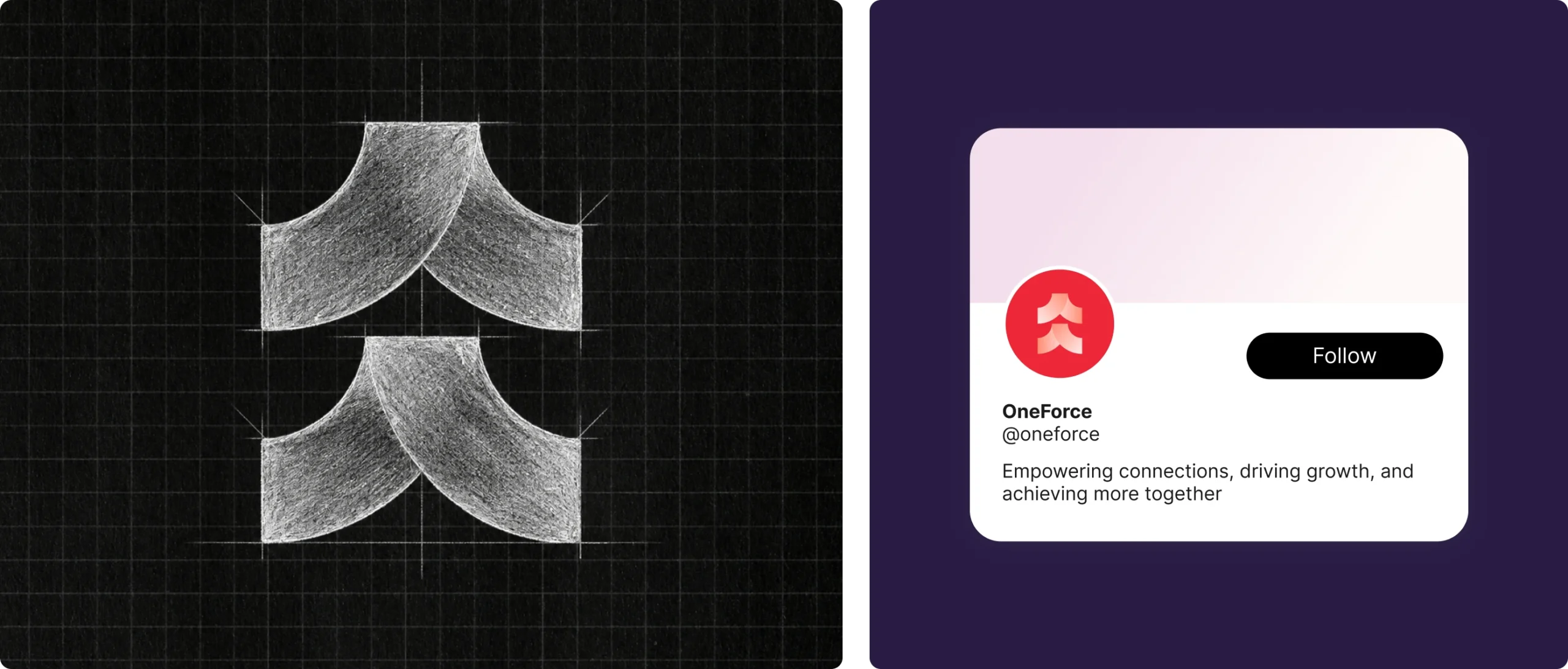
Initial sketches captured dozens of explorations for modular VI sub-brand lockups, blending the mastermark with audience-tailored icons.
These rough sketches tested geometric pairings and abstract symbols, iterating toward optimal balance of uniqueness and instant recognition. Refined compositions locked in the flexible grid system and hierarchy rules that power the final scalable family.
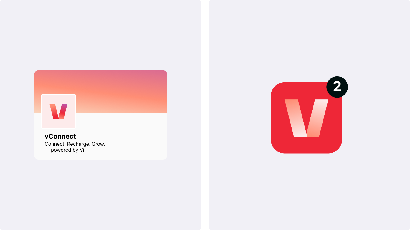
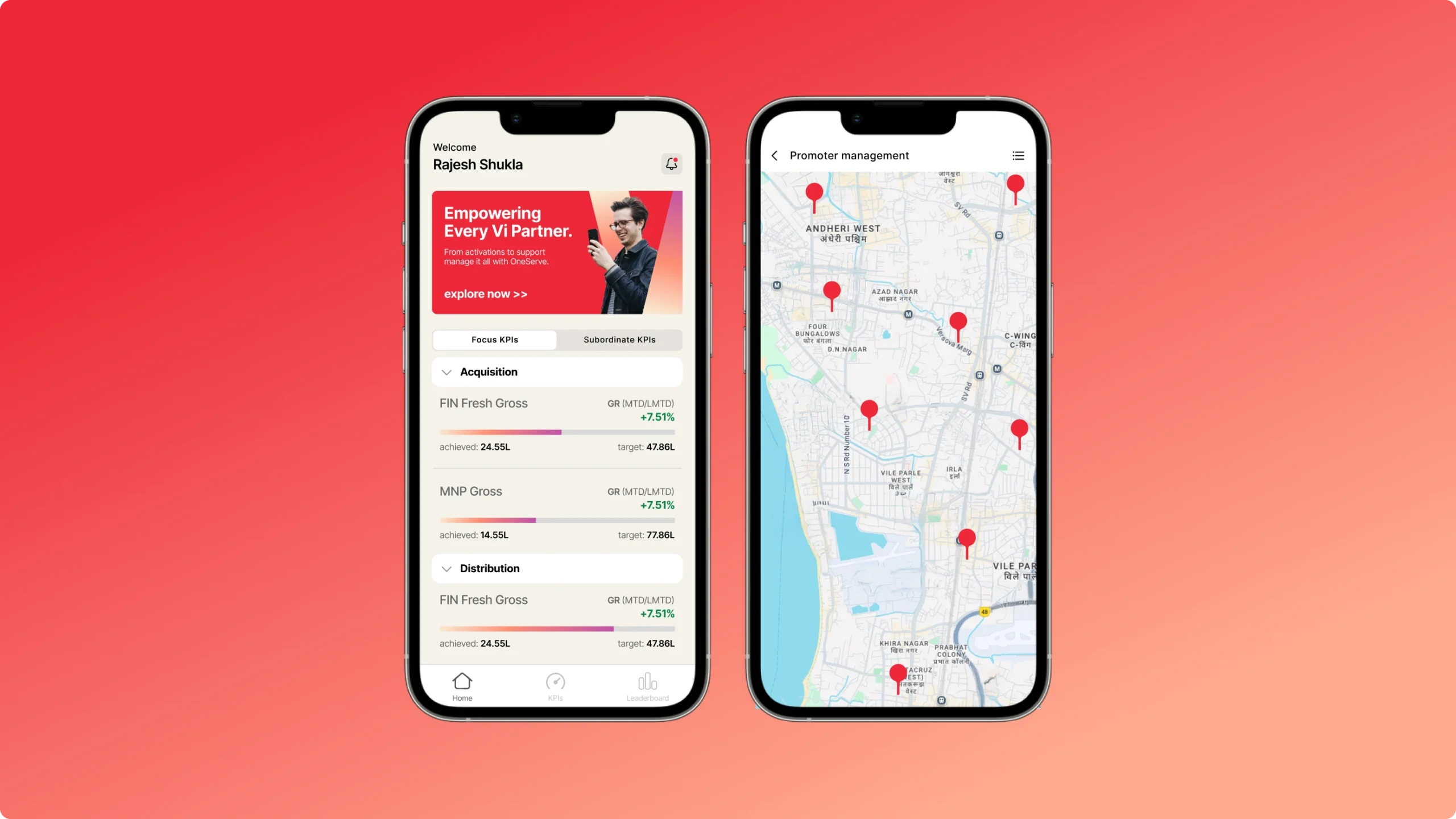

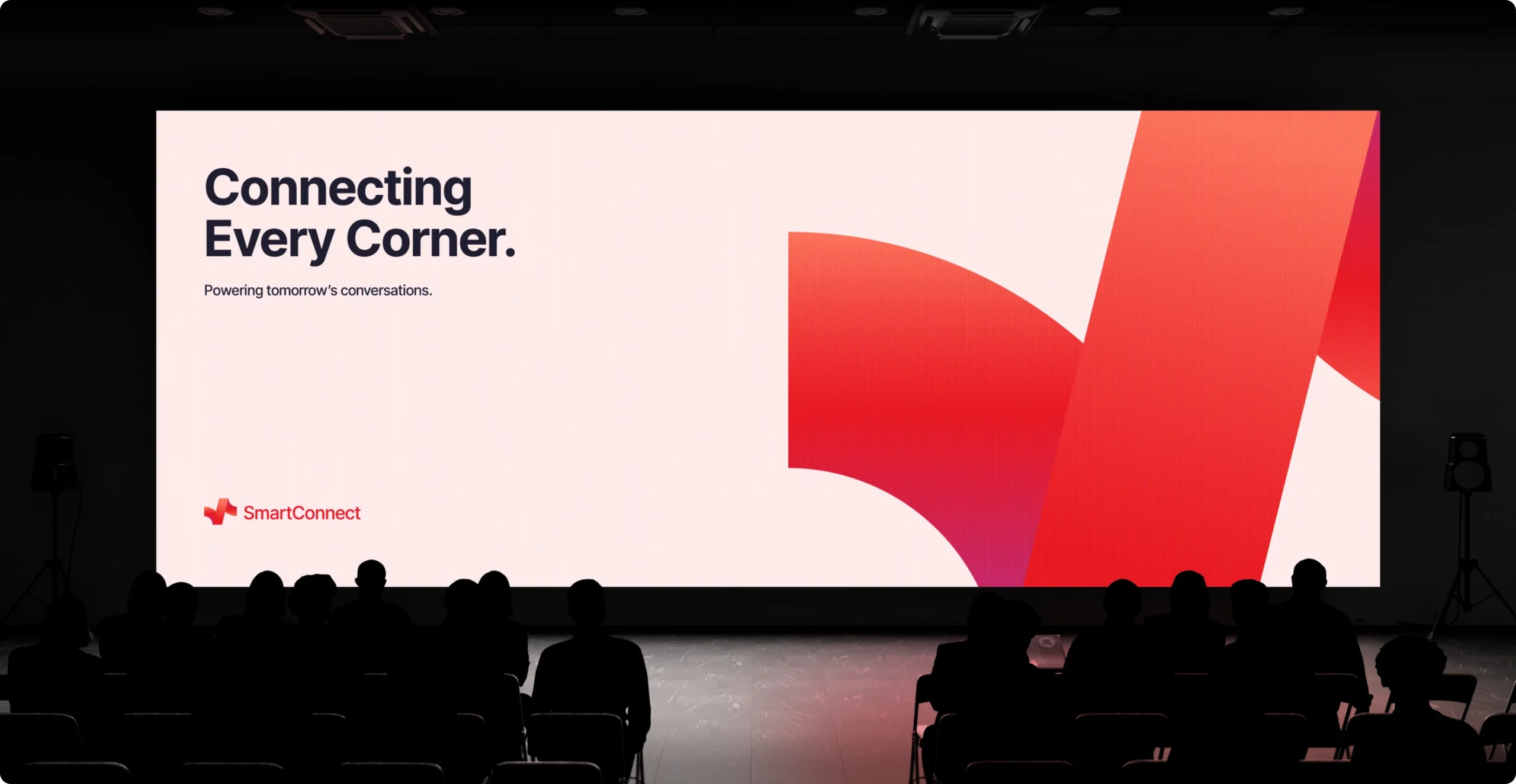
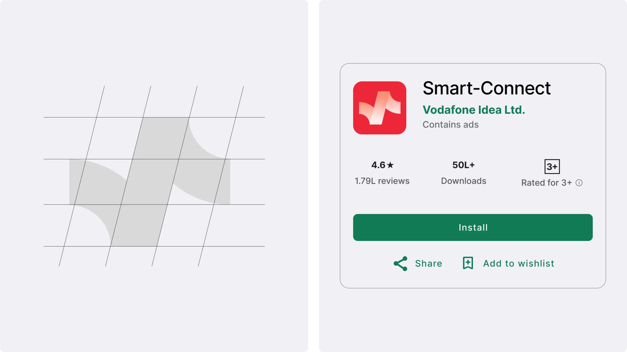
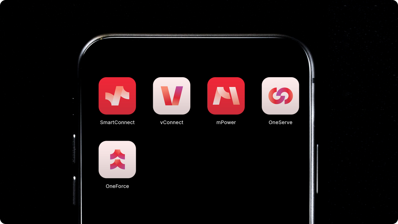
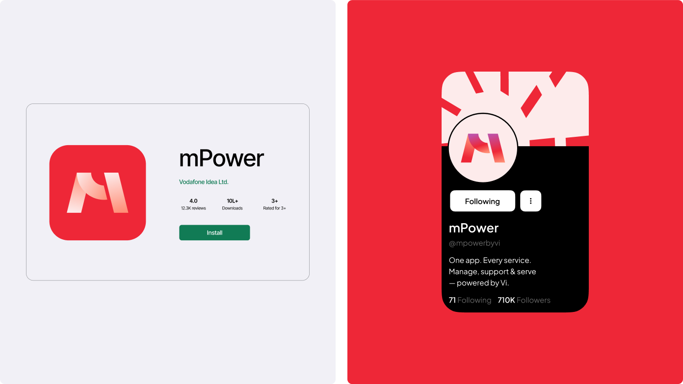
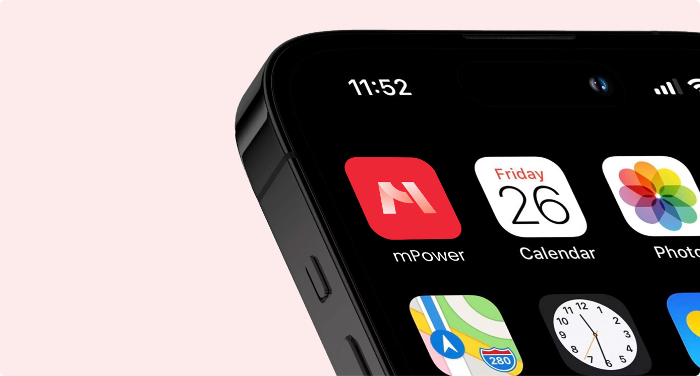
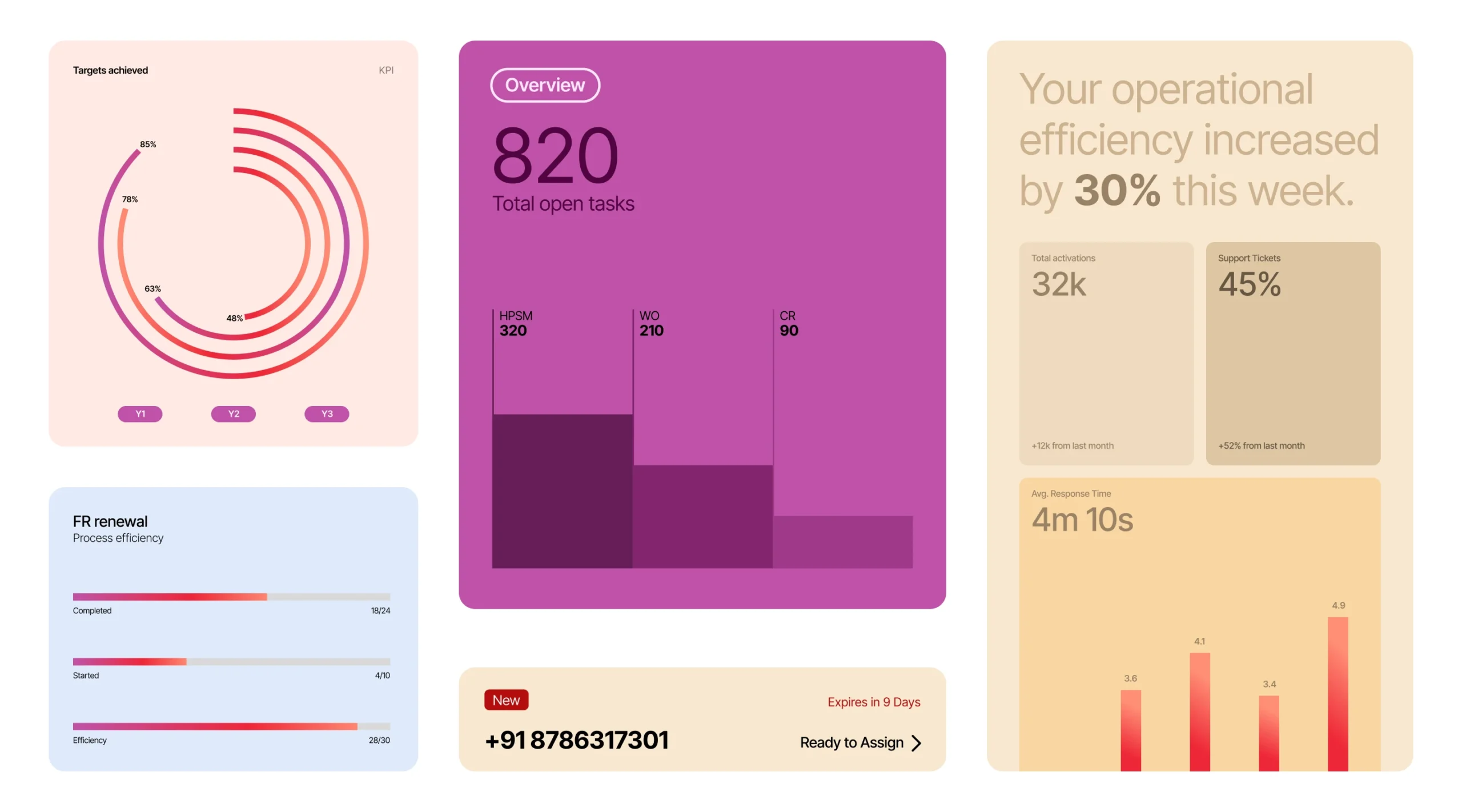
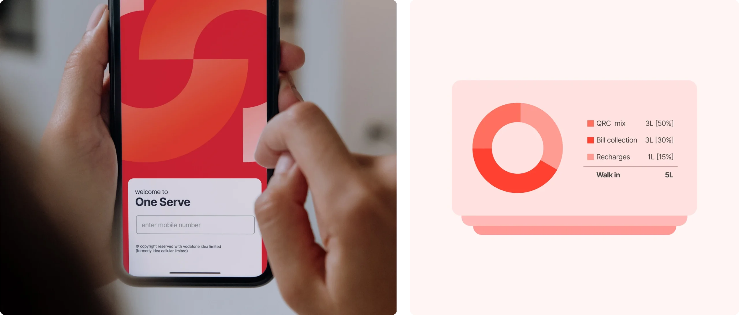
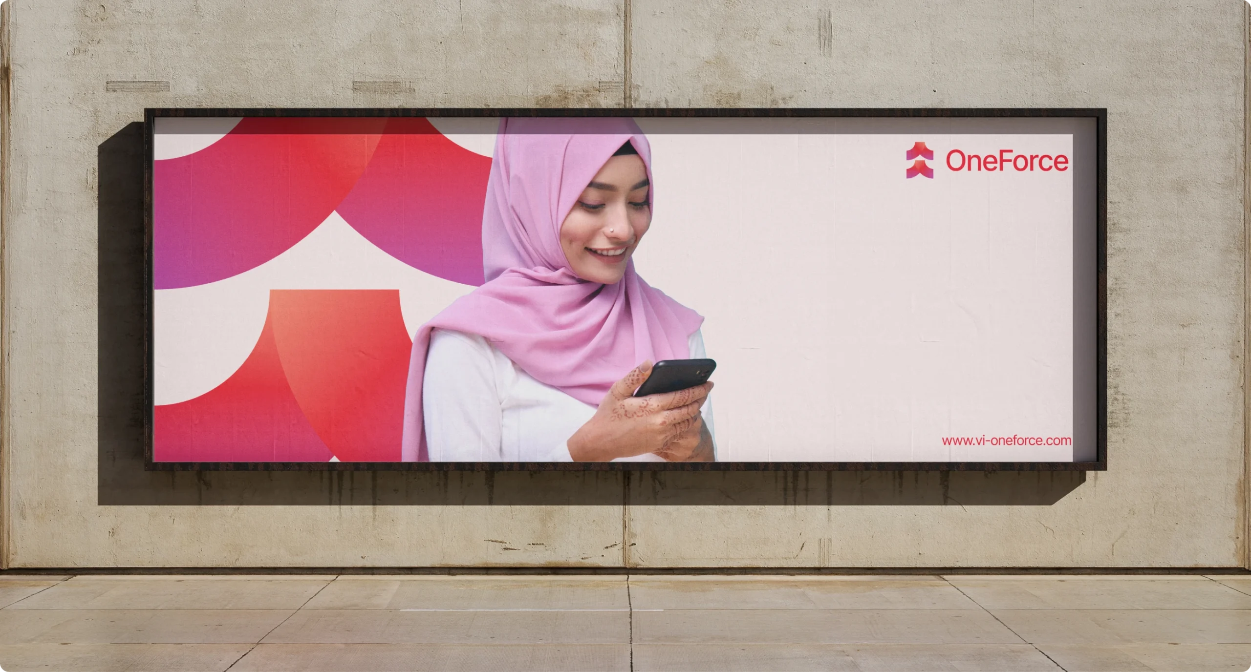
The final system delivers a scalable framework with modular lockups that pair the VI mastermark with distinct icons. Color logic extends the VI palette, applied through simple hierarchy rules. Typography leverages the single VI font family with weight and scale variations for instant readability, ensuring flawless execution across 16px app icons to large-format signage in any condition.





Our Role
Product Design
Content