Titan Eyeplus in with the new
Titan Eyeplus is India’s leading optical retail chain, offering expert eye care and eyewear solutions across 860+ stores in 384+ cities, both online and offline.
- Eyewear & Optical Retail
- App Design
- Illustration and Iconography
- Motion Design System
- Research
Titan Eyeplus needed a digital refresh to match its offline growth. Brucira collaborated to redesign their mobile experience, making it seamless, intuitive, and true to the brand.
In twelve years Titan Eyeplus has gone from a fresh venturer to leader in online eyewear industry, providing end-to-end services to millions of users.
Even after four years of rapid growth in offline stores, Titan Eyeplus’ mobile traffic no longer reflected the stature of the company. We followed an optimized UX strategy, tweaked, reworked and refined. This meant overhauling the overall experience and developing more sophisticated e-commerce portal.

Our biggest challenge was redesigning a mobile experience that matched the scale and maturity of Titan Eyeplus’ offline growth. We needed to reduce friction across the conversion funnel—from discovery to checkout—while encouraging more product views per visit and ensuring a seamless, intuitive journey for every user.
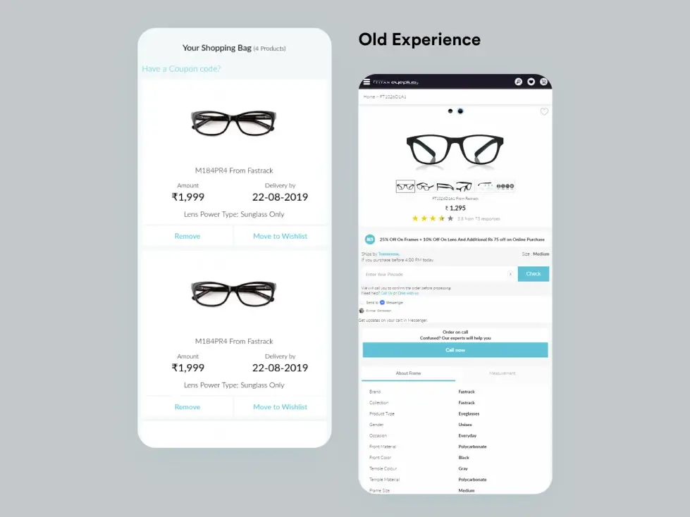
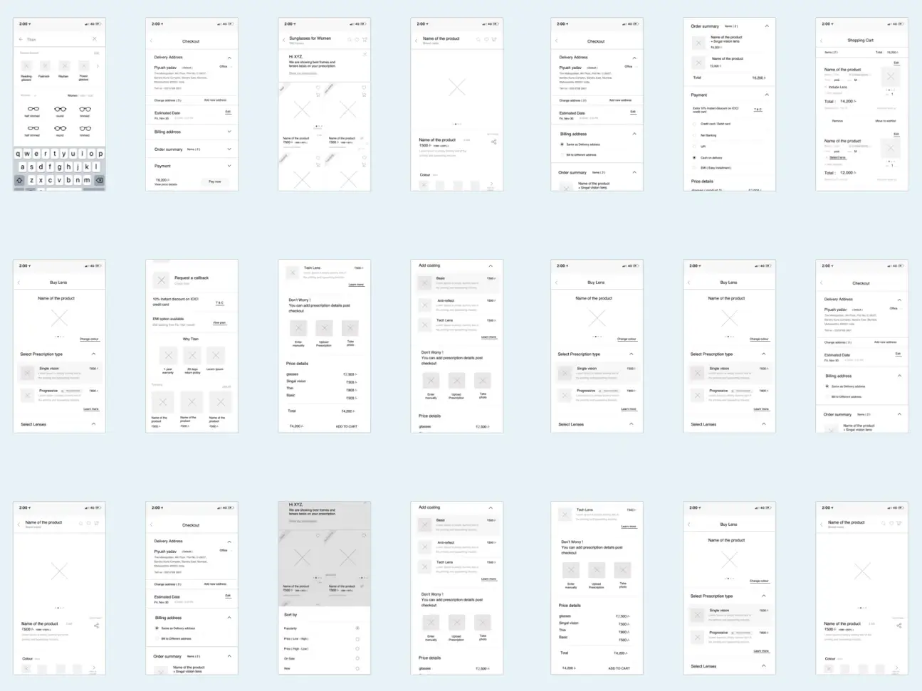
Designing for Smarter Checkout Journeys
We streamlined the user journey from browsing to buying, increasing product views per visit and improving conversion rates.
Key updates included highlighting total items in the cart, displaying product images, and making the “Place Order” CTA more visible. We introduced cart memory to help users pick up where they left off and integrated discount and coupon assistance throughout the experience.
Simplifying the Purchase Journey
We reduced friction across the funnel with faster discovery, clear options, and personalised incentives.
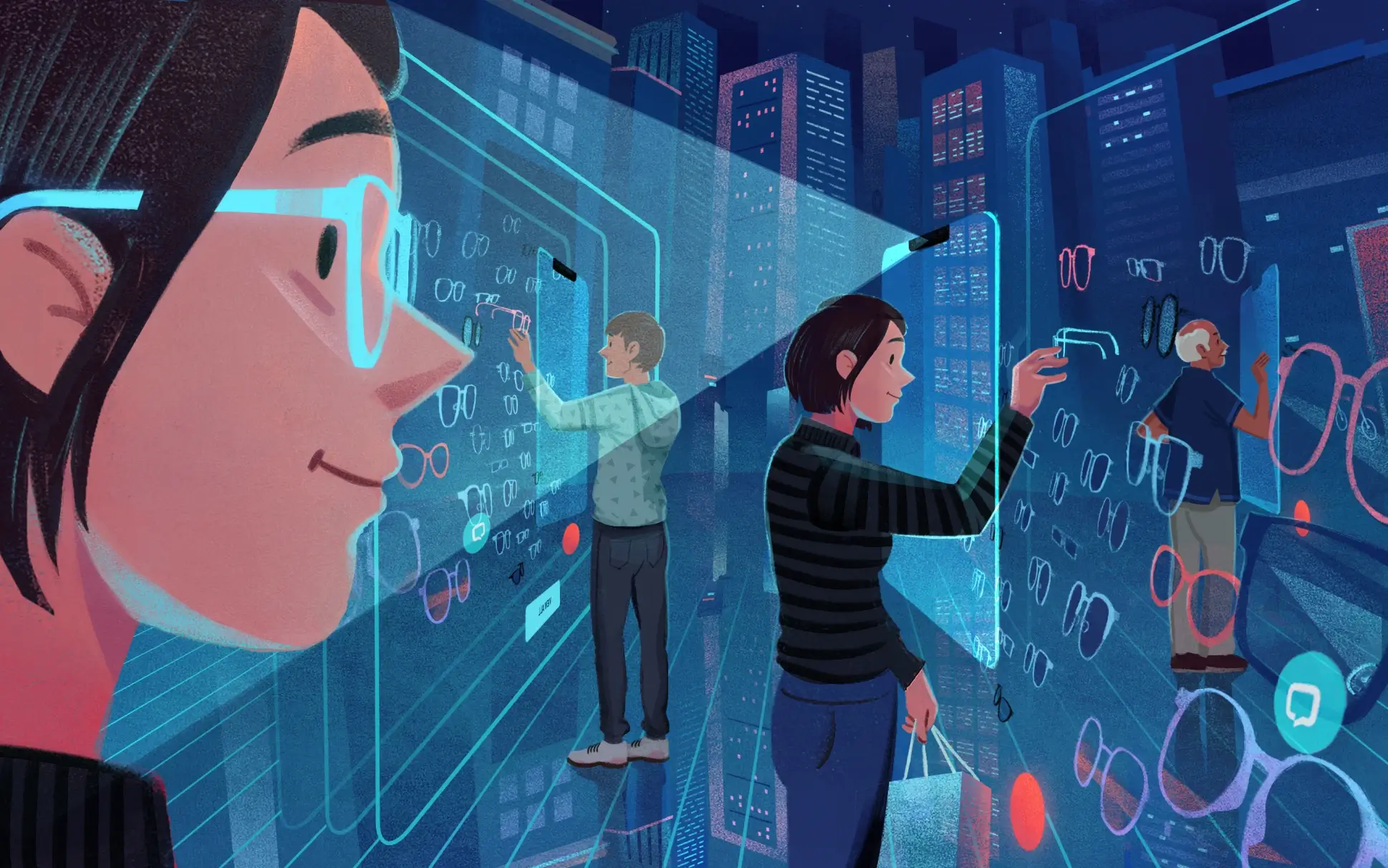
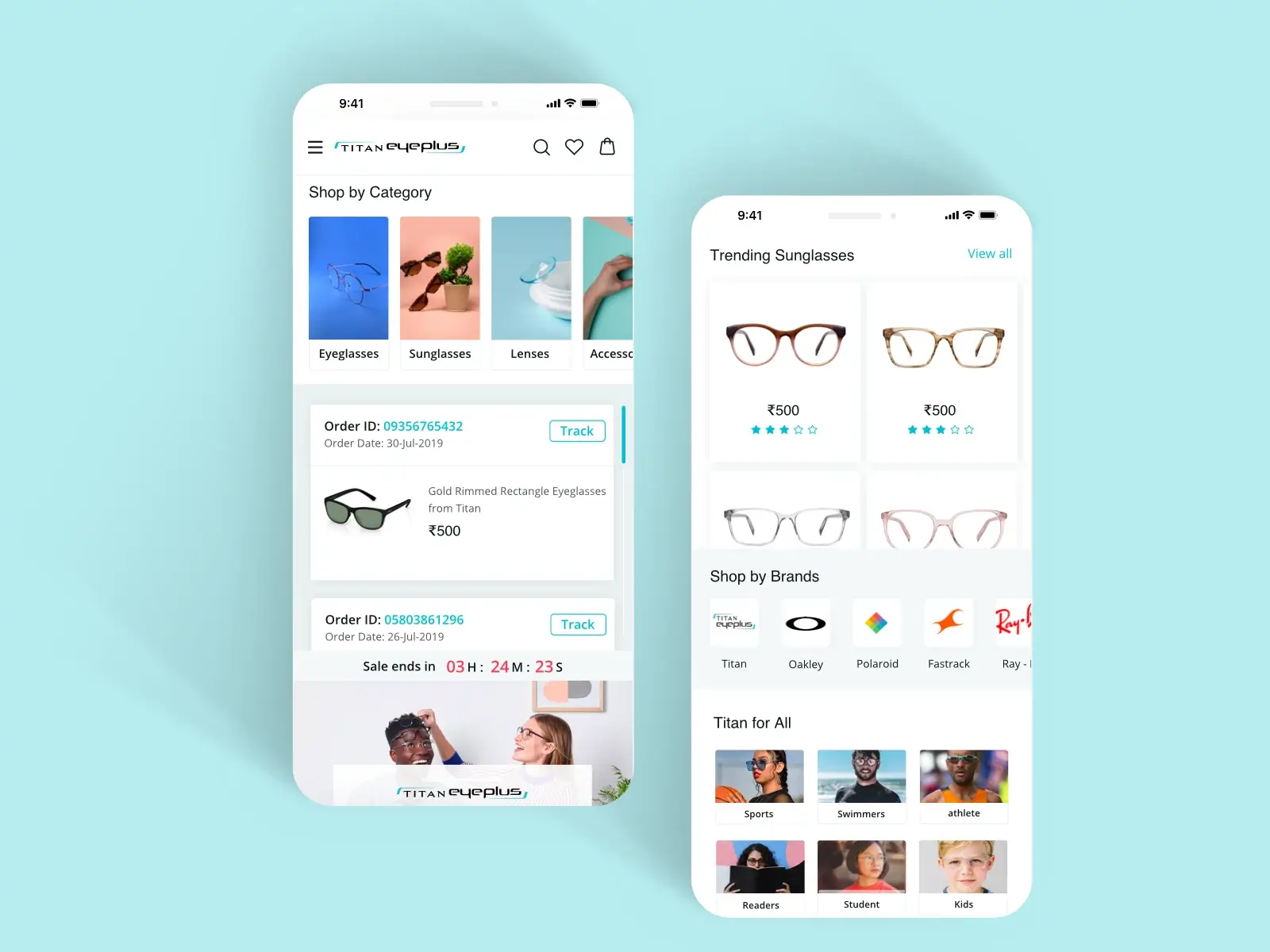
Users could filter by target and browse sub-categories upfront. We introduced multiple conversion modes—Try at Home, Visit Store, and Eye Test—based on user preference. Offer banners were placed prominently, collections were organised by brand, shape, and lifestyle, and search recommendations included visual cues. Each customer cohort was thoughtfully considered.
Our approach was rooted in reviewing existing metrics and identifying key pain points. Analysing user drop-offs and friction areas was a vital part of our pre-design process—it provided actionable insights and aligned the entire team in a clear direction.
By mapping data with client goals, certain solutions naturally revealed themselves. Sometimes, they just clicked.
We went through every screen to spot issues—some were obvious, others subtle but frustrating. And they mattered—not just to us, but to millions of users.
As the user base grew, so did the complexity of client needs. That’s where well-crafted PRDs played a key role—helping us stay aligned with requirements and enabling seamless collaboration across teams throughout the project.
Improved the conversion funnel and increased the purchase rate per customer.
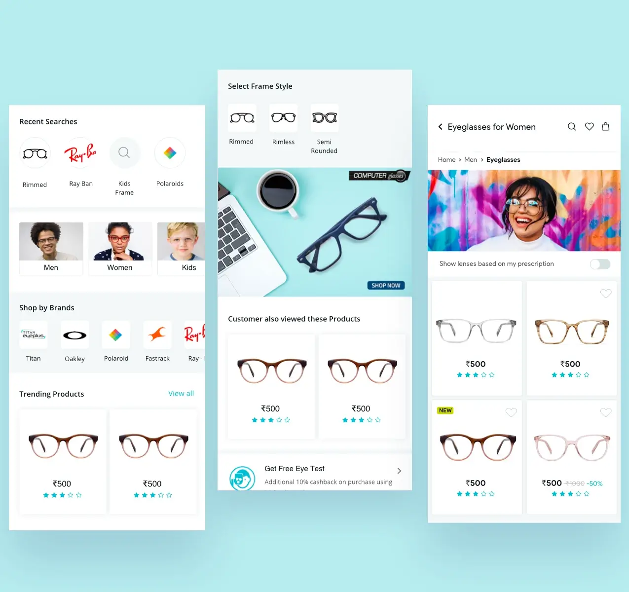
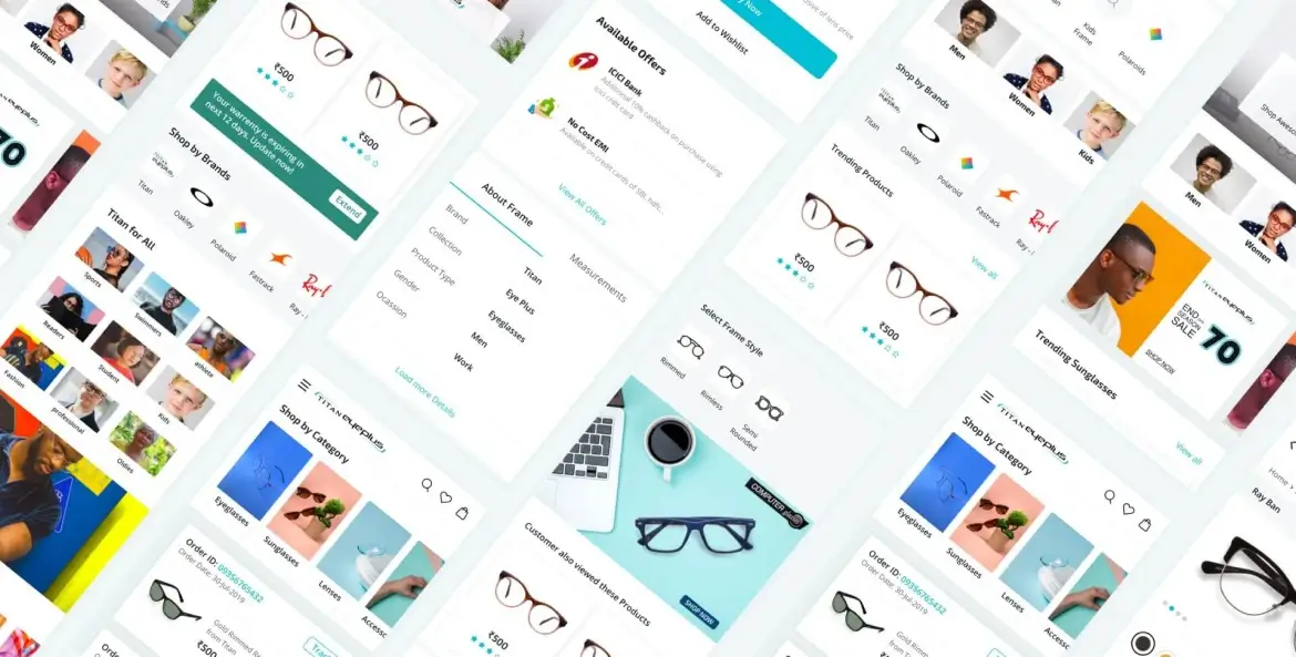
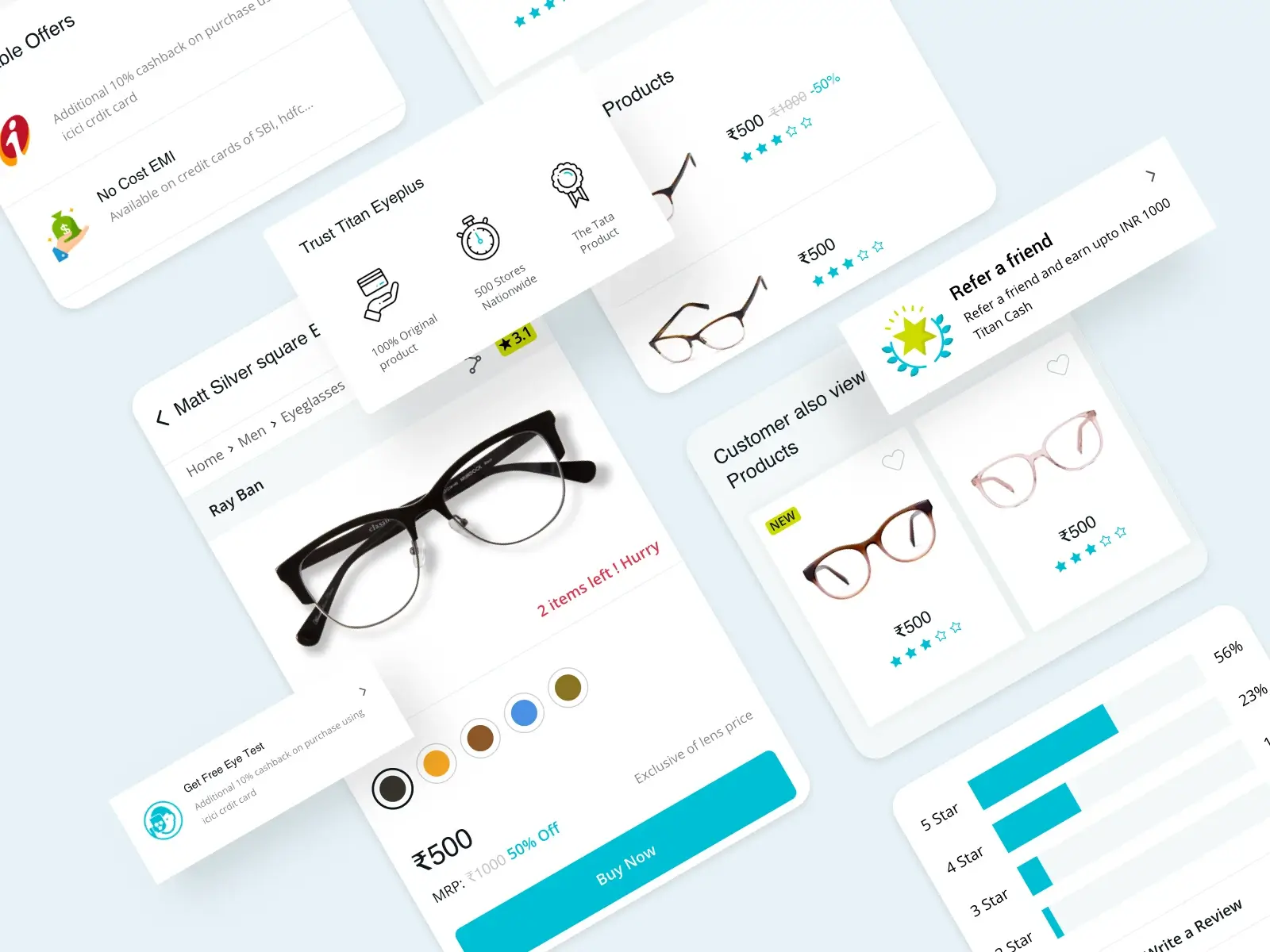
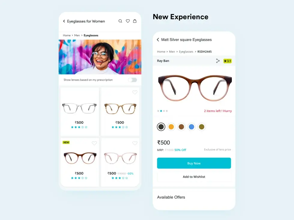
We created a series of style tiles. Taking a multiple aesthetic approach, we worked closely with Titan’s team to define how products were to be perceived.
The new tile style was aimed at being adaptable and flexible. The idea was to power users to pick the right products, cutting needless diversions, while not oversimplifying the interface. To achieve a clean yet functional interface which made sense, we decided to show existing ratings of the products and the prices. The product detail page has been kept very clear and concise. We didn’t move away from the carousel but welcomed it. Sticking with global design patterns is very important in certain places, rather than reinventing the wheel. More information about the frames was made available through the screens with additional shipping information. We thought through various folds to meet both- the customer, and the business needs.
Between eliminating minor fixes and final user testings, our users loved using Titan’s Eye Plus for mobile. Check out Titan Eye Plus on your mobile phone now. We think you’re gonna love it.
The redesigned experience led to smoother navigation and higher engagement. The Titan team appreciated the clean, functional design and how it simplified the purchase journey while staying true to their brand vision.
Our Role
We redesigned Titan Eyeplus’ mobile experience—enhancing usability, improving the purchase journey, and aligning design with their growing brand presence.
Product Design
Content