Brucira logoHiring!

Start a conversation[email protected]

We are available here

Creating an user-friendly app design for Plum

plum banner

Plum provides the insurance plans to the corporate employees

Plumhq is a Bengaluru-based company which distributes and customises group health insurance and wellness plans for large corporations and startups. They help businesses to get insurance at premium quotes, customise plans based on employee needs and more.

Their aim is to set a foundation for building long-term direct-to-employee relationships for selling new D2E products and engaging them via wellness-based value propositions.

Services
we provide

User interface

Created designs that are easy to interact with in a clear, intuitive, and efficient manner. It helped the users to accomplish tasks and achieve their goals.

User research

Competitive analysis and user research was done to gain a deep understanding of users, their needs, behaviors, preferences, and motivations.

User experience

Optimized the design of interfaces, navigation, information architecture to ensure that they are clear, concise, and easy to use.

Animation

Animated the illustrations to create a visual storytelling experience that engages and informs the audience.

Iconography and illustrations

Created illustrations unique to the brand that specifically communicated the message.

The
Challenges

Design a highly intuitive, usability-aligned App which guides the users seamlessly throughout the process. The final interface had to be delightful. We had to figure a way to cover all the important features in the App and ensure discoverability within it at the same time. This was one of the major challenges that we faced early on, however, with teamwork and rigorous ideation, we mitigated them.

plum screenplum screen

Created an expansive set of design standards for UI elements and interactions throughout the app for consistent design process

This would help the designers and developers to refer to or change any elements in the future as all the components are available centrally. We ensured that the style guide includes all the essential UI components like typography, colour palette, primary secondary and tertiary buttons, fonts, icons, illustrations, component library like cards, and notifications which could be easily reused in the app.

plum screen
plum screenplum screen
plum screen
plum screen

Considered the visual ergonomics principles while creating high fidelity visual designs

We included all the states of buttons like normal, pressed, and disabled along with their three categories: primary, secondary and tertiary. For the colour palettes, we ensured to document the entire color palette.

plum screen

The
Approach

The design process was divided into three phases. The first phase included empathizing with and addressing the user's pain points. The pain points were converted into the problem statement which clearly described the issue, keeping the focus on the users at all times. This phase helped us to appreciate the user's needs, frustrations and motivations.

The second phase included the creation of customer journey maps and site maps. This helped us understand exactly how a person is feeling at each point of interaction, what key questions they may have and their specific needs at each stage. We laid out various user flows where the user will take the necessary steps to complete a specific task. This helped us to distinctly define the features of the app.

Subsequently, we mapped out how your users will move through the app. We defined the hierarchy and navigation structure of the app. This helped us to organise and define the hierarchy of the content into screens. During the third and final phase, we started with converting the wireframes into low fidelity prototypes. This helped us quickly realise and omit any mistakes at an early stage.

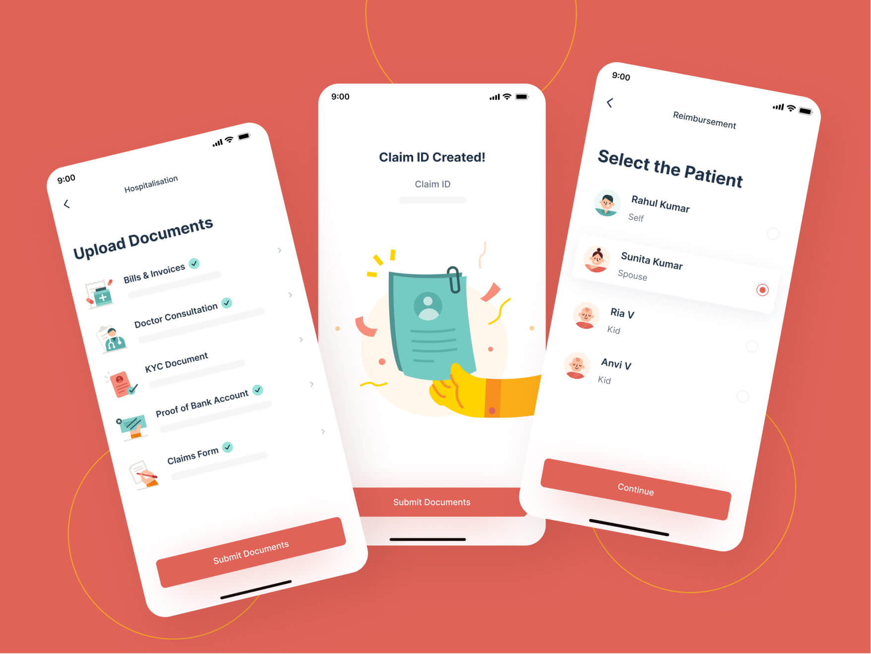
We followed this with wireframes by transforming them into high-prototypes by introducing the UI elements that included typography, illustrations, animation and other visual design details.

plum screenplum screen

Best
Experience

We delivered consistent UI and a better UX and created an expansive set of design standards

plum screen

Plum builds best health benefits experience for the users

Provide your team with genuine peace of mind that goes beyond just health insurance and helps you value their wellness—be it financial, physical, or mental. Access all your health benefits in one place. You can Raise and manage claims on the go.

It is extremely comfortable to find network hospitals near you. Also, you can schedule doctor consultations anytime and view wellness sessions & content.

The
Impact

The final design of the App is incisive and minimal. It provides easy navigation and focuses on the prime features and functionality of the product. Our iterative process avoided any unnecessary delays in the delivery process. It was commended by the leadership at Plum HQ and our deliverables were received with much appreciation and encouragement.

marketer-excellence-award