Yoga Bar saw a 100% boost in average conversion rate following Brucira's web redesign
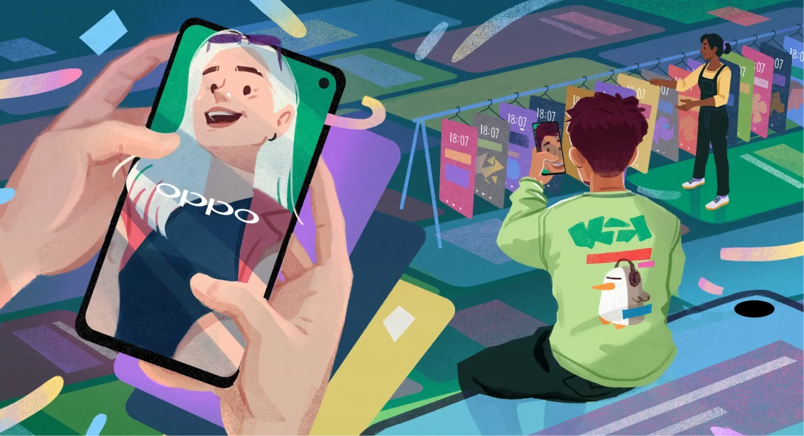
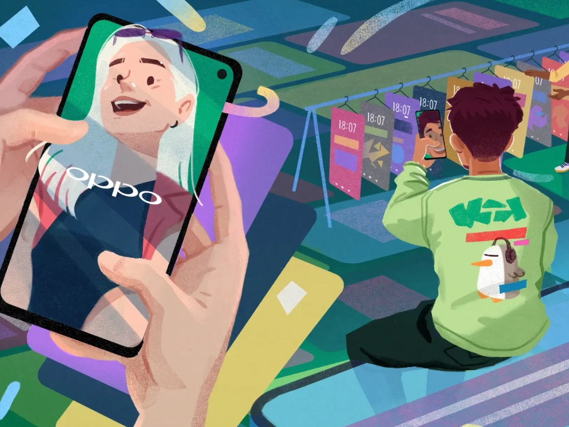
•Brucira wins Foxglove Award for Best Visual Design for their work with Oppo
•Brucira partners with Kwikpay to design their distinctive logo
•Yoga Bar saw a 100% boost in average conversion rate following Brucira's web redesign
•Brucira wins Foxglove Award for Best Visual Design for their work with Oppo
•Brucira partners with Kwikpay to design their distinctive logo
•Yoga Bar saw a 100% boost in average conversion rate following Brucira's web redesign
•Brucira wins Foxglove Award for Best Visual Design for their work with Oppo
•Brucira partners with Kwikpay to design their distinctive logo
•Yoga Bar saw a 100% boost in average conversion rate following Brucira's web redesign
•Brucira wins Foxglove Award for Best Visual Design for their work with Oppo
•Brucira partners with Kwikpay to design their distinctive logo
•


We help ramp up design capacity, speed up product development, and improve bottom line.


Speed up product
development & reduce
go-to-market time.

AI/ML
We’ll help you integrate AI into your products, effectively utilizing AI/ML to unlock powerful data-driven insights that fuel growth and innovation.
App Development
Build high-performance, scalable applications tailored to your goals, ensuring smooth functionality, quick deployment, and exceptional user satisfaction.

Website
Development
We craft engaging, responsive websites designed to captivate users, streamline experiences, and significantly reduce your go-to-market timeline.

Framer
Development
We transform bold ideas into fully functional, production-ready websites — all powered by Framer.

Shopify
Development
We create custom Shopify stores, optimize performance, integrate apps, develop advanced functionalities, and ensure scalable solutions tailored to your business needs.
Strategy