Enhancing Payments:
Brand Identity for KwikPay
Enhancing Payments:
Brand Identity for KwikPay
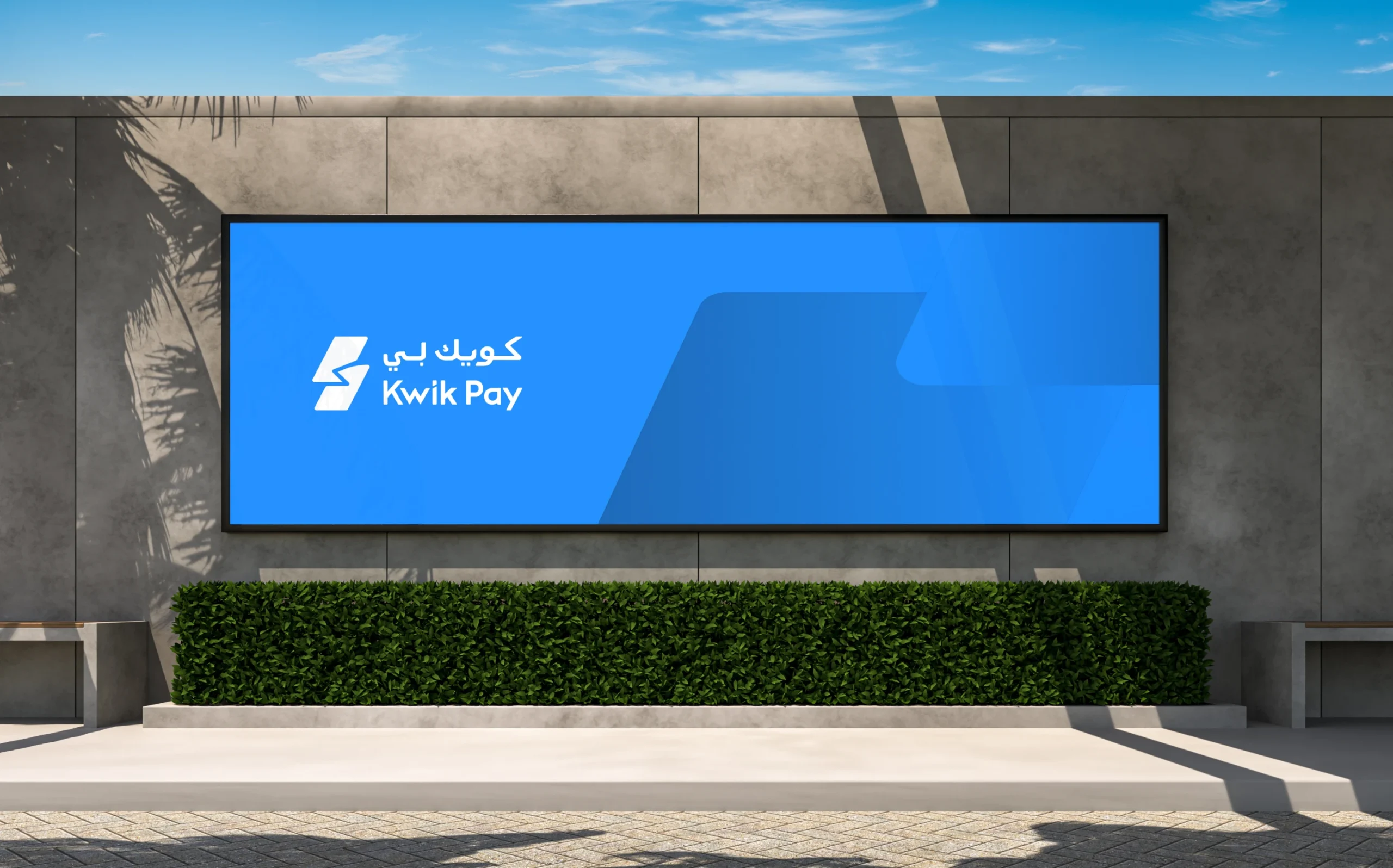
KwikPay is a digital wallet app designed to seamlessly bridge online and offline payments. Offering secure technology and on-the-go transactions.
- Fintech
- Brand guidelines
- Brand Identity
- Graphic System
- Logo Design
- Visual & Motion Design
- Visual Identity
KwikPay needed a distinctive brand identity reflecting speed, trust, and cultural relevance. They chose Brucira for expertise in crafting modern, culturally resonant branding solutions.
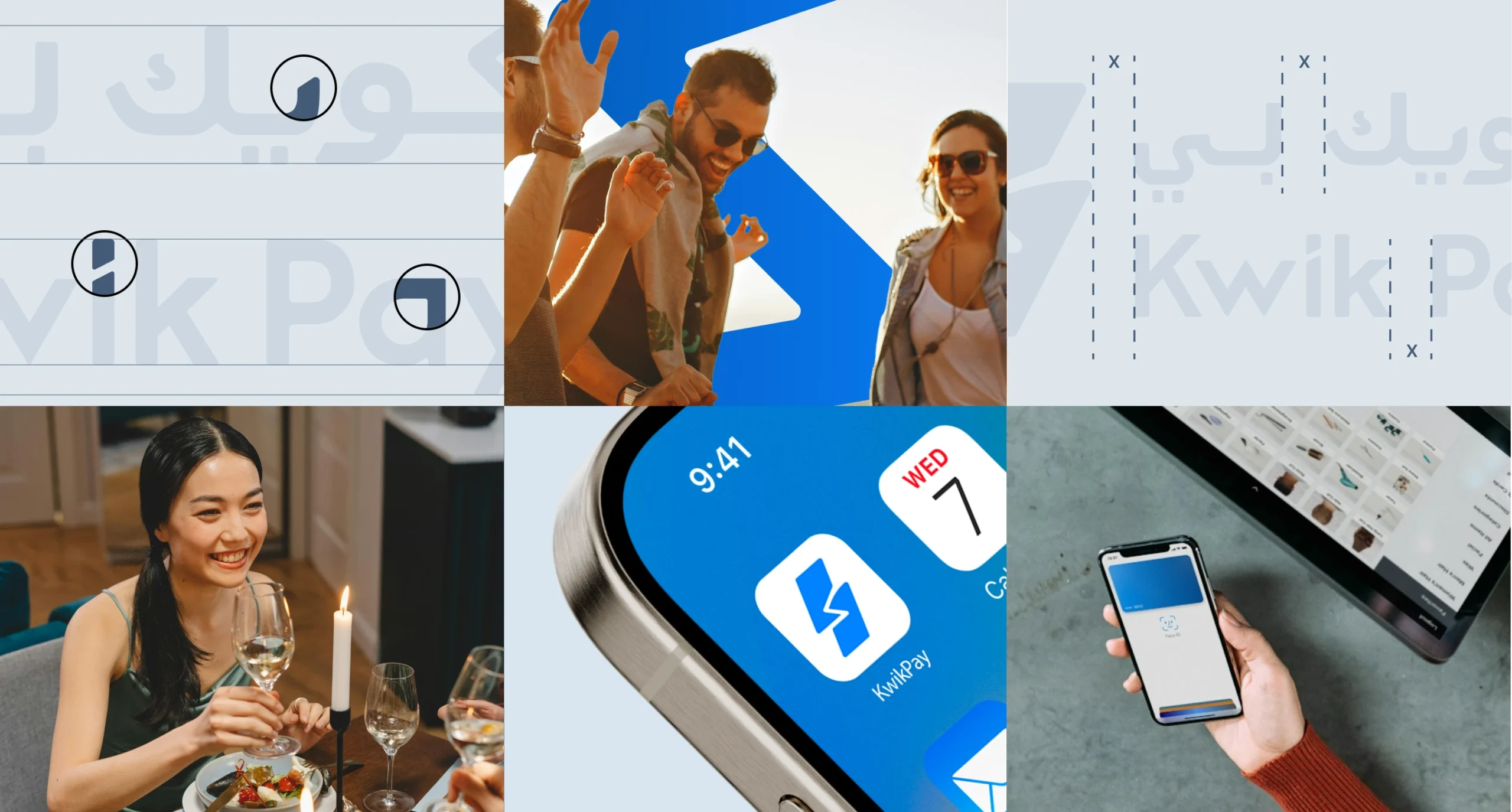
KwikPay needed a branding solution that reflected both speed and inclusivity while balancing cultural significance with a premium, modern look.
The challenge was to create a logo and design system that resonated with diverse audiences, incorporated Kuwaiti cultural elements, and stood out in the competitive fintech space. Additionally, the branding had to maintain a sleek, minimal aesthetic while being adaptable for various digital platforms.
We crafted a complete branding system, beginning with exploratory logo sketches based on client preferences for “K” and “Q” concepts.
The final design balanced speed and simplicity, incorporating cultural motifs like Arabic geometric patterns and dynamic elements to reflect the brand’s quick and secure payment capabilities.
A cohesive design system unified color, typography, and graphic elements, creating a consistent and engaging visual identity.
After a detailed call with the client, we were presented with two creative directions for the logo design. The first focused on a “K”-centric logo featuring a unique element for easy recognition, while the second explored a “Q”-based approach with an abbreviation like “QPAY.” The client expressed a preference for the “K” concept, favoring an icon paired with the logotype to establish a stronger brand identity.
Additionally, we were asked to experiment with two distinct color palettes: calming blue shades to convey trust and fintech relevance, and a combination of red and black inspired by the Kuwait flag to evoke a premium and national feel.
We explored three design directions: Exclusive and Trustworthy, Aspirational and Minimal, and Contemporary Luxury with cultural elements. The client chose a blend of clean, modern, and slightly premium style.
Based on this, we developed logo concepts featuring Arabic patterns, sailboats, and dynamic elements like arrows and motion-inspired symbols. The final design combined speed, represented by a lightning bolt, with cultural inclusivity through a dual-language “K,” creating a logo that resonated with both Arabic and English audiences.
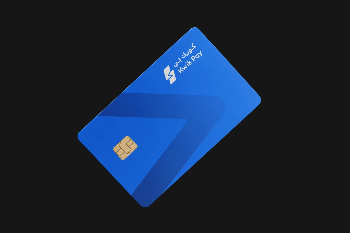
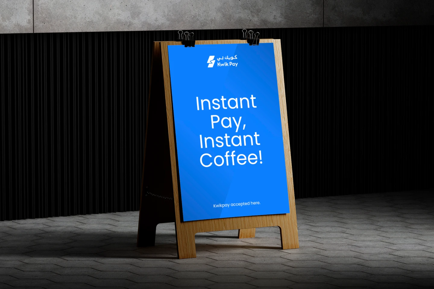
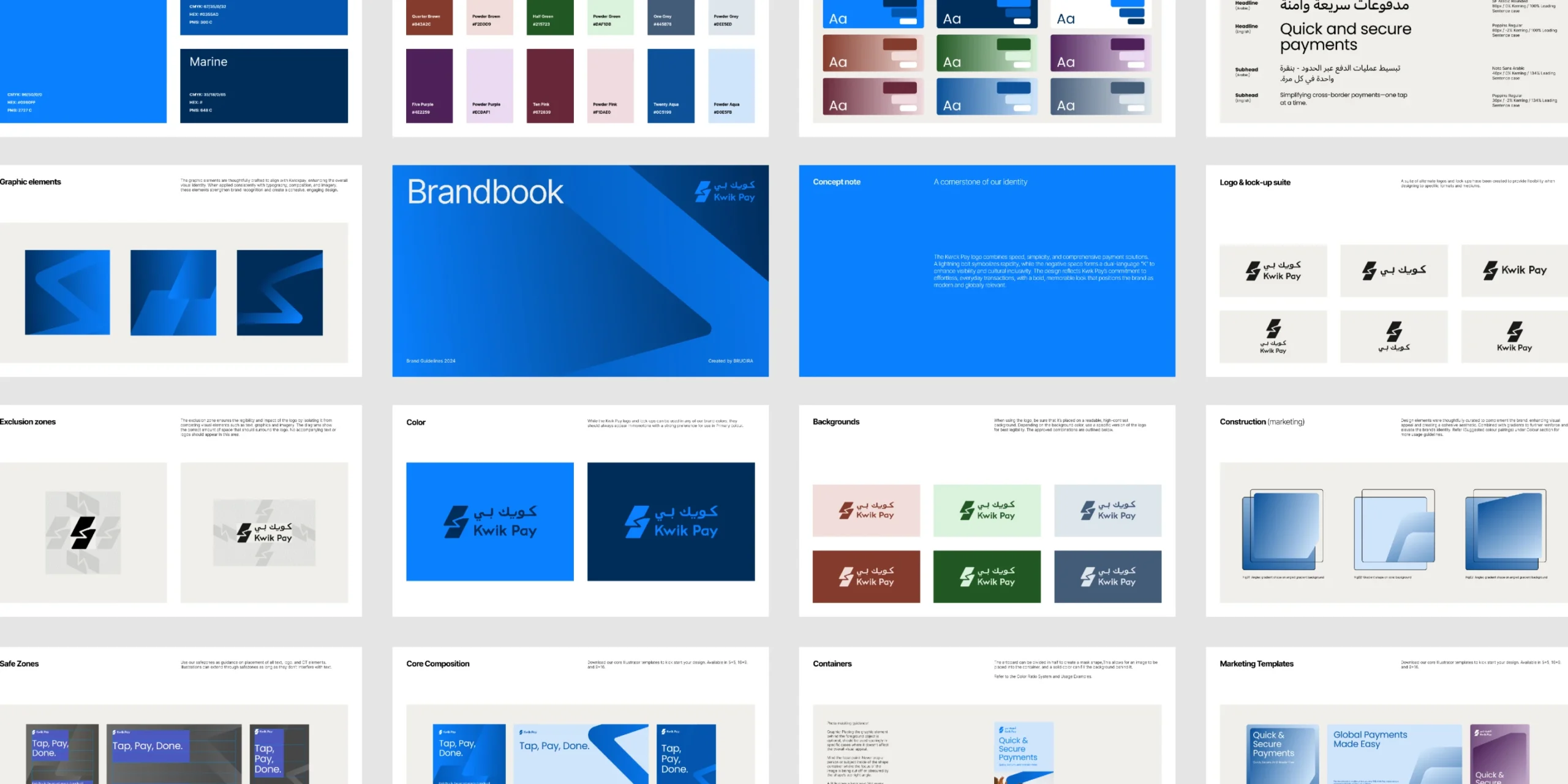
The KwikPay logo symbolizes rapidity and inclusivity. The lightning bolt conveys speed, while the negative space forms a “K” that represents both English and Arabic scripts. This modern, memorable logo captures KwikPay’s essence—fast, inclusive, and reliable—positioning it as a leader in digital payments.
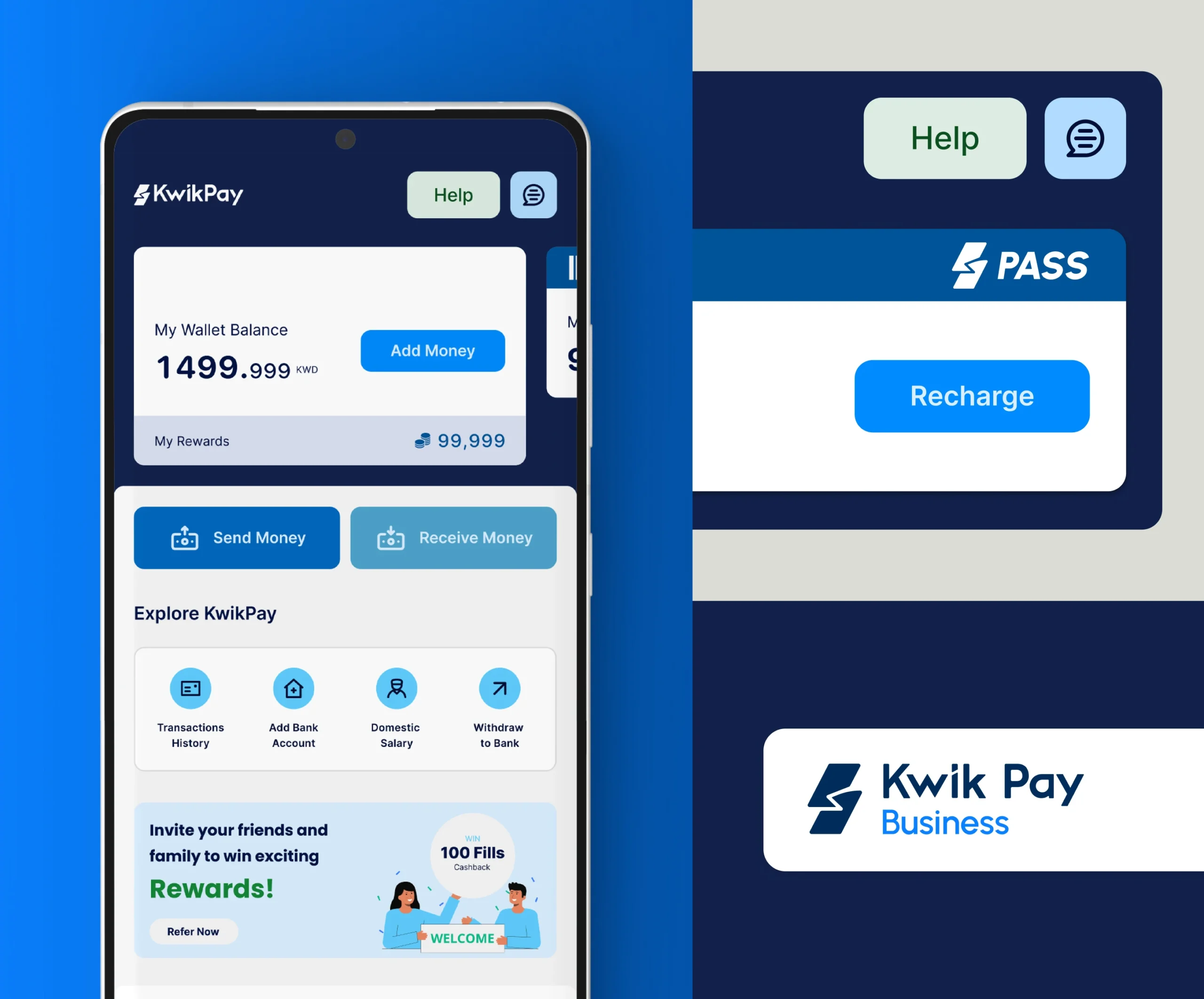
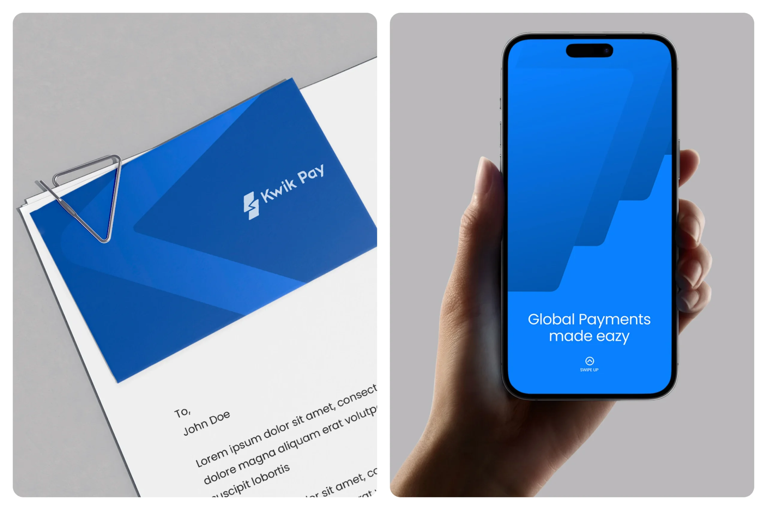
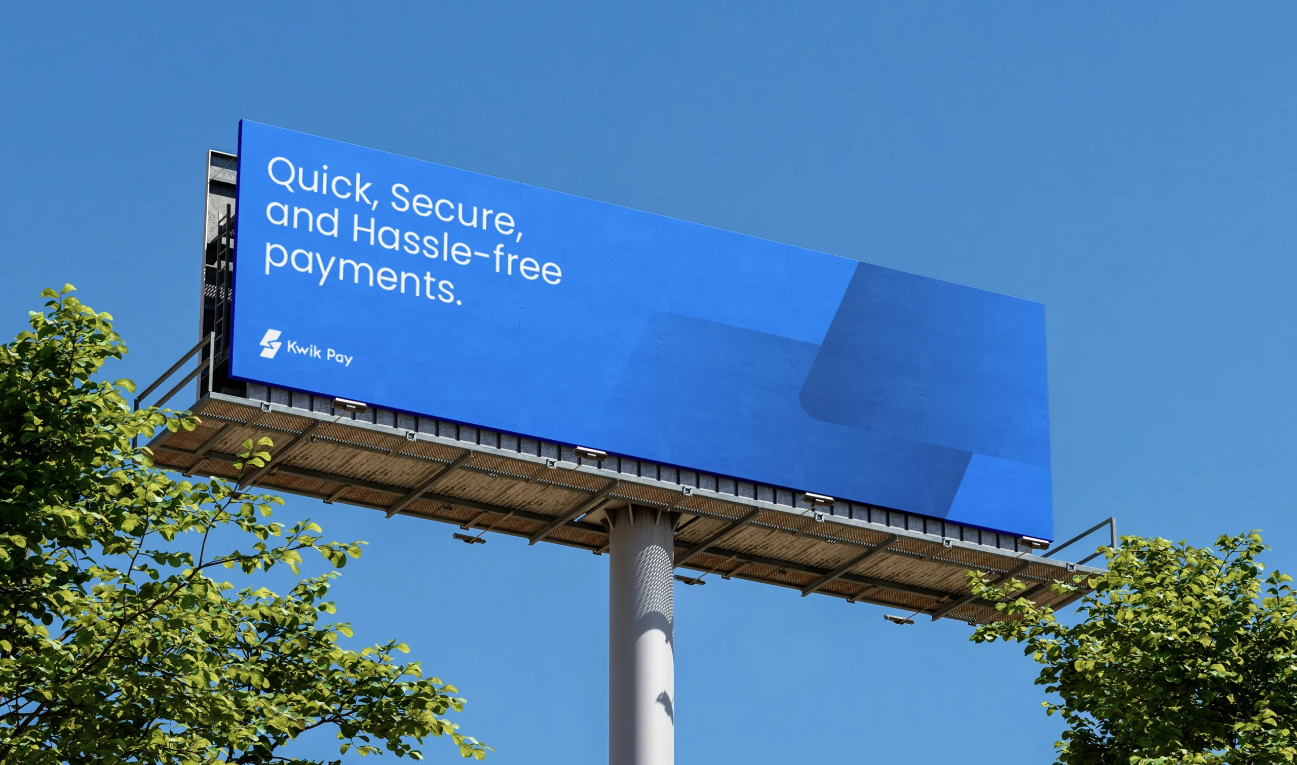
The design system reflects KwikPay’s core values of trust, security, and modernity. The color palette, centered around calming shades of blue such as Azure, Denim, and Marine, creates a sense of stability and reliability. Complementary secondary colors, inspired by the Kuwaiti Dinar, introduce a vibrant yet restrained contrast, adding depth to the visual identity.
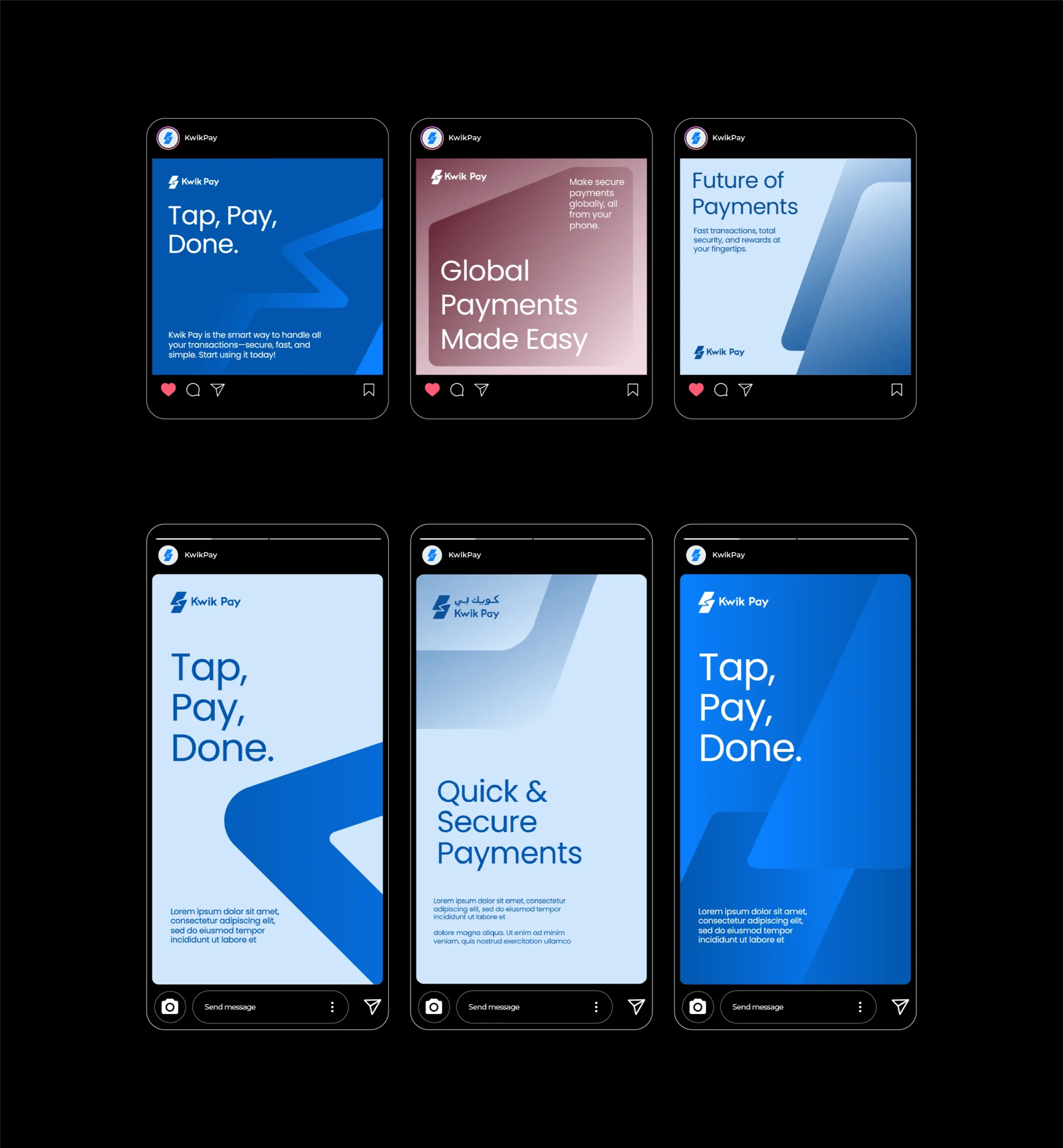
The typography seamlessly integrates Poppins, a versatile and approachable font for English, with SF Arabic Rounded, ensuring fluidity and harmony between the two languages.
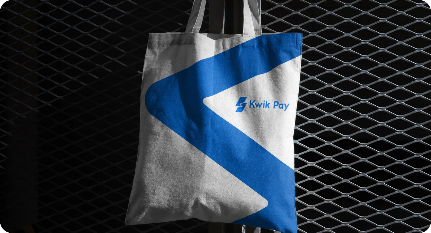
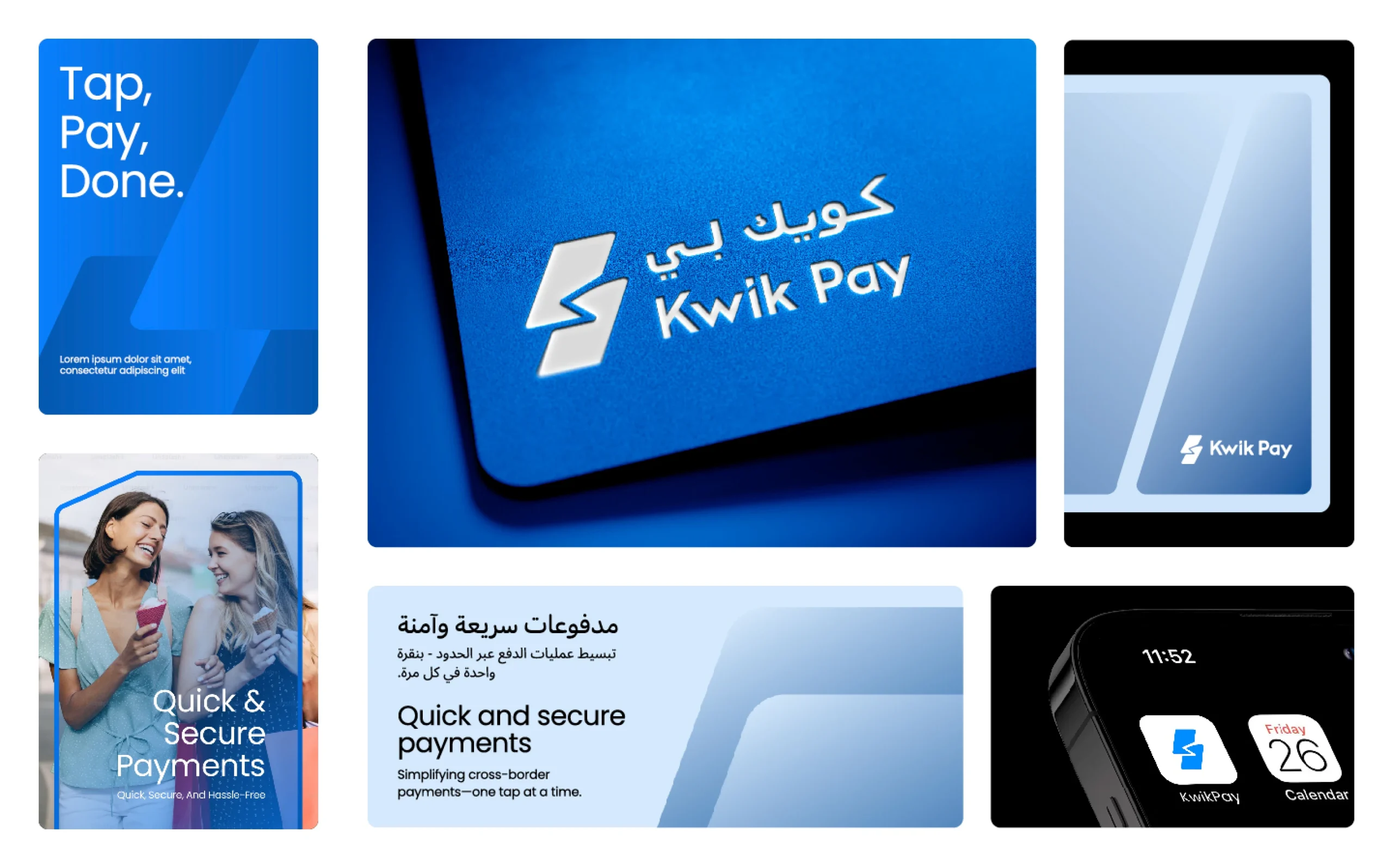
Graphic elements, such as zoomed-in gradients of the logo, enhance the brand’s dynamic appeal while maintaining consistency across applications. Together, these elements create a cohesive and engaging identity, resonating with KwikPay’s diverse audience and establishing it as a trustworthy fintech solution.
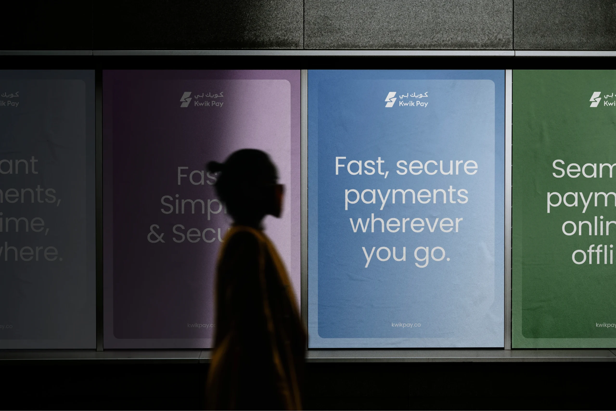
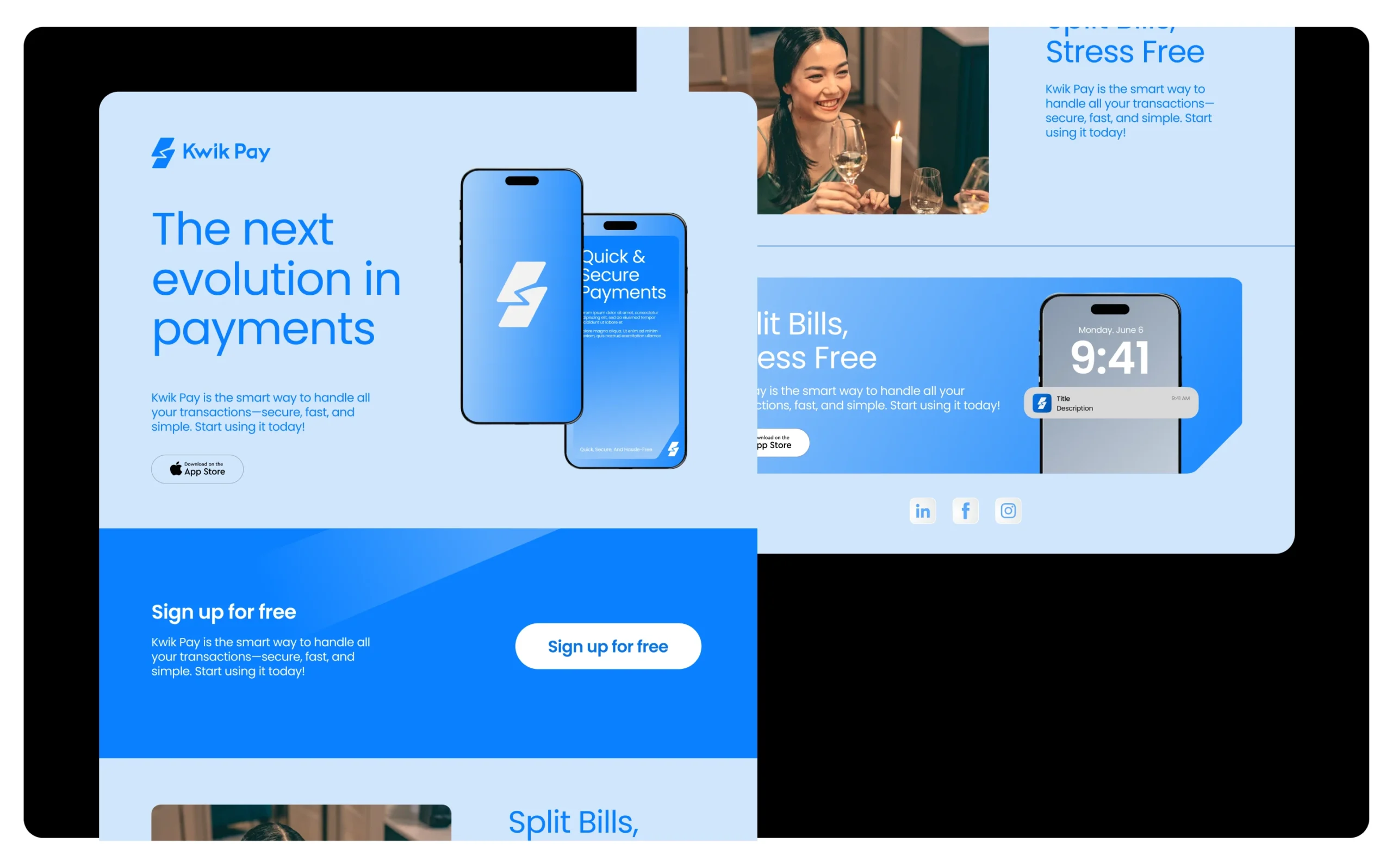
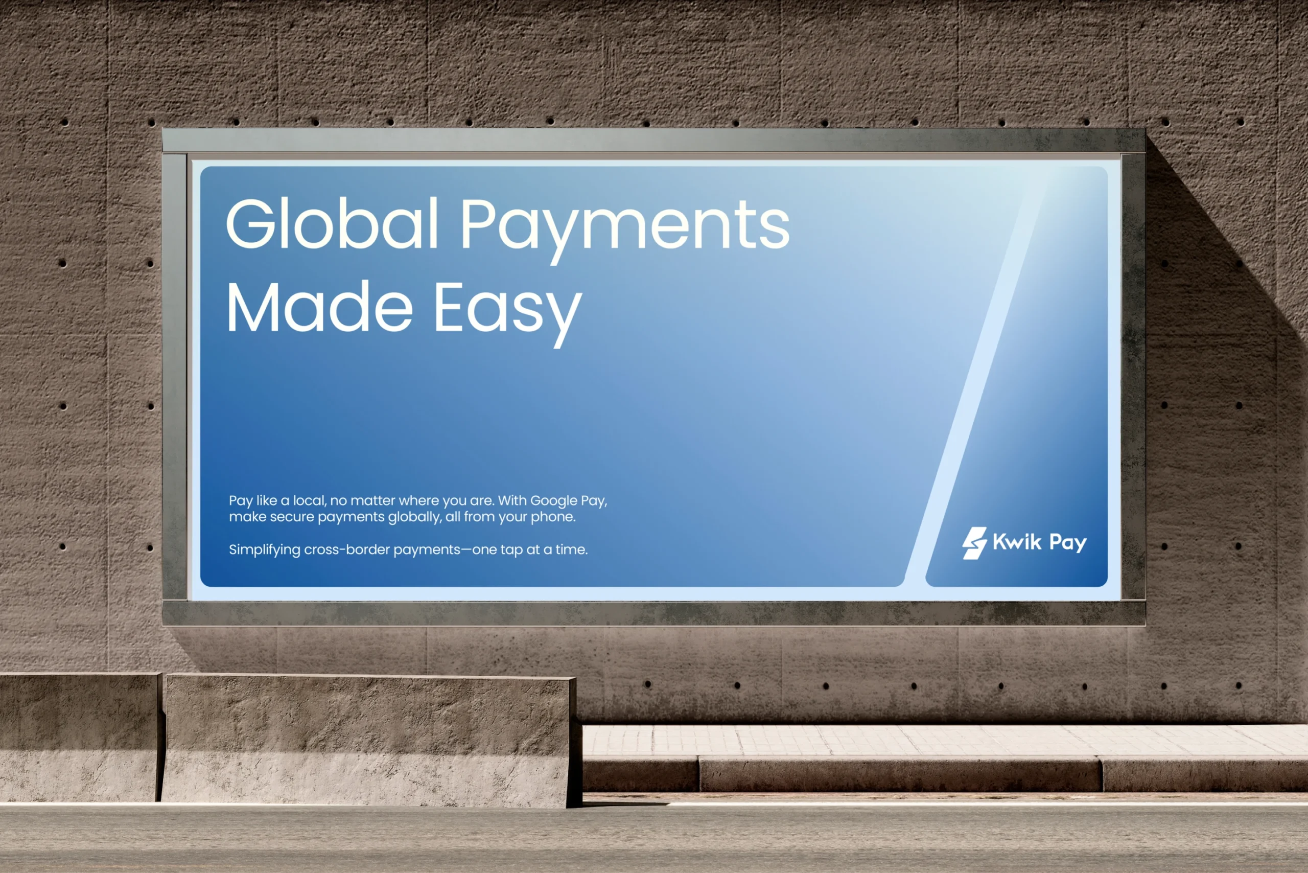
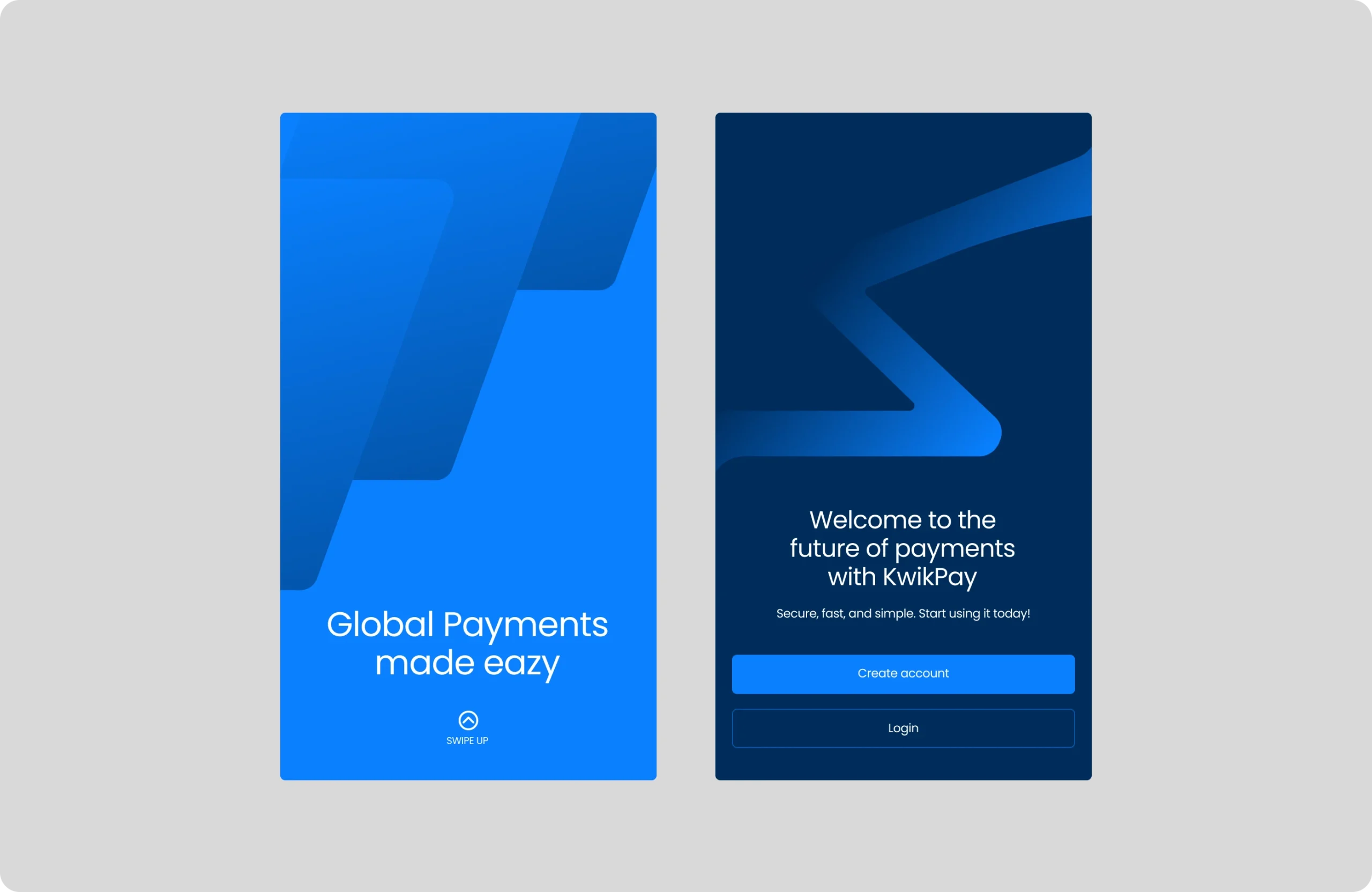
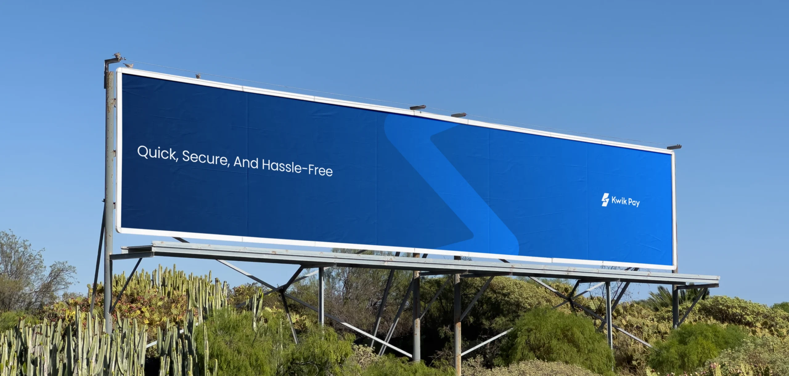
The new branding elevated KwikPay’s position in the fintech market. The modern, user-friendly design system ensured seamless integration across platforms, boosting adoption and engagement. The dual-language logo strengthened brand recognition, making KwikPay a trusted choice for secure, frictionless payments in Kuwait and beyond.
Our Role
Content