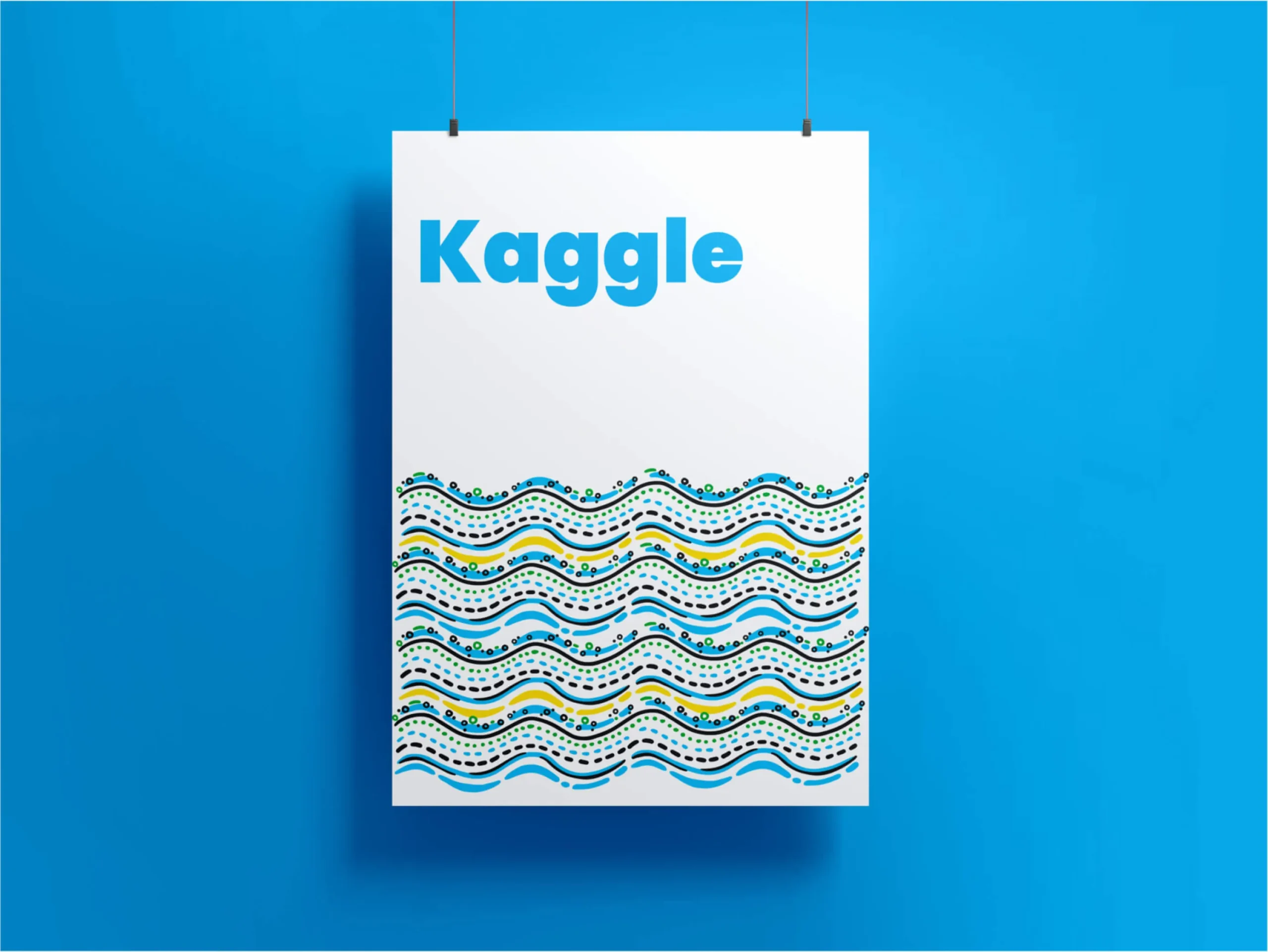
Creating a standout brand
for Google’s Kaggle.
Kaggle, acquired by Google, is the world’s largest data science community, offering collaboration and learning services globally.
- Artificial Intelligence
- Data Science
- Branding
- Illustration
Kaggle, a global data science community, collaborated with Brucira to create a custom illustration library to enhance its platform’s visual storytelling and engagement with its users.
Kaggle needed a visual overhaul that could better represent its data science platform through illustrations while maintaining brand consistency. The key challenge was to create illustrations that were not only visually appealing but also accurately conveyed complex data science concepts. Additionally, these illustrations had to seamlessly integrate with the existing platform without overwhelming the user experience.
Balancing technical information with creative visuals was essential to ensure the illustrations would resonate with a highly specialized audience without compromising clarity.
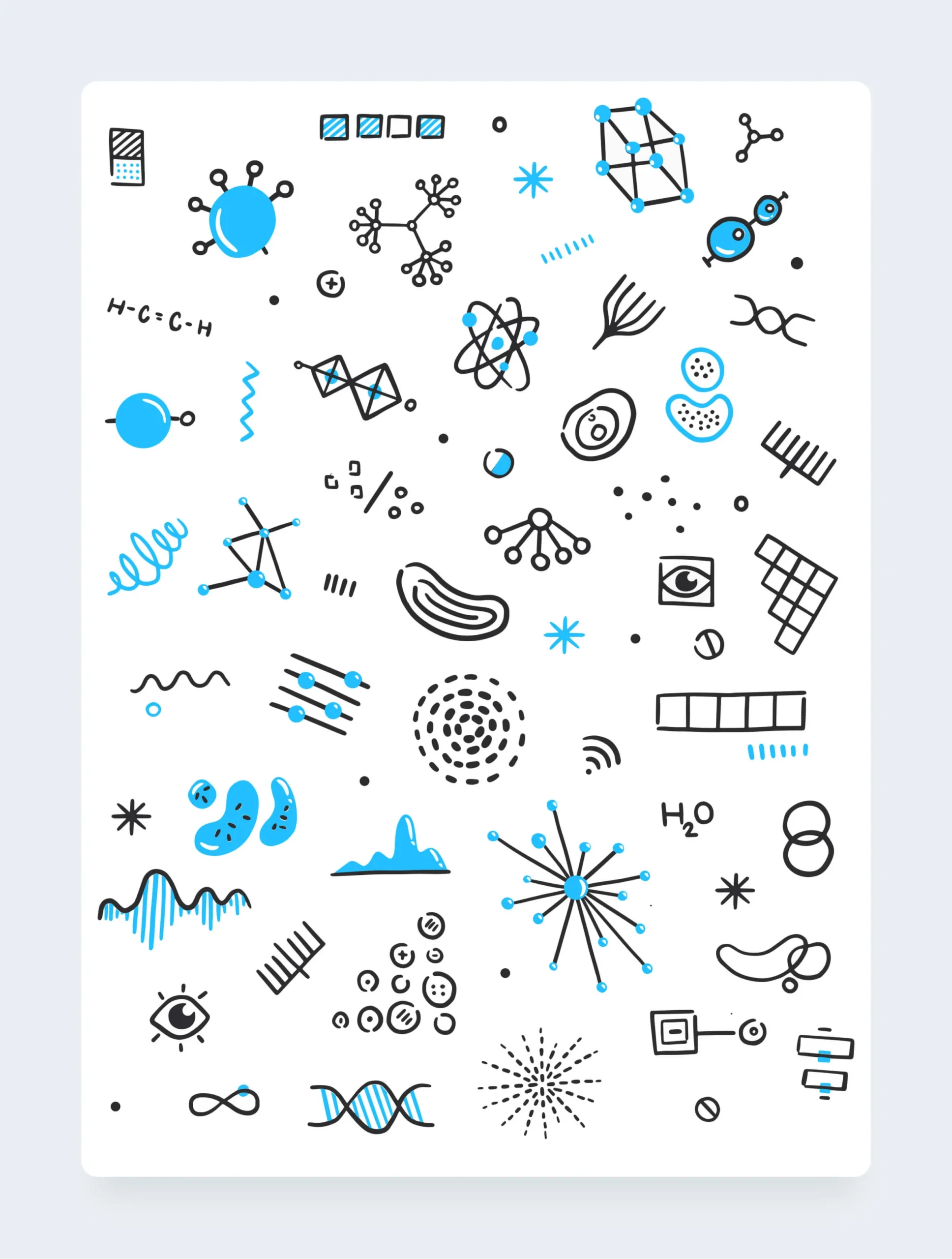
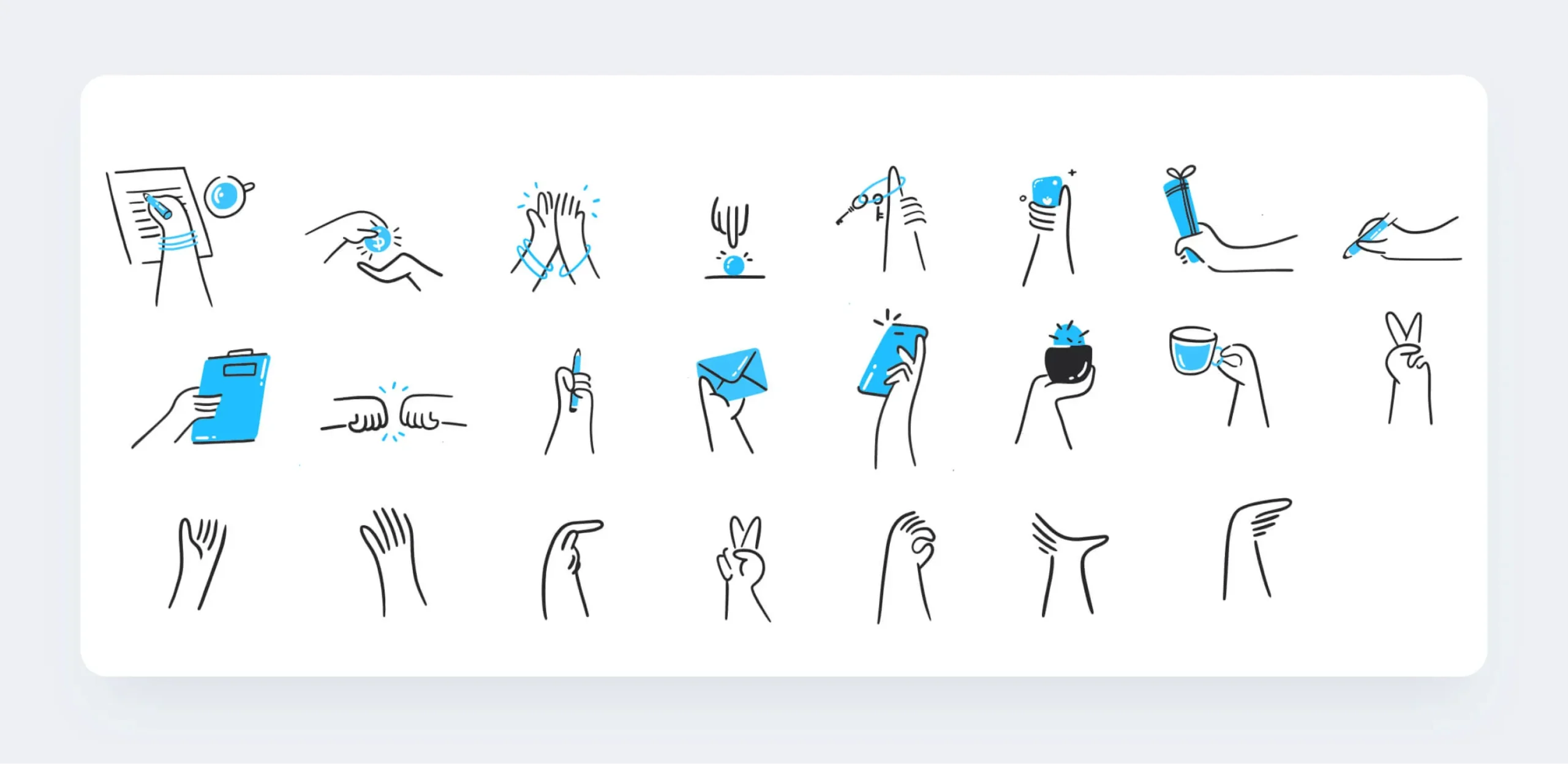
We designed product illustrations inspired by abstract concepts, combining organic forms with realistic elements to represent Kaggle’s offerings. Focused on curiosity and playfulness, we created diverse, warm, and professional characters that could be mixed across Kaggle’s platforms. From ideation, we avoided stereotypes and ensured inclusivity. By the approval stage, we delivered a cohesive set of illustrations that captured Kaggle’s brand personality while enhancing the overall user experience and visual appeal.


Data offers many valuable insights. There is a constant challenge to filter it and communicate its representations. Through illustrations, we could precisely humanize data and present it on Kaggle. We also succeeded in explaining data, its extrapolation, and potential by creating an all-new library of scientific illustrations.
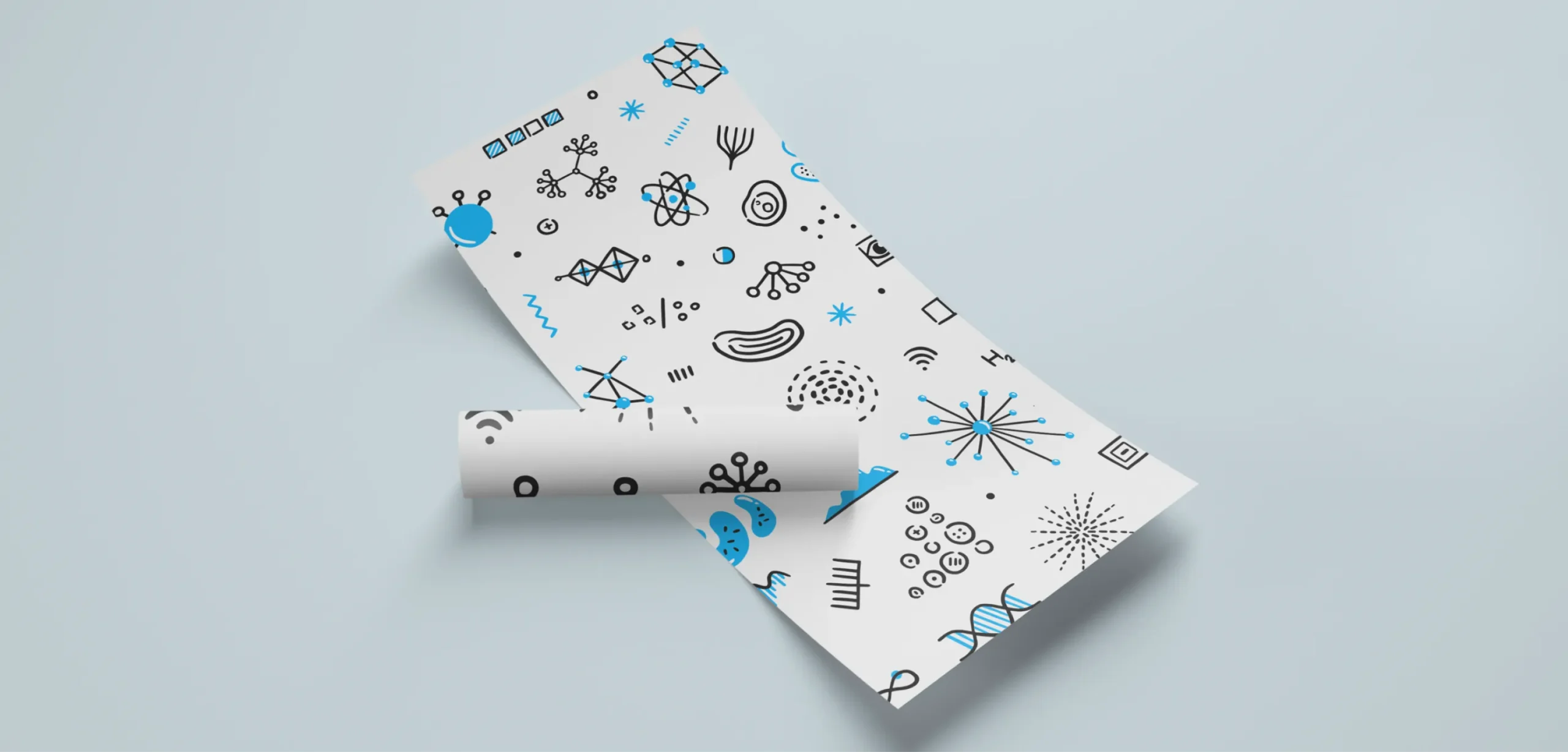
We used distinct primary and secondary colours to evoke enthusiasm. They not only ended up showing visual synergy but also created a better appeal for the brand. Overall, we followed this design and behavioural principle to create overlapping patterns for Kaggle.
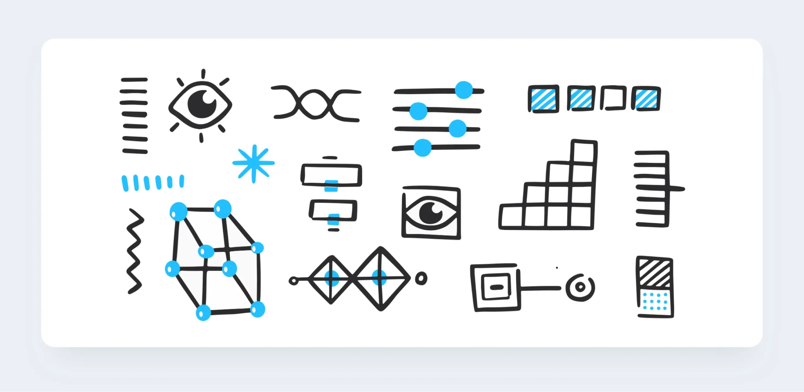
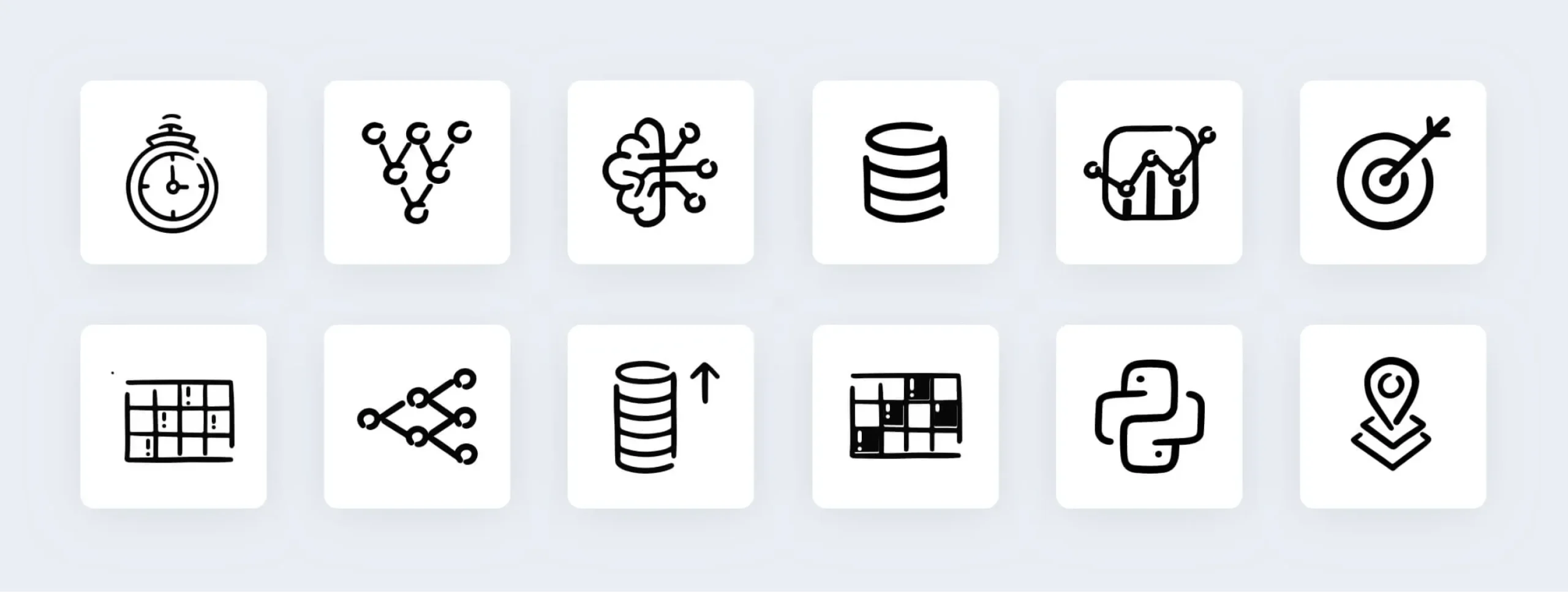
We also recreated icons for Kaggle. To initiate its process, we worked on a new visual identity. We avoided using colour blocks for them as per the brief. The new set of icons were neat and precise. As recreated illustrated icons, they made communication simpler and more effective.
We helped in creating the Goose mascot for two scenarios: no searches found and error. The sound of Kaggle rhymes with Gaggle, the flock of goose, so visually a Goose mascot had to live up to the broader aesthetics of Kaggle.
Following the same, we designed a minimalistic yet playful Goose which could engage users during no search or error prompts.
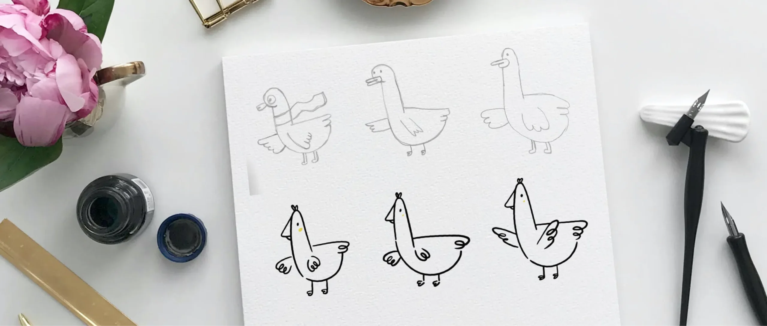
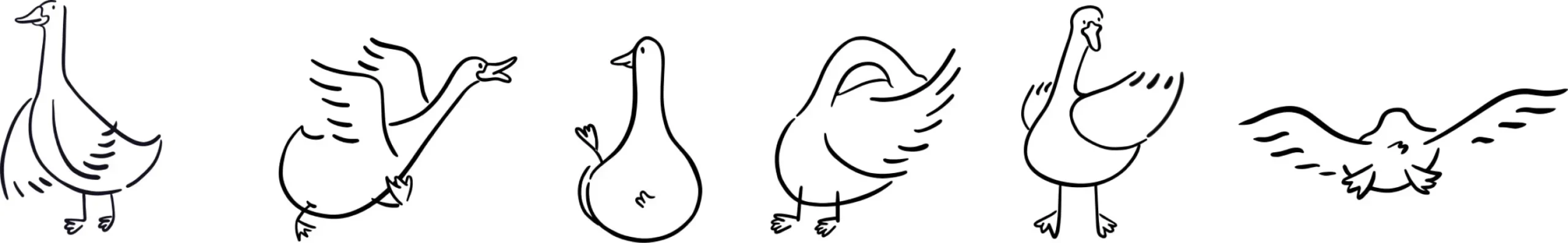
The shapes and icons featured rounded edges and smooth lines to create a more approachable feel. Our goal was to humanize the brand, so we leveraged our creative synergy to exceed the team’s expectations.


To streamline feedback, we compiled all sketches and illustrations into Google Slides, allowing the Kaggle team to leave comments directly. This approach enabled our team to address feedback quickly and make real-time adjustments.

The Kaggle team was exceptionally happy with the results. The character illustrations were able to convey the brand message. On the other hand, the data-based graphical illustrations successfully conveyed the type beautifully, and the icons were placed across the website as well.
Consequently, we were able to create 50+ illustrations for their product over the course of 6 months. These illustrations are live across their website and product pages.
Our Role
We developed a cohesive color scheme, crafted custom illustrations, and created a detailed mood board to establish Kaggle’s visual identity.
Content