Designing the Food App for the World Food and Music Festival
The World Food & Music Festival in Downtown Des Moines (DSM) began in 2004 and has since grown into one of USA’s largest food & music festivals
- Advertising
- Artificial Intelligence
- Brand Positioning
The World Food & Music Festival in Downtown Des Moines (DSM) began in 2004 and has since grown into one of USA’s largest food & music festivals
The World Food & Music Festival in Downtown Des Moines (DSM) began in 2004 and has since grown into one of USA’s largest food & music festivals. Two dozen vendors welcomed thousands of visitors and offered them a taste of cuisines from around the world. More than a decade later, the festival now attracts more than 90,000 visitors who are looking to explore diverse cuisines from Italy, Mexico, India, and other countries.
The Des Moines Food Festival needed a brand new app that addressed existing pain points and enriched the user experience for the festival-goers.
Brucira needed to build an app that considered the following pain points:
- The existing app didn’t have a proper solution for the venues which had been created from the dashboard. The existing user needed to have all the information to get a suitable result.
- The app lacked functionalities that improved user experience for different buyer personas.
- The user interface (UI) needed to be improved and built to be made more user friendly rather than being sales-centric.
- There were bugs and issues that the users faced during booking cancellations and reaching out to the hosts that needed to be fixed.
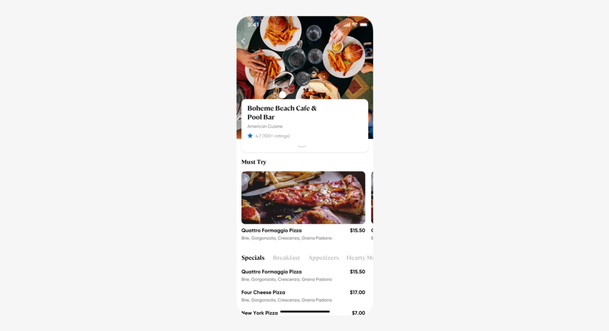
Brucira’s key idea was to build an app which was clear, spacious and easy to use. We wanted to redo the overall user experience and make it easy for users to find the information they need within seconds.
Brucira tackled the redesign of the World Food and Music Festival app in different sections:
Design:
While finding solutions for pain points, we also integrated some attractive new features to embellish the overall user experience.
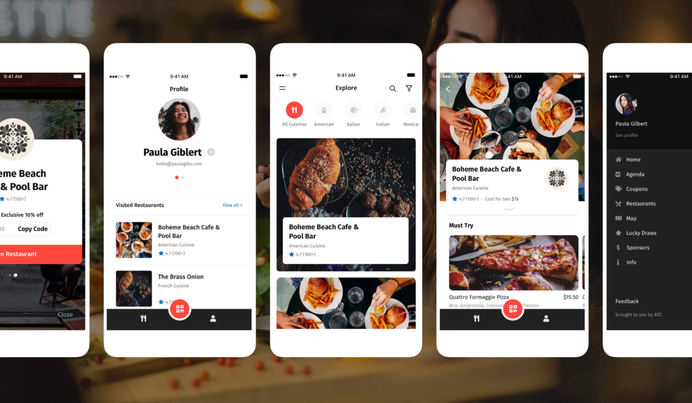
Homepage
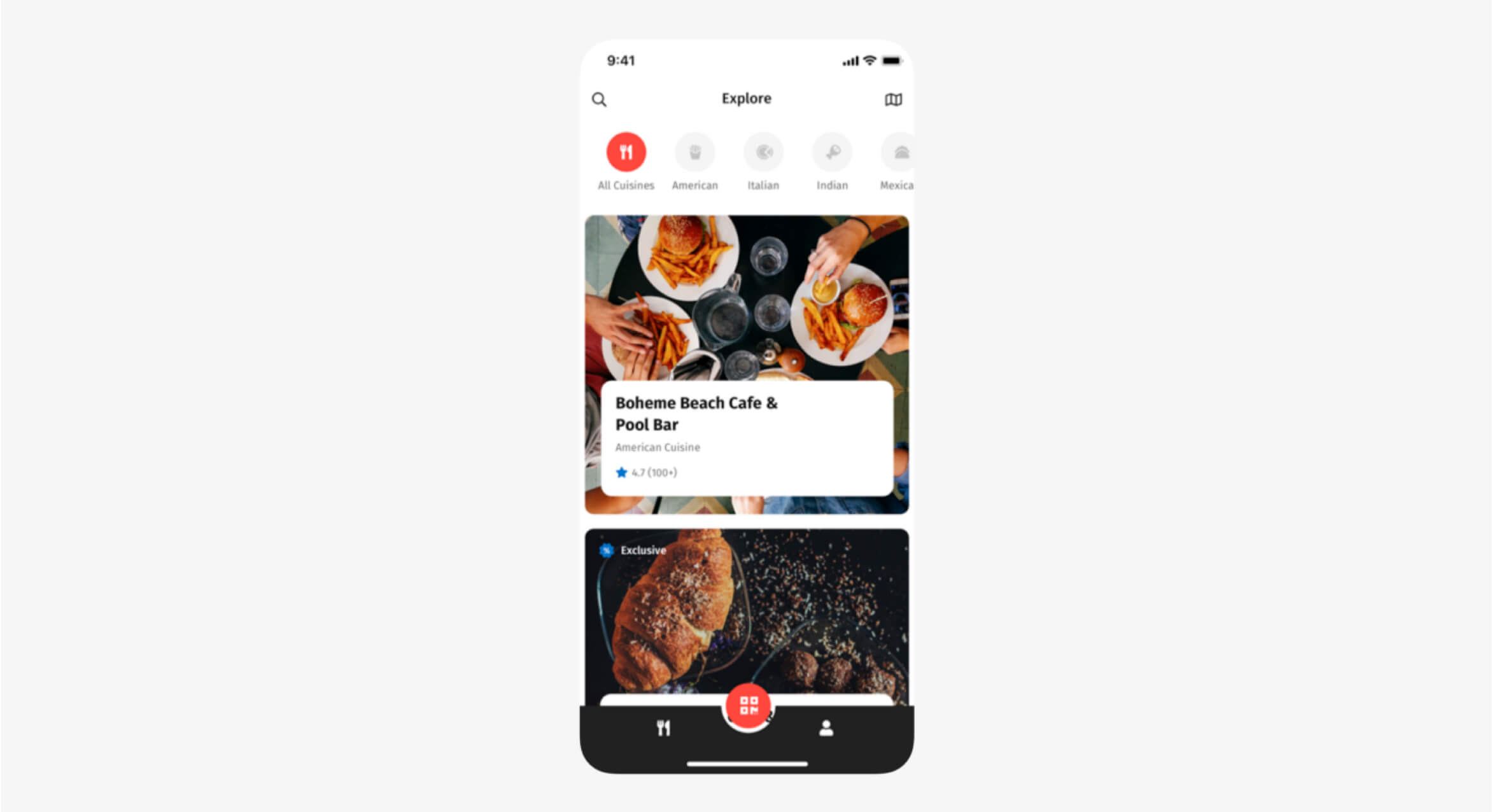
We made several changes to the current homepage. The ‘Search’ function was completely redesigned to avoid asking users to input excessive amounts of information to get a result.
Navigation
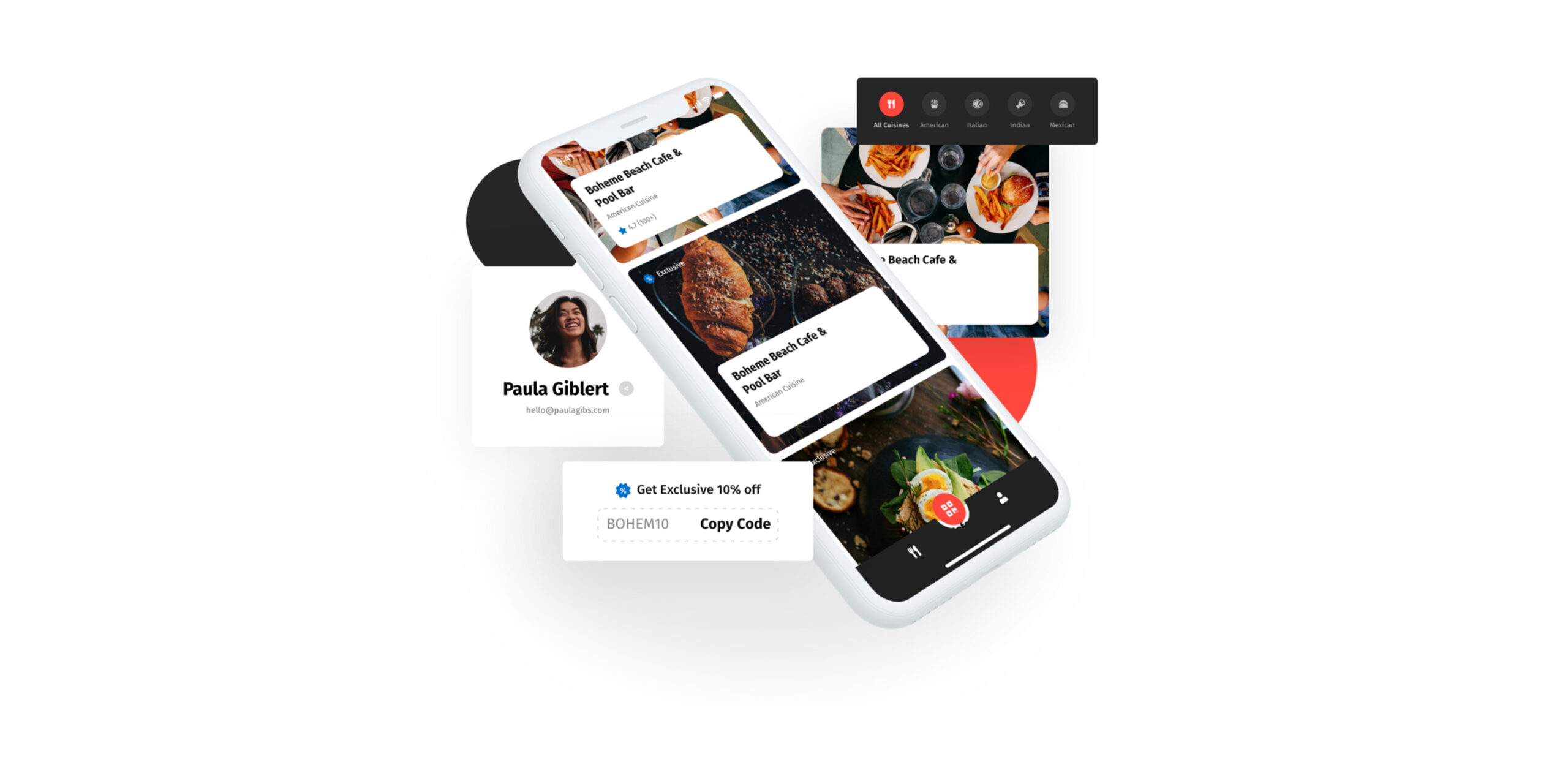
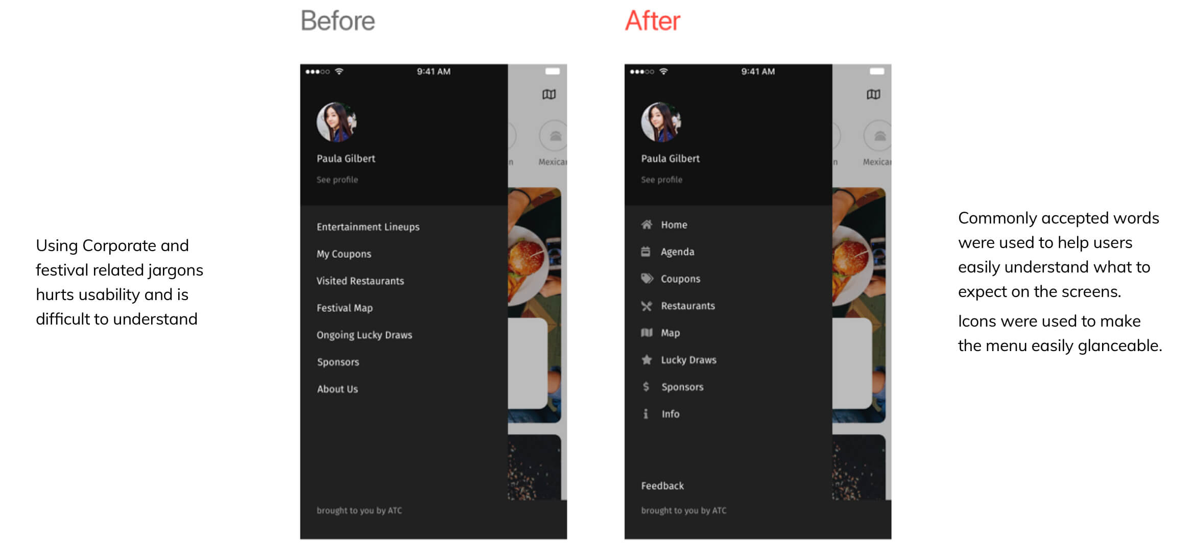
We added a new Tab bar, pulling out the ‘scan’ button from the IA (information architecture) so that the user can quickly access their saved properties. We also added a ‘Profile’ section so users could see the restaurants they’ve visited. This concise data allows them to easily recall their favourites and/or change any rating they’ve shared throughout the festival.
Restaurants
More and more restaurants are integrated into the festival each year so we wanted to include the same in the app. We included a new feature that allowed users to ‘check into a restaurant’ with their profile. This also allowed them to see the currently available dishes along with some quick discounts. We’ve relegated this feature to the homepage as we wanted to collect more data about its use before rolling it out across other sections. Restaurants also display average reviews and pricing info. A new feature allows users to check the location of the restaurant within the app itself.
Listing pages
We changed the filer from 3 buttons to 2 to reduce the number of user steps. It continues to remain at the bottom of the screen for quick and easy access. We added labels to identity section types. Each listing showcases the main facilities and amenities offered by the venue in the very first screen so they can make an informed decision. Leveraging buyer persona data, the property listing can be customized to highlight relevant information for every individual persona. We converted the prices from ‘total’ to ‘for 2 people’ to make it easier for festival-goers to compare between properties.
The complete redesign of the app was a huge success. We decided to highlight the important aspects of every restaurant first — pricing for two people, types of cuisines available, timings, and other notable info was moved to the front. The information continues to be shown in tabs but now it’s a long scroll, not separate tabs.
After the prototype was approved, the app went live on the play store and the app store within a month. Both the client as well as the users loved the new app — over 2,000 people availed discounts through it every day during the festival.
Our Role
Our role was to design a website that educates users, showcasing food festival services and core philosophy effectively.
Product Design
Content
