Transforming CoverSure’s App with a simplified insurance management platform
CoverSure is a fintech platform designed to simplify insurance management for individuals and families. It enables users to track, manage, and analyze all their policies across health, life, motor, and more, within a single unified portfolio.
- Fintech
- Insurance Sector
- App Design
- Personality and Tonality Setup
- Product Strategy
Brucira collaborated with CoverSure to transform their existing interface by using minimal changes to create high-impact output to improves usability, clarity and trust across the product.
CoverSure wanted to bring all kinds of insurances that a person would have into one place where they can easily track, and manage their insurance portfolio.
Their existing app had the following key issues:
- Heavy gradients that felt unprofessional for fintech
- Unclear flows and inconsistent structure
- Complex information layout
- Weak visibility of the core USP: personalized insurance insights
The goal was to redesign the experience with minimal effort and maximum impact.
We refreshed CoverSure’s product experience with a focus on trust, clarity, and usability. Visual clutter was reduced, navigation was streamlined, and core flows were refined for smoother policy management.
By making minimal yet meaningful changes, we wanted the app to become more reliable, scalable, and easier for users to navigate.
We began with a quick audit of the existing product to identify inefficiencies in flows, UI patterns, and hierarchy. Taking this information, we ran a competitive analysis model of some related players to see the design trend in the industry. Using all of this information, we focused on improvements like cleaning layouts, refining navigation, simplifying components, and aligning the experience with insurance user needs. Personalization was placed at the core of the redesigned journeys.
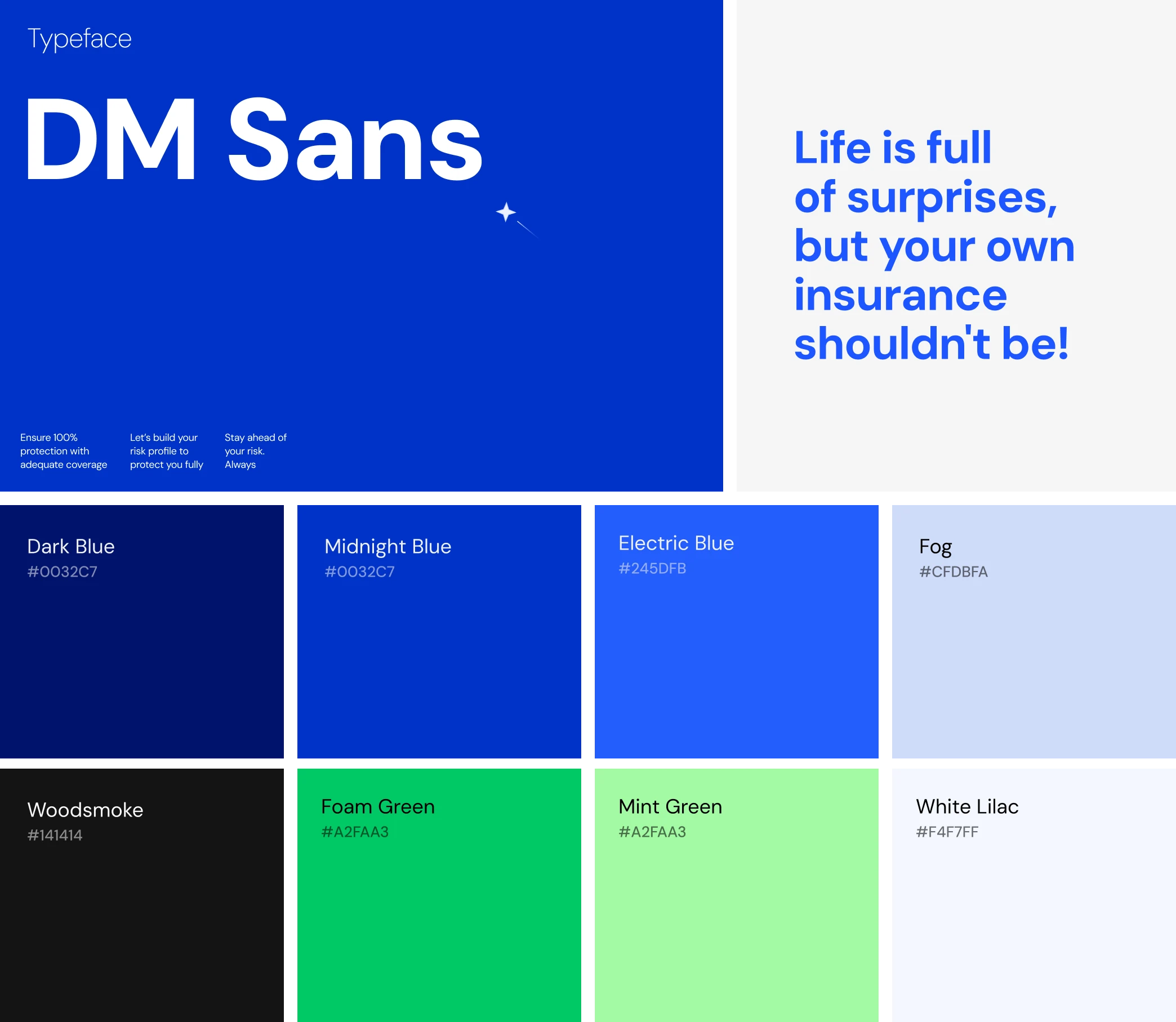
Our moodboard leaned into a polished fintech aesthetic, clean lines, muted neutrals, minimal gradients of blue to give a feel of tech, and a focus on clarity. Typography shifted to DM Sans to bring softness and approachability, while still maintaining a professional, trustworthy tone.
The visual direction emphasized simplicity, balance, and a sense of reliability, qualities essential for an insurance-focused product.
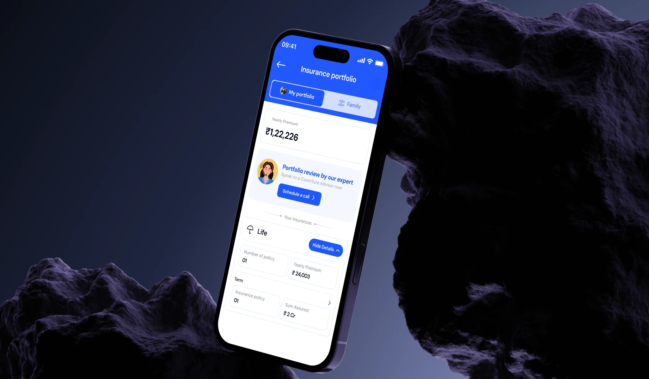
At its heart, CoverSure is about clarity: making insurance simple, understandable, and personalised. We brought this philosophy into the digital experience by embracing minimalism and structure.
Inspired by the idea of a single portfolio holding all family policies, we designed a unified system that mirrors this simplicity. Subtle data-driven patterns, structured grids, and clean surfaces help communicate order and transparency which are the key pillars of the insurance space.
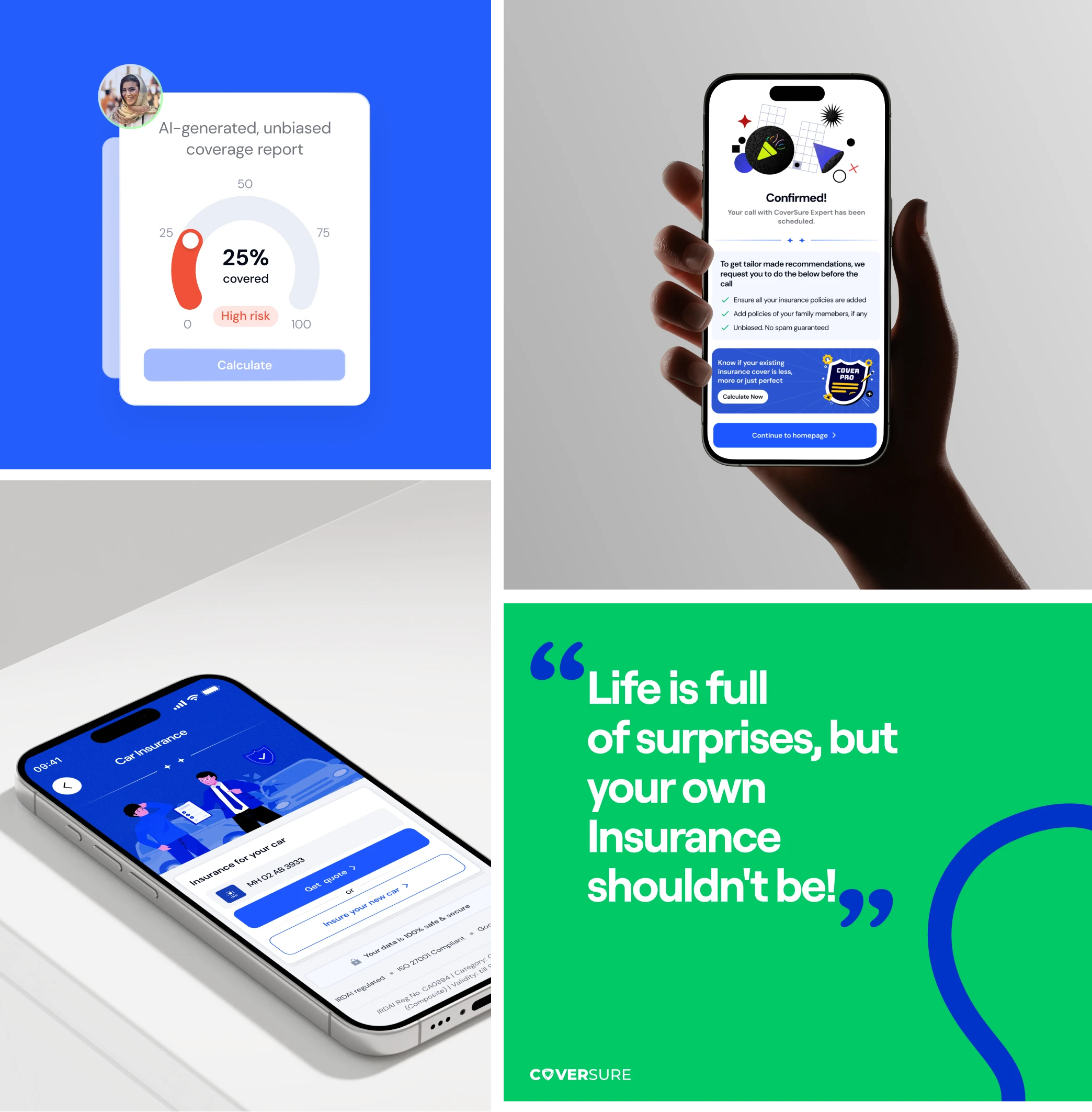
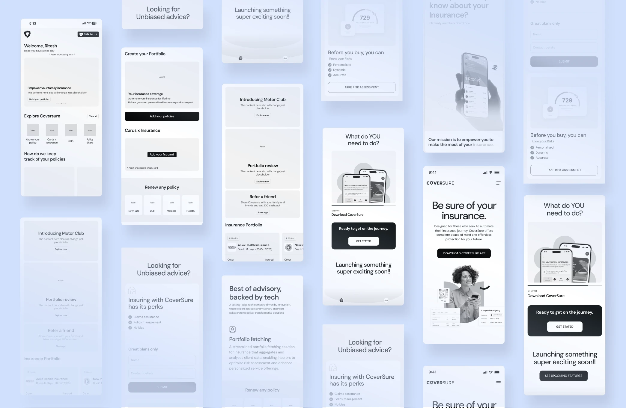
We built a clean, trustworthy visual language tailored for fintech and insurance. Gradients were removed in favor of flat, professional surfaces, while DM Sans introduced a lighter, refined tone. Clear spacing, simplified components, and subtle data-driven accents created a structured look that made policies easy to scan and understand. The result was a modern, minimal style that conveyed reliability and clarity from the first interaction.
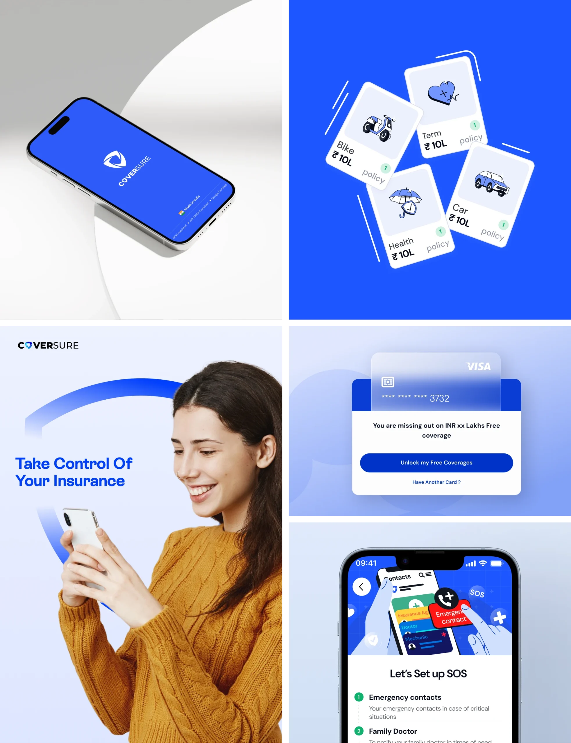
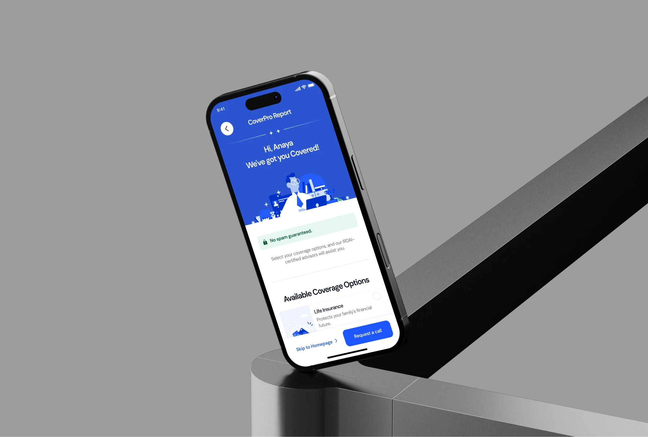
Our UX focus was on making interactions clearer and more intuitive with minimal redesign effort. One example was the policy card, which originally felt purely informational, causing users to miss that it was clickable.
Along with such refinements, we also rethought the onboarding flow. The goal was to capture user details smoothly while allowing them to upload policy documents through multiple sources like Google Drive, DigiLocker, or a even PDF. Thus the main focus was to make the entry experience faster, flexible, and more user-friendly.
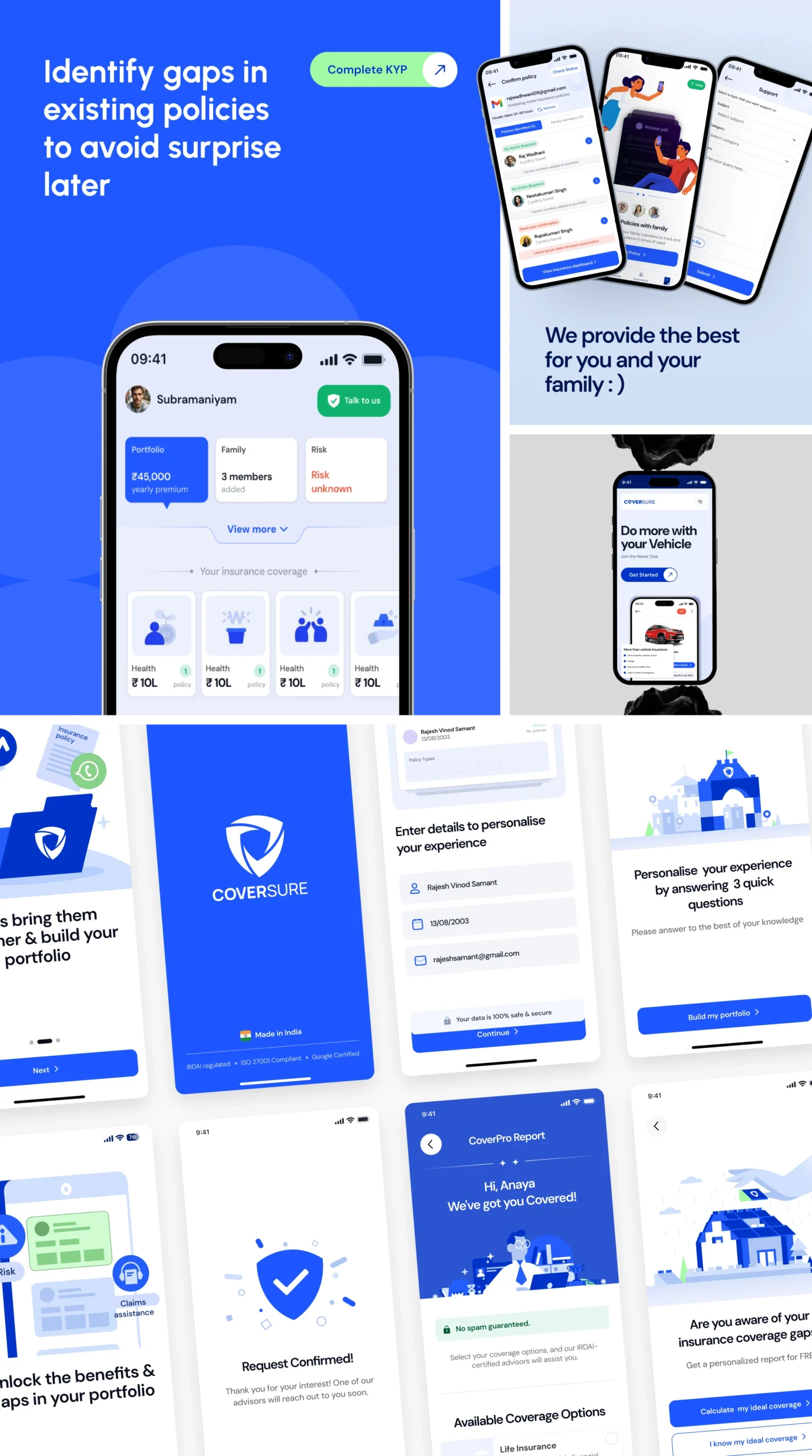
The final app brought together strategy, UX improvements, and the refreshed visual system into a unified insurance management experience. Users could easily add policies, view their family’s complete insurance portfolio, and access personalised insights, all within a cleaner, more intuitive interface. With streamlined flows and a professional fintech aesthetic, the app made insurance simpler, more organised, and more approachable.
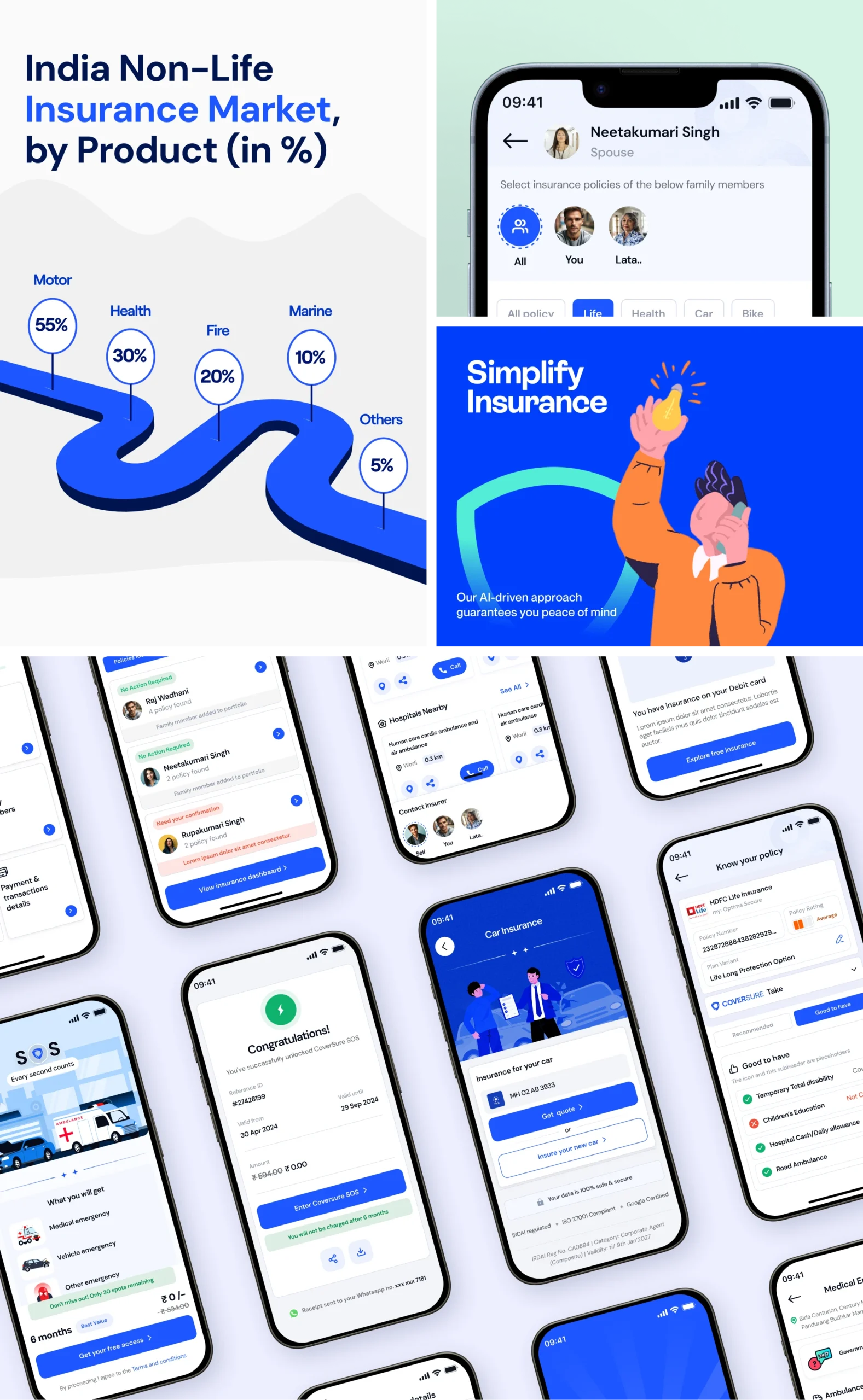
The redesign gave CoverSure a cohesive, trustworthy identity in a complex insurance market. Usability improved significantly with clearer navigation, simplified flows, and a single dashboard for all policies. Personalised insights became more visible and valuable, helping users make informed decisions with confidence. Overall, the updated experience strengthened CoverSure’s position as a reliable, user-first insurance platform.
Our Role
Our role was to redesign the CoverSure interface, creating a seamless experience that strengthens trust and credibility while supporting user growth.
Product Design
Content