Decoding the design process behind Finity’s minimalistic logo.
Finity is one of the most loved low-cost investing platforms. Millennials and Gen-Z look up to it for investing online in the stock market and creating passive income gateways through ETFs, IPOs, mutual funds and more.
- Advertising
- Artificial Intelligence
- Brand Positioning
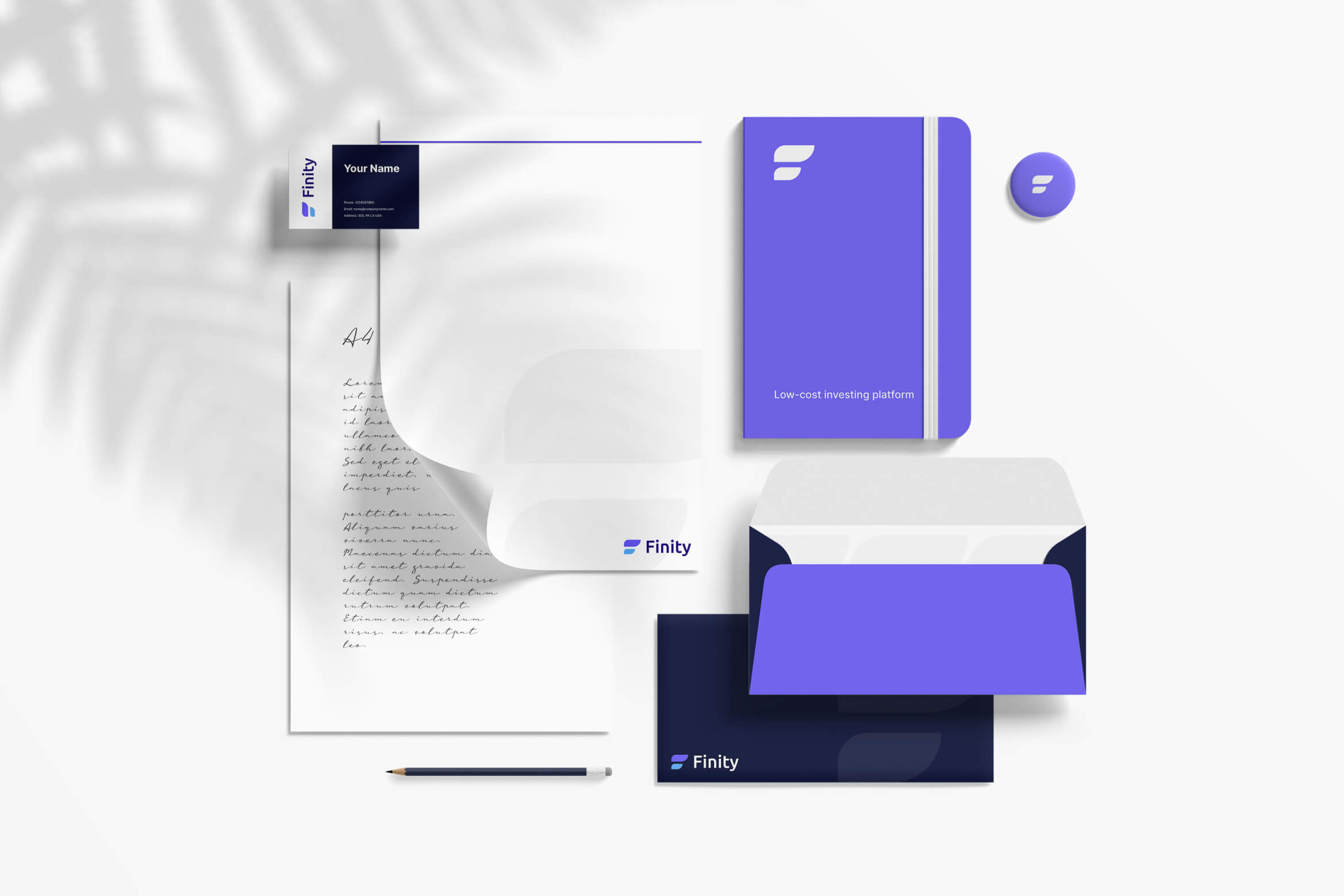
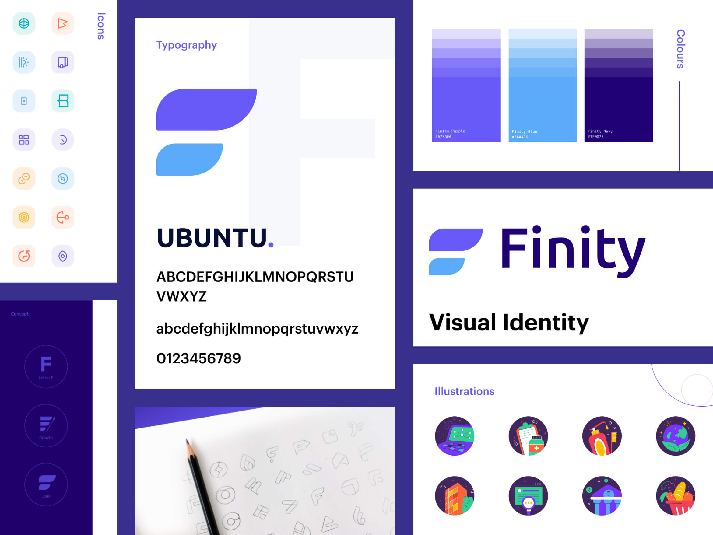
At Brucira, we designed Finity’s complete brand identity system, from logo to visual language, built for a modern generation of investors.
Finity is one of the most loved low-cost investing platforms. Millennials and Gen-Z look up to it for investing online in the stock market and creating passive income gateways through ETFs, IPOs, mutual funds and more. It serves as a single, robust platform for all your varied investment needs. You can open your Demat and online trading account and start investing with Finity to actualize your financial goals.
Team Finity wanted us to relook at their logo and create a striking brand identity for them. The end goal of this endeavour was to enhance the brand of Finity and convey that they strive to offer financial freedom to their users.
While the brief by Team Finity was straightforward, creating its logo sent unique challenges our way. Finity’s logo had to firstly showcase its offerings and yet not appear cookie cut. It had to have a unique personality. The logo had to organically showcase the strengths of Finity yet not get to ornate. We had to find a minimal yet striking balance for finalizing the aesthetic of Finity’s new logo.
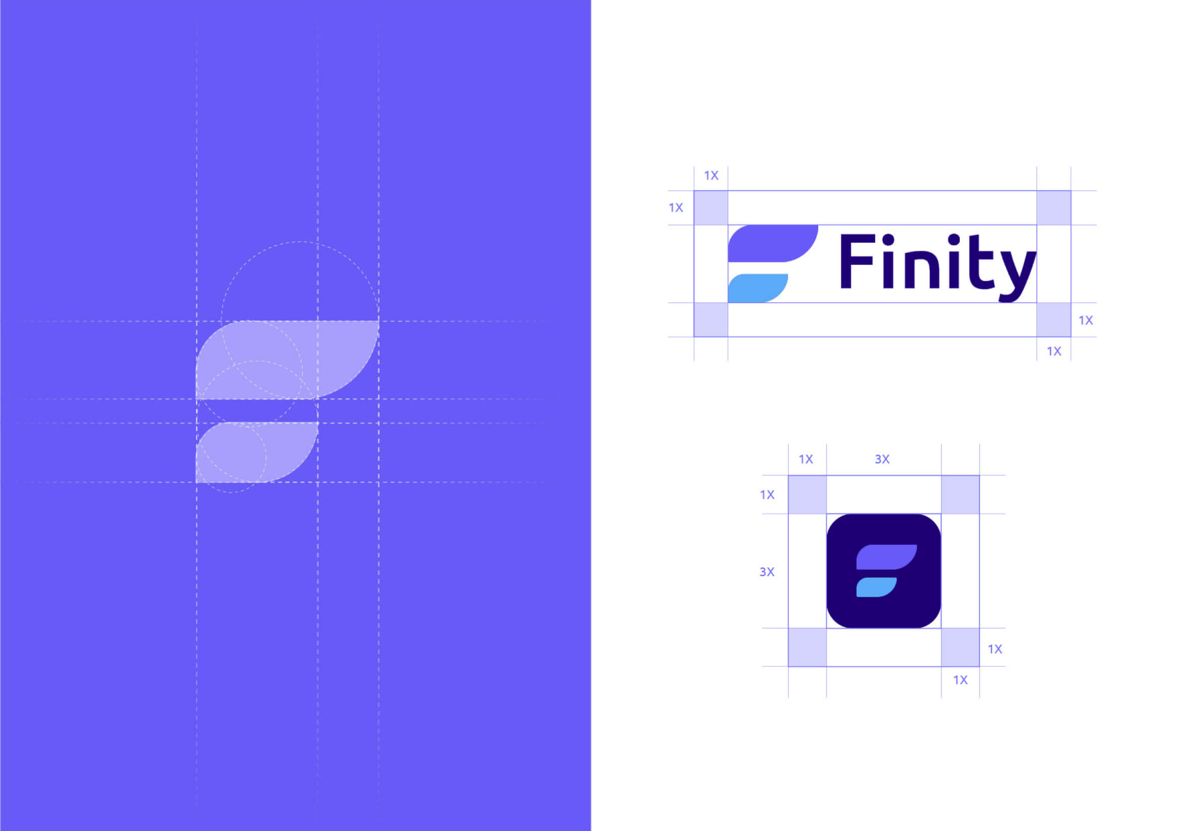
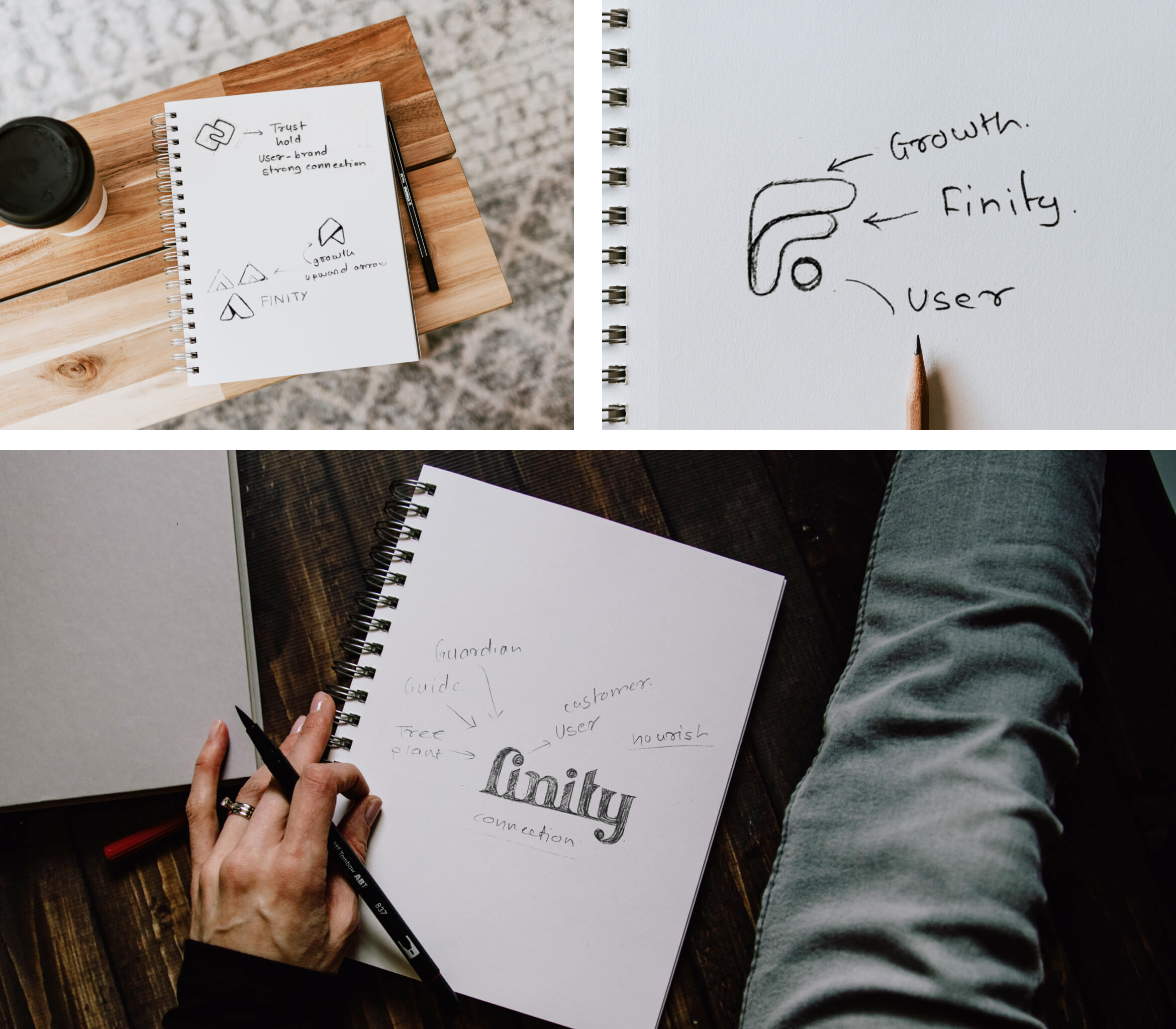
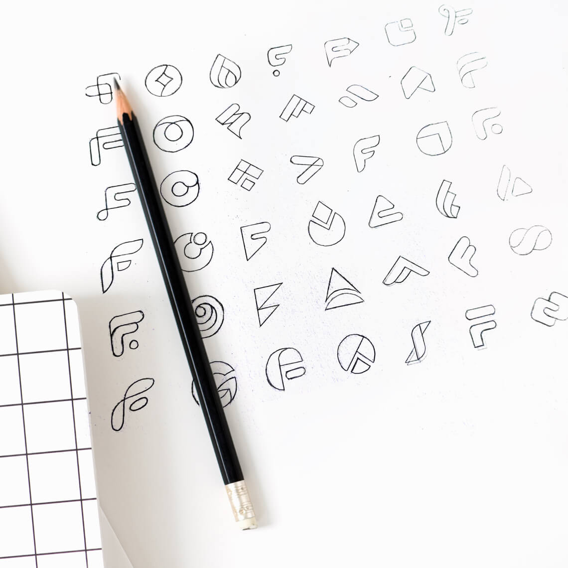
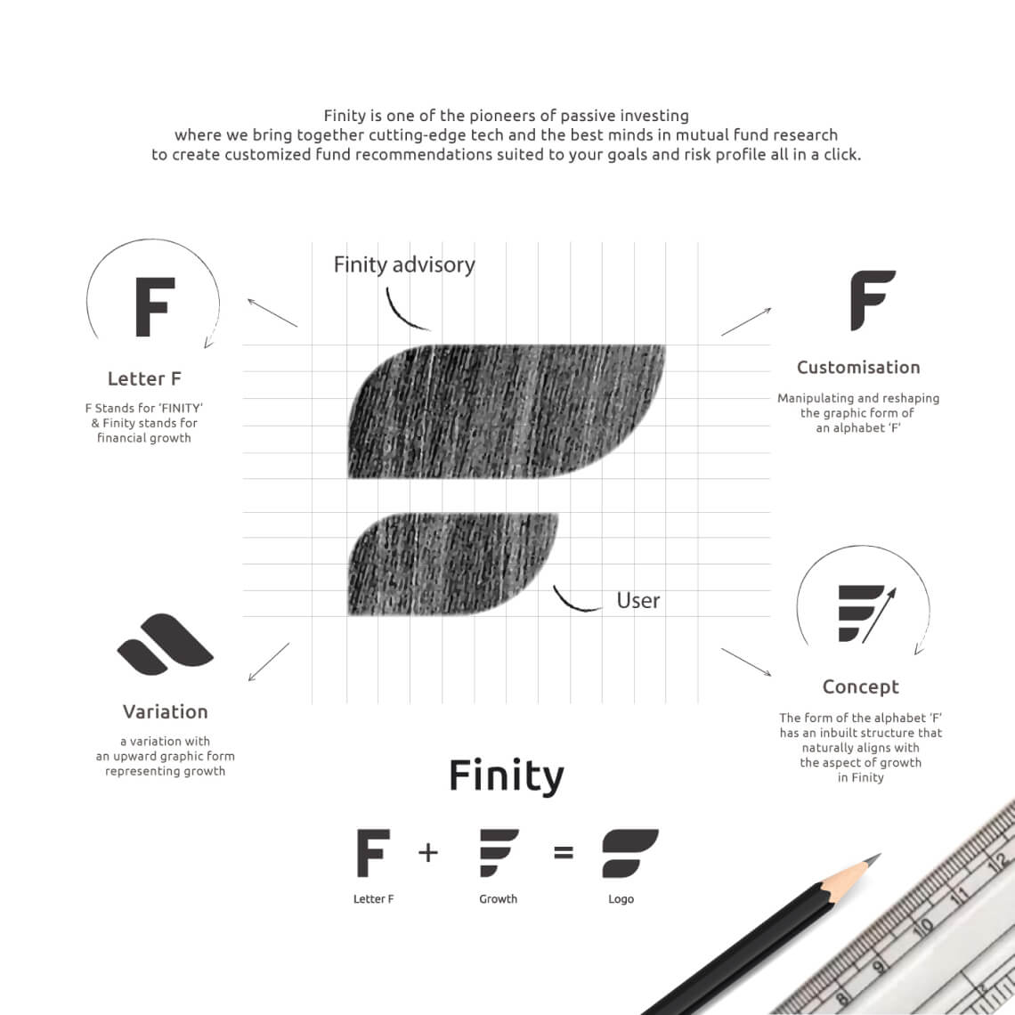
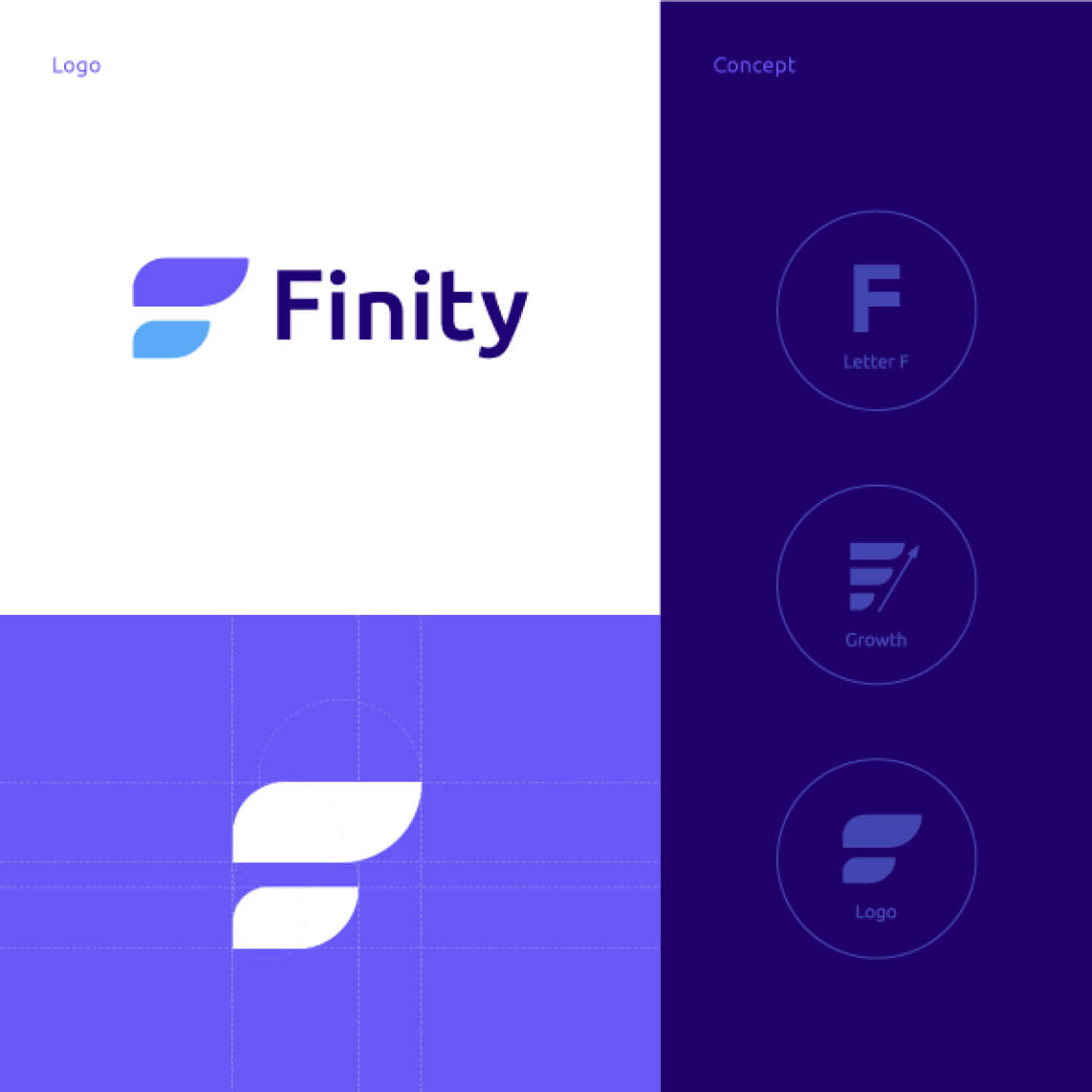
To begin with the logo design process, firstly, we understood the brief in detail. We were cognizant of the fact that this new logo would be the new identity of Finity which would stay for years to come and hence it had to live up to it. Keeping this prognosis in mind, we understood the offerings of the brand, their vision for the brand and their target audience. Through this process, we interacted with the team and also the end users. Once we completed the research, we initiated the sketching process. We brainstormed on how we could make an iconic logo for Finity and that’s how we landed up using the its initial ‘F’ as the core of the logo.
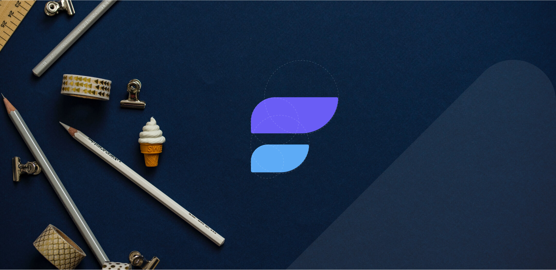
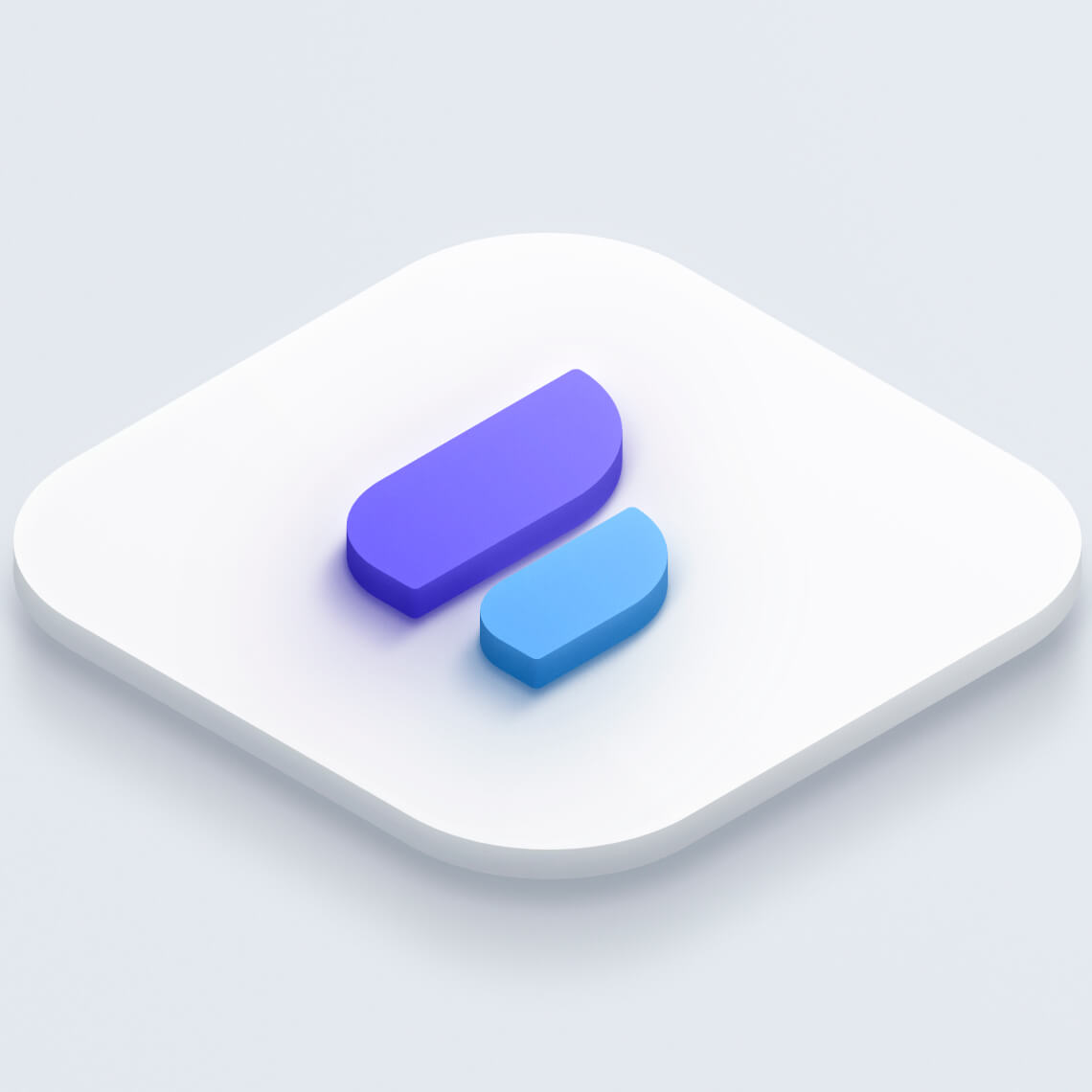
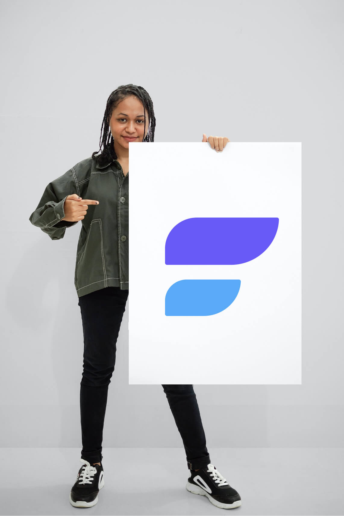
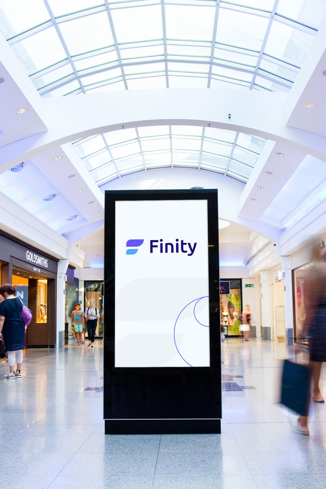
We looked at the letter ‘F’ with fresh eyes and extrapolated it as financial freedom. The colours blue and purple were used to make it more engaging. The flag shaped design was thus ideated to represent the core of Finity. It took us multiple rounds of sketching, iterations, feedbacks and finetuning to achieve the current logo that you can check here:
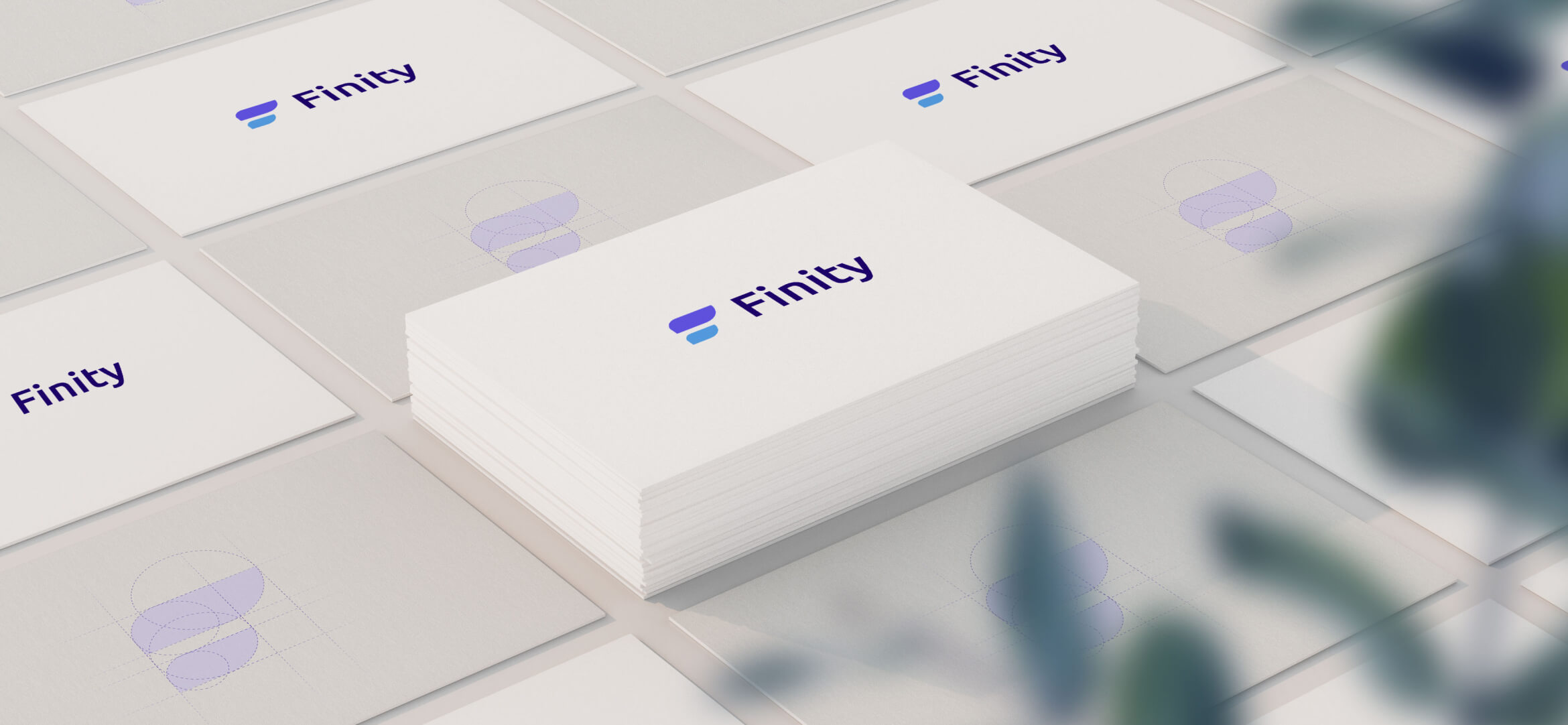
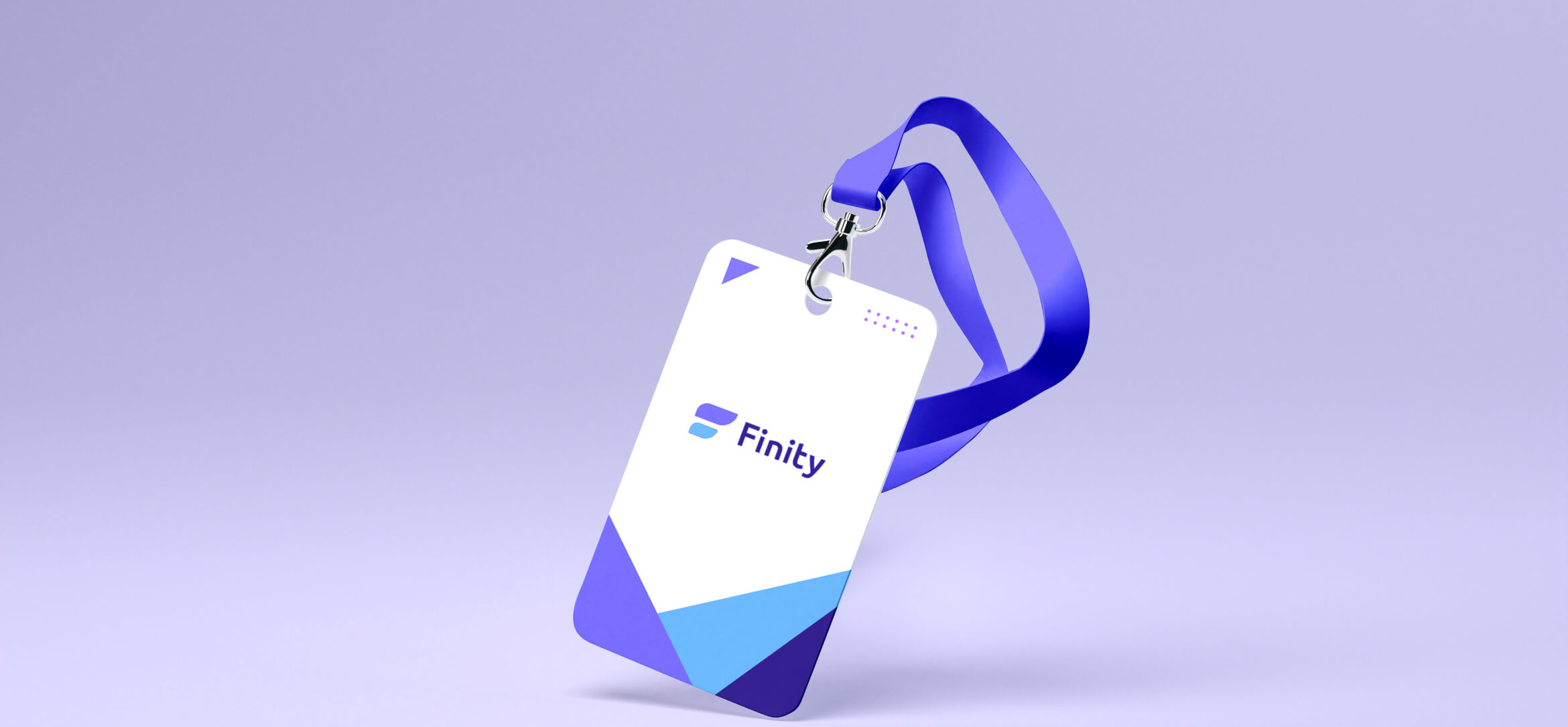
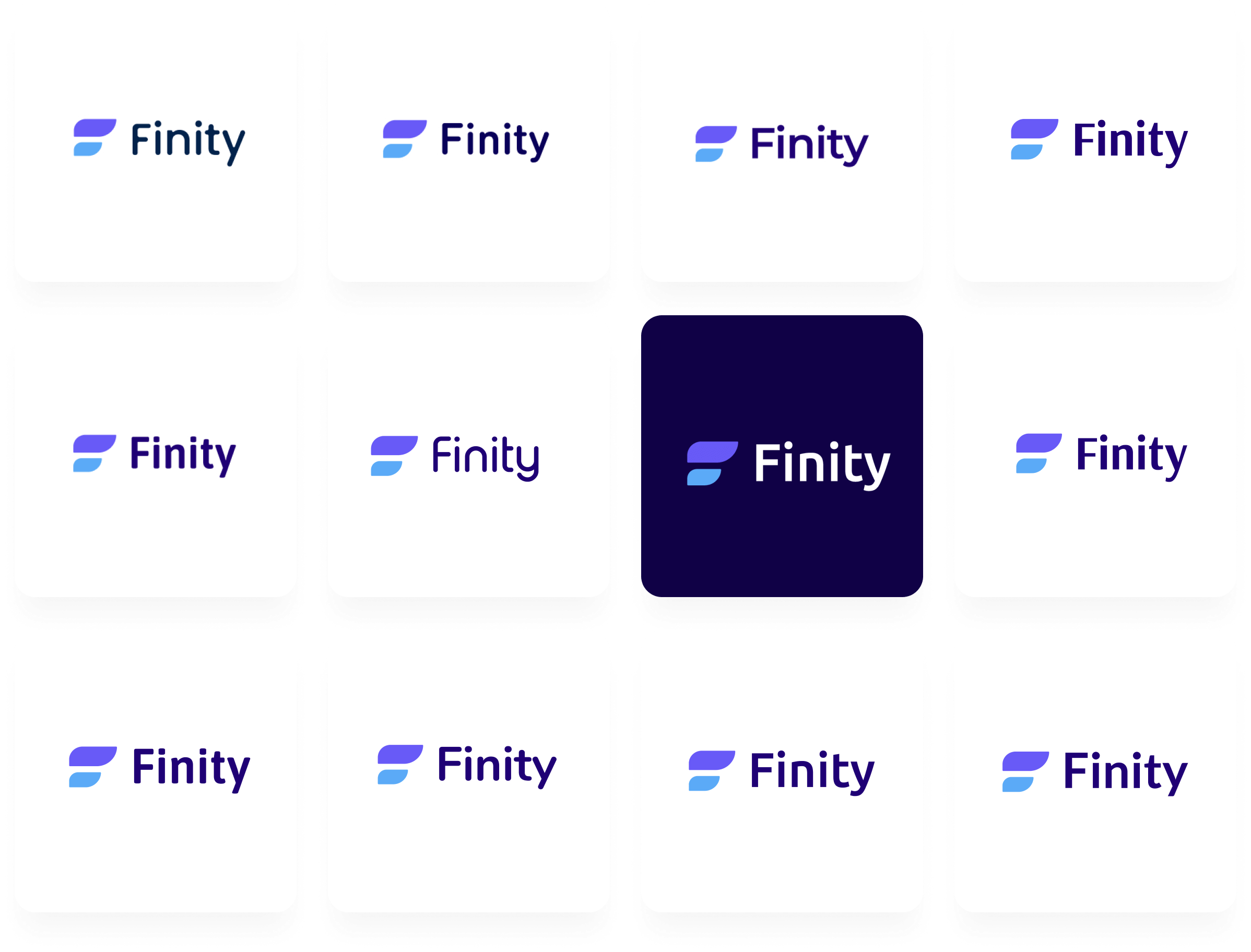
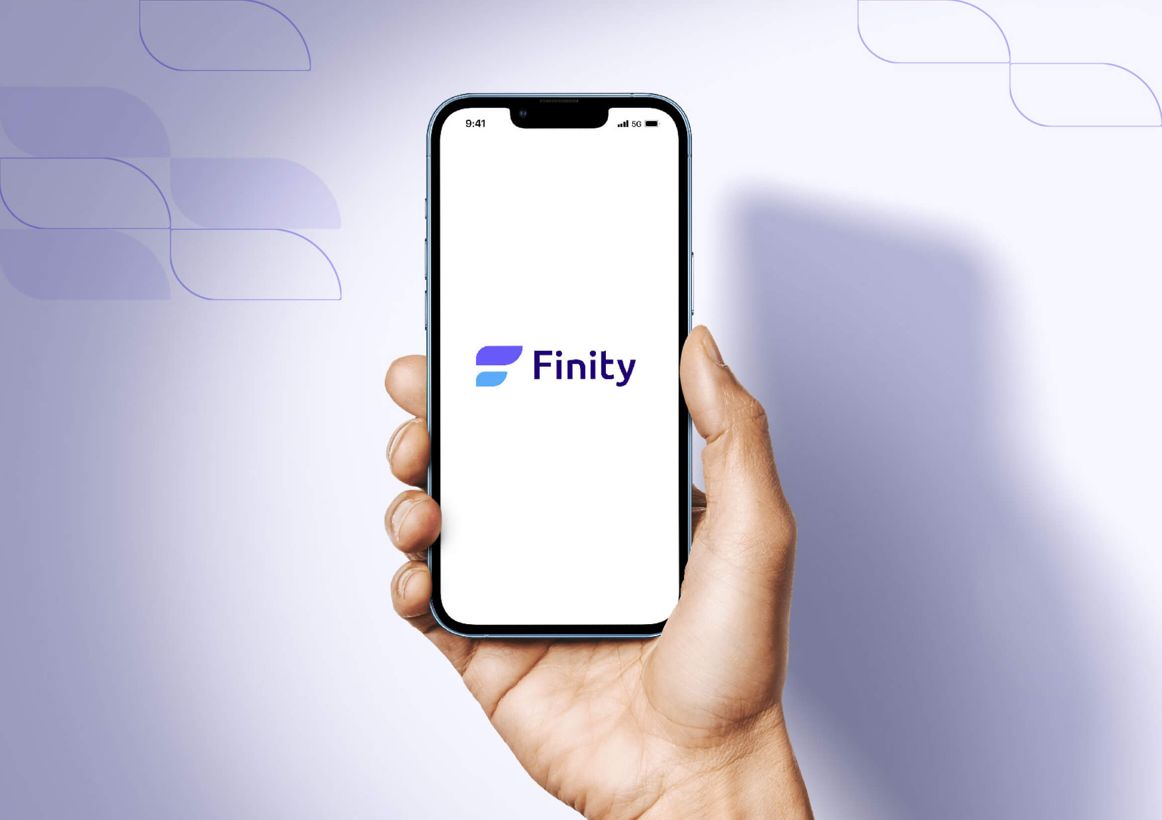
The new logo of Finity captures the essence of the brand and presents personal finance in a relatable manner. As its design is detailed and thoughtful, the final logo was liked by the Finity Team and it struck a chord with the young audience of their brand as well.
Our Role
Our role was to design a website that educates users, showcasing finity services and core philosophy effectively.
Product Design
Content