Translating Plum’s blend of natural ingredients and scientific research into a clear digital narrative
Plum is an Indian beauty brand offering science-backed, cruelty-free products that balance natural ingredients with clean, effective formulations.
- Beauty & Personal Care
- App Design
- Brand Positioning
- Illustration and Iconography
- Personality and Tonality Setup
- Web App/Website
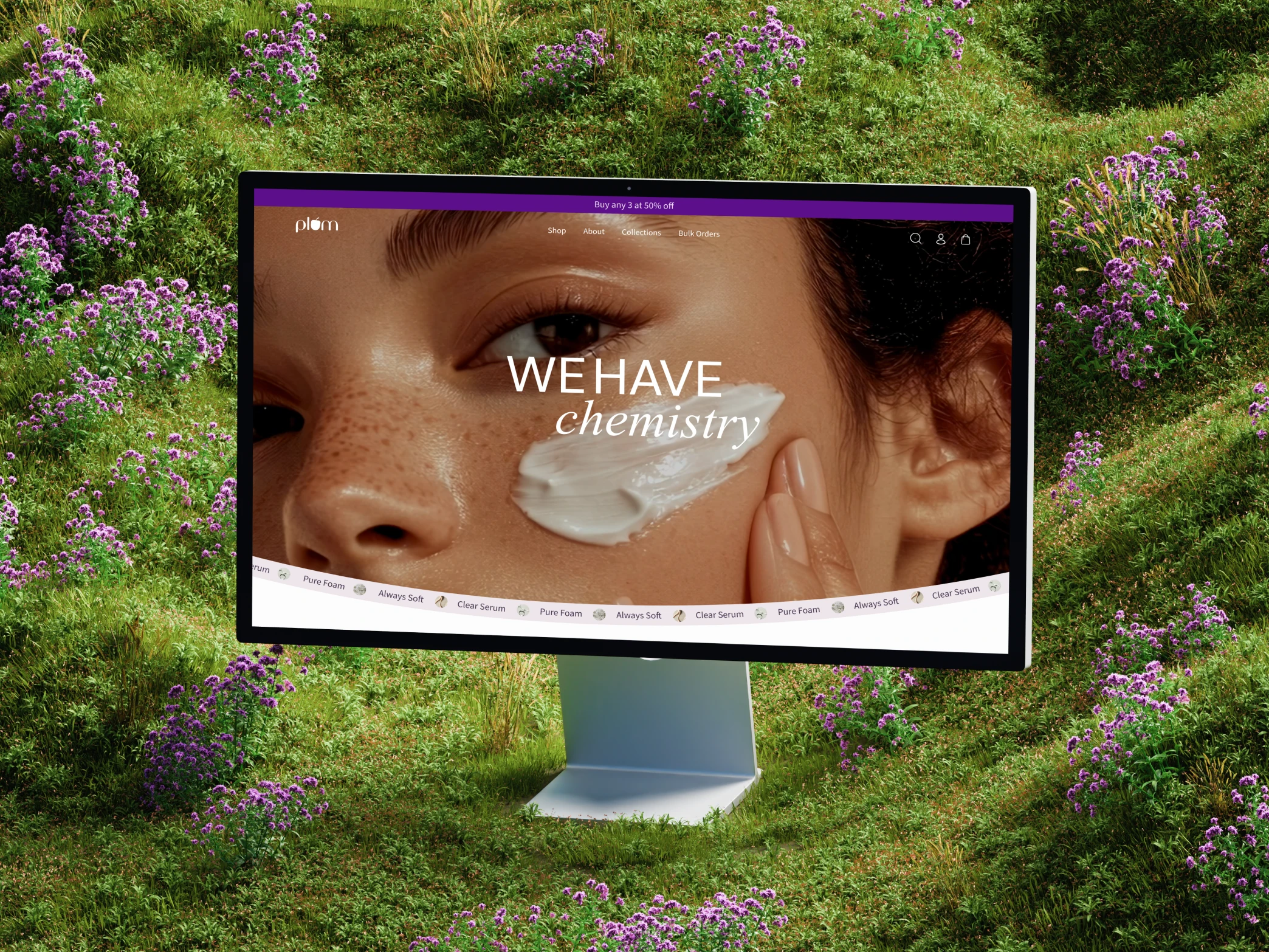
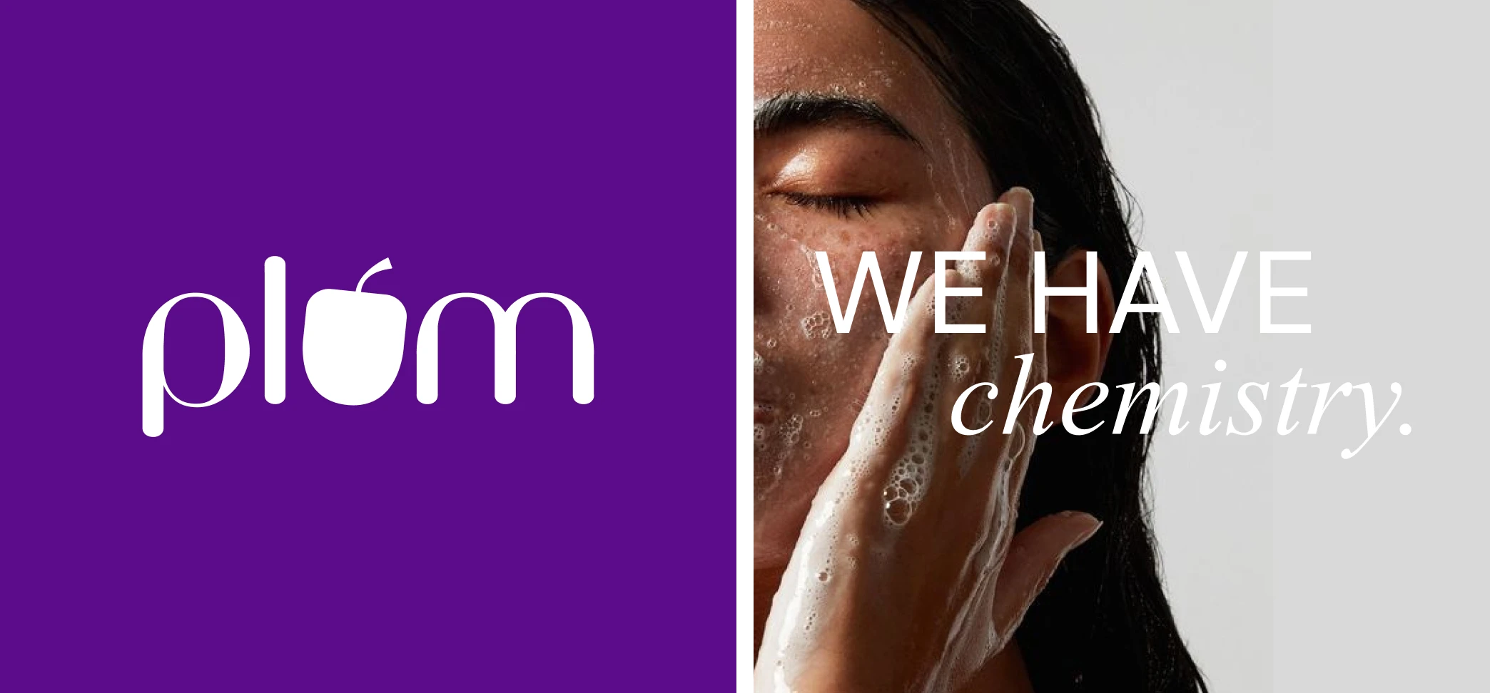
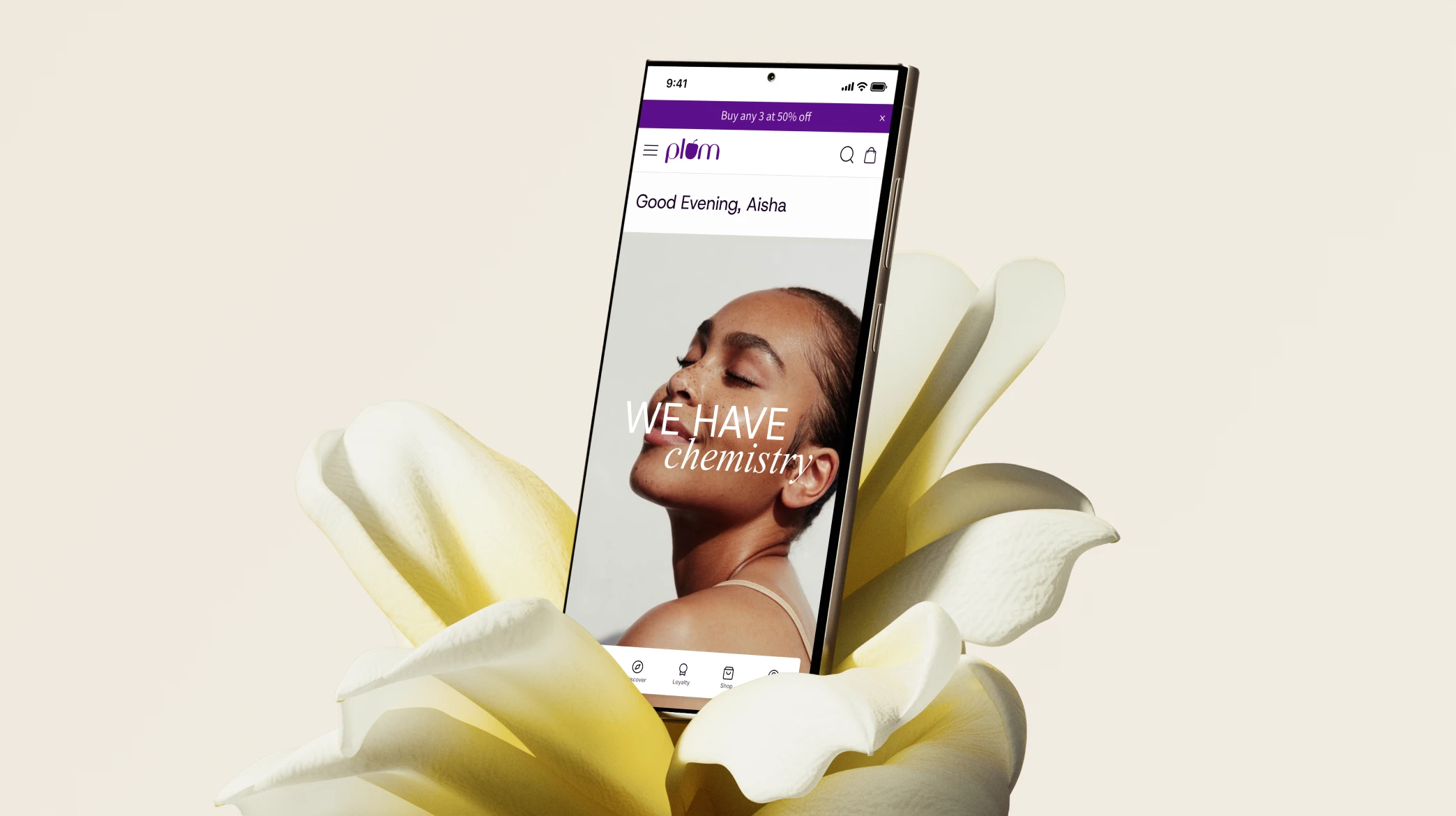
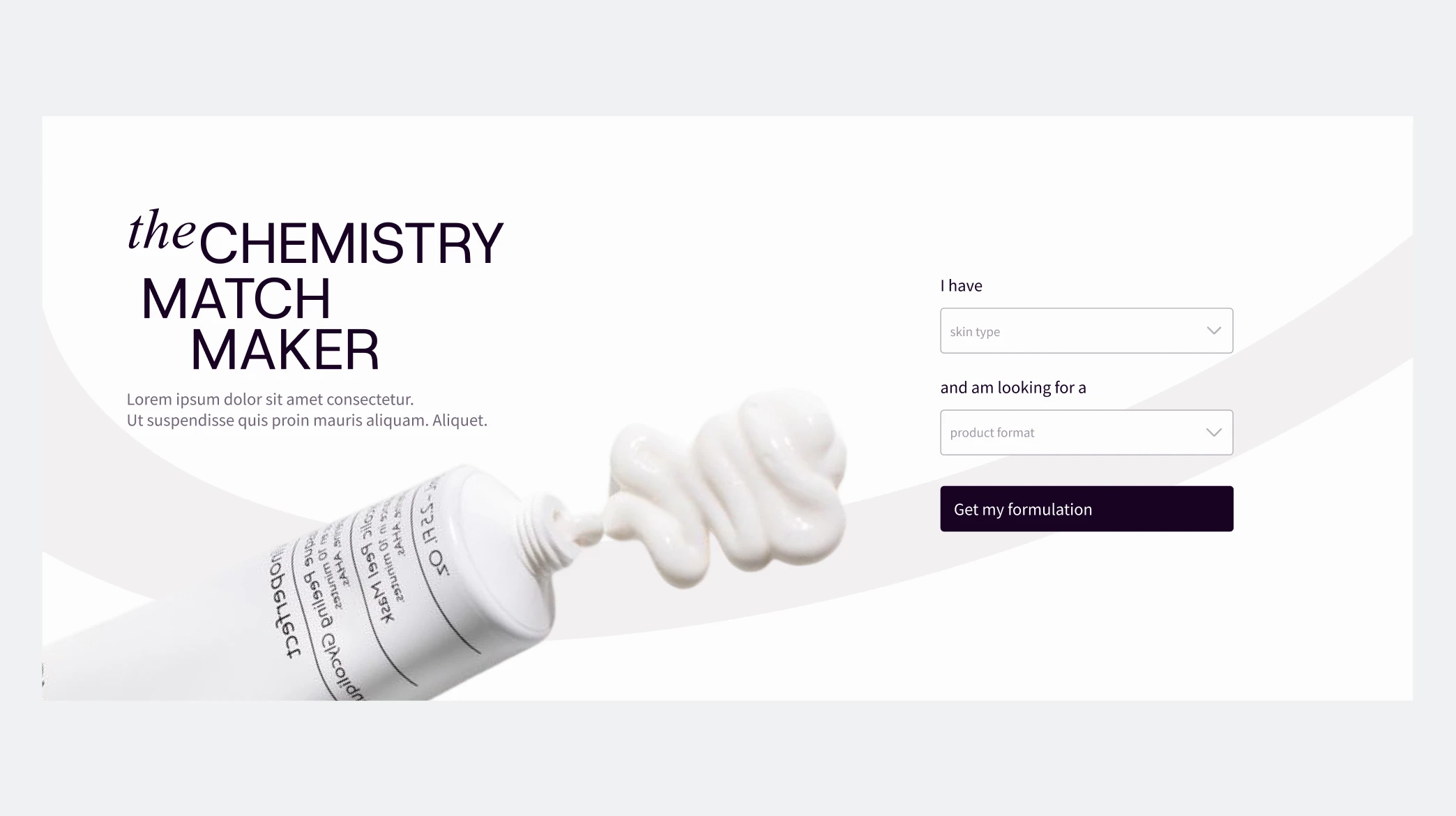
We redesigned Plum’s website to bring its “We have Chemistry” philosophy to life, creating a clear digital narrative that balances natural ingredients with the brand’s science-backed formulations. The new experience highlights research, transparency, and product efficacy while keeping the interface clean, engaging, and easy to explore.
Plum needed a refreshed brand identity that brought together its science-backed formulations and natural ingredients into a cohesive narrative. The challenge lay in aligning this vision across stakeholders while simplifying a complex product-led menu structure.
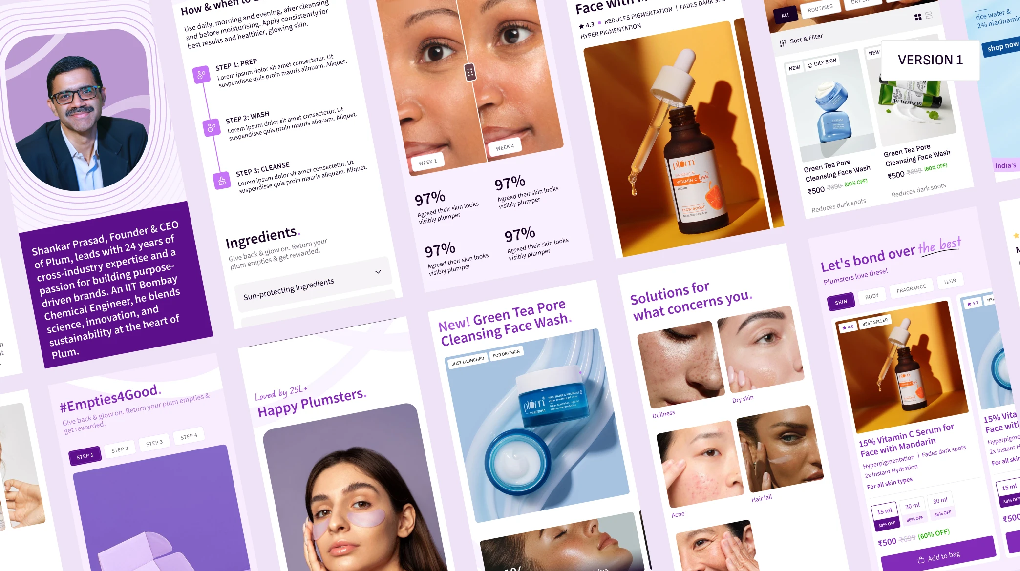
The homepage also had to move away from a sales-driven approach, creating a brand-first space that felt more like a premium library than a store.
We approached the redesign with a brand-first mindset, shaping a clear narrative that balanced Plum’s scientific credibility with its natural ethos. The information architecture was simplified to make discovery intuitive across categories, while the homepage was designed as a calm, curated space that invited exploration rather than pushing products. The result was a refined digital experience that felt premium, cohesive, and unmistakably Plum.
We approached Plum’s redesign as an exercise in balance — between science and emotion, function and beauty. Guided by an iterative, mobile-first process, we designed a digital narrative that embodies the brand’s philosophy, creating an experience that’s both purposeful and distinctly Plum.
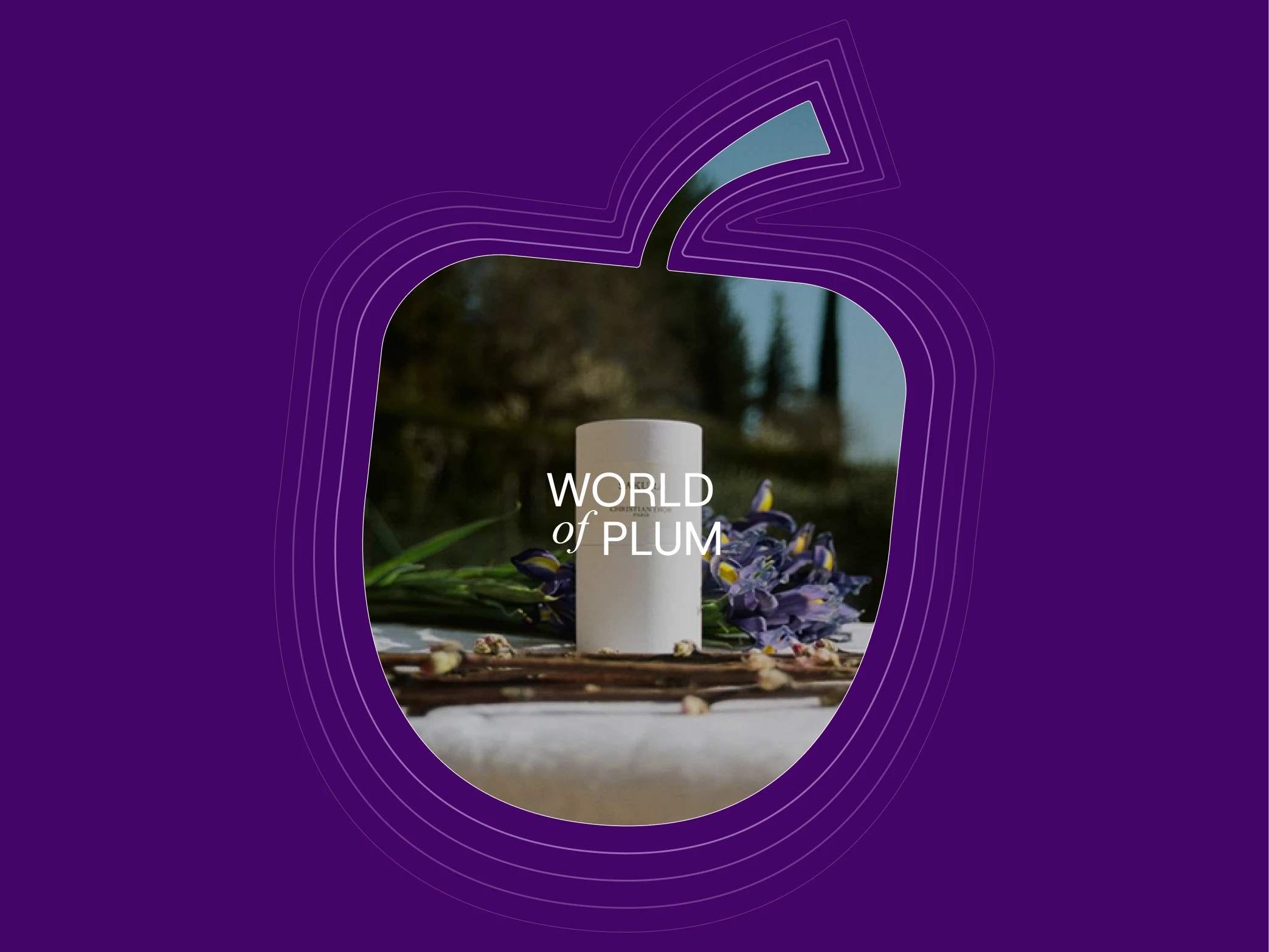
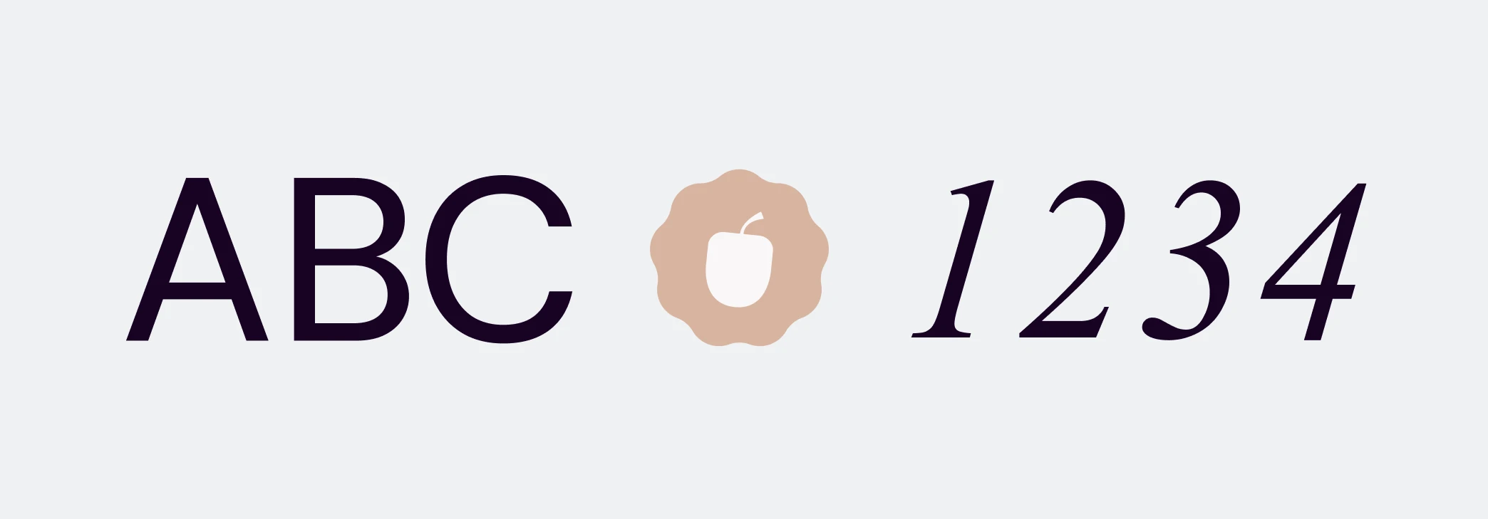
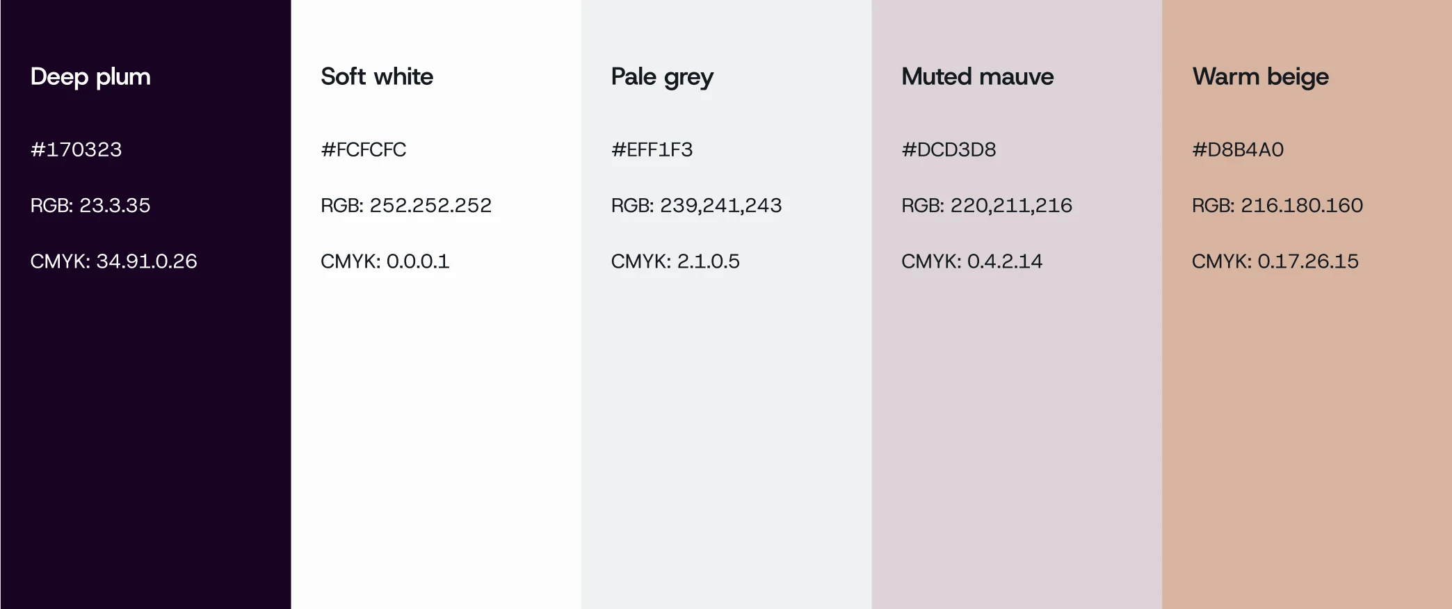
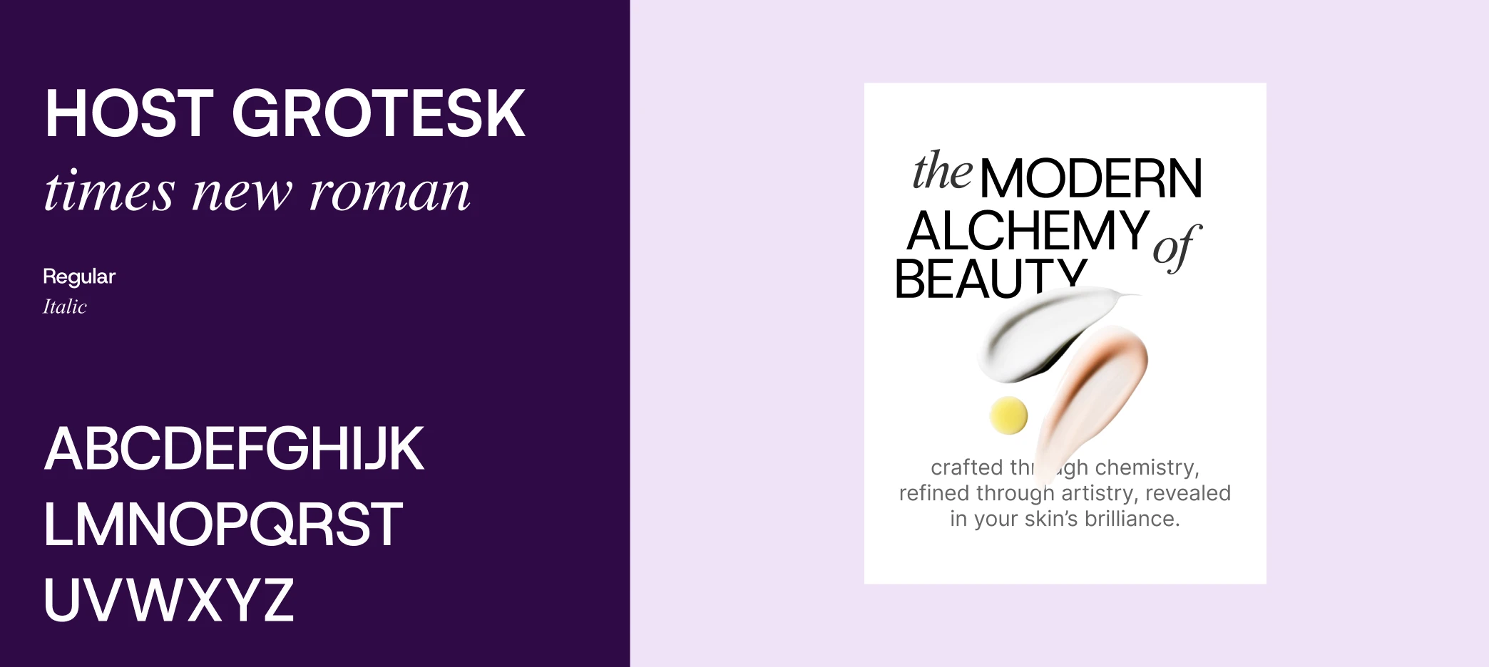
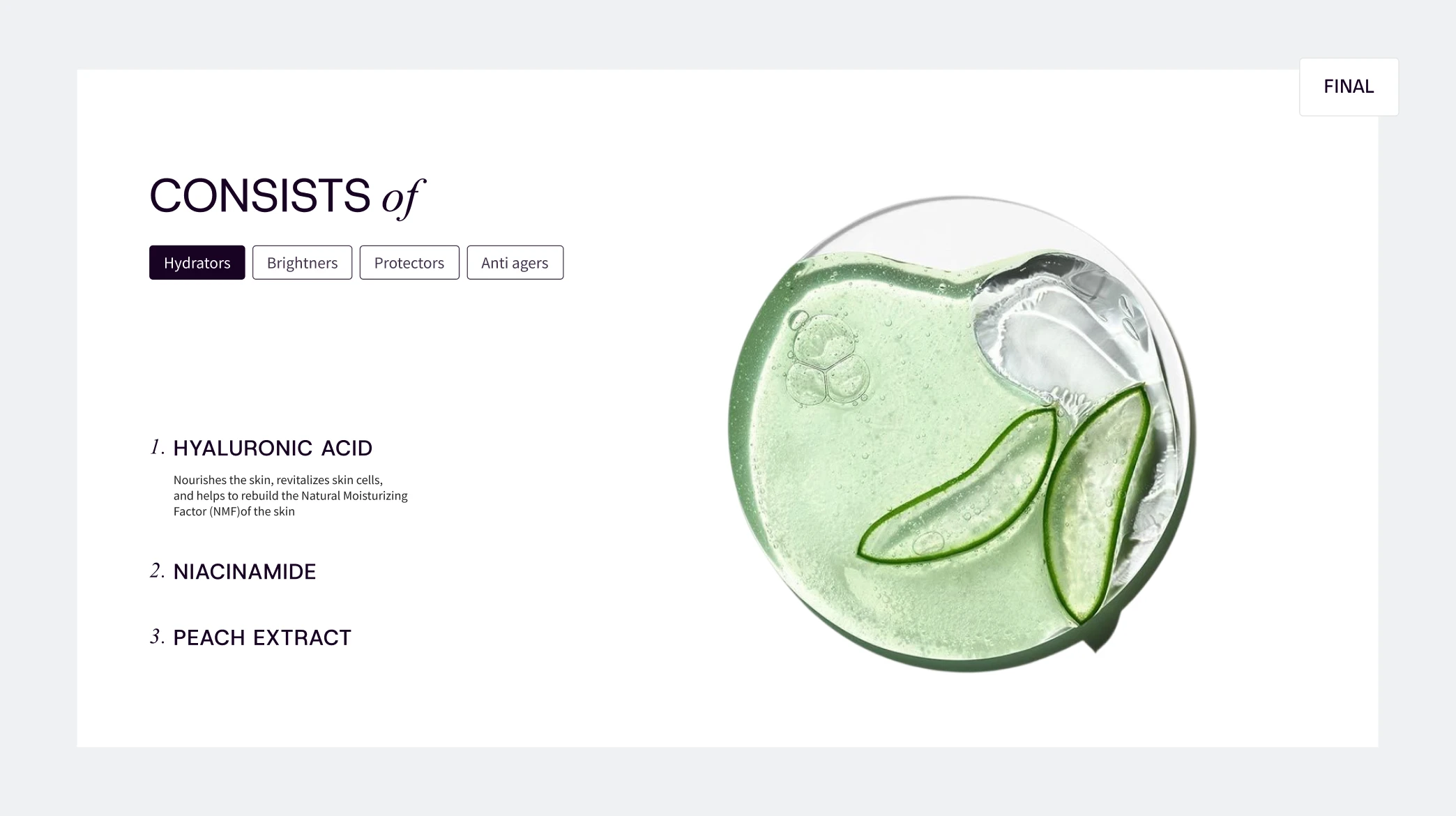
The moodboard was built using Plum’s core colour palette, softened with neutral tones to create balance and harmony. Highly legible sans-serif typefaces introduced a sense of clarity and precision, hinting at the brand’s scientific side, while stylised, decorative typography added warmth and an organic touch. Together, these elements set the foundation for a refined visual language that quietly reflected Plum’s balance of chemistry and nature.
Our process began with understanding the purpose of the website revamp, followed by building a moodboard of references that aligned with the client’s vision and aesthetic. To define the site’s personality and tone, we conducted a brand personality spectrum exercise with the client, helping translate their intent into a clear and consistent digital direction.

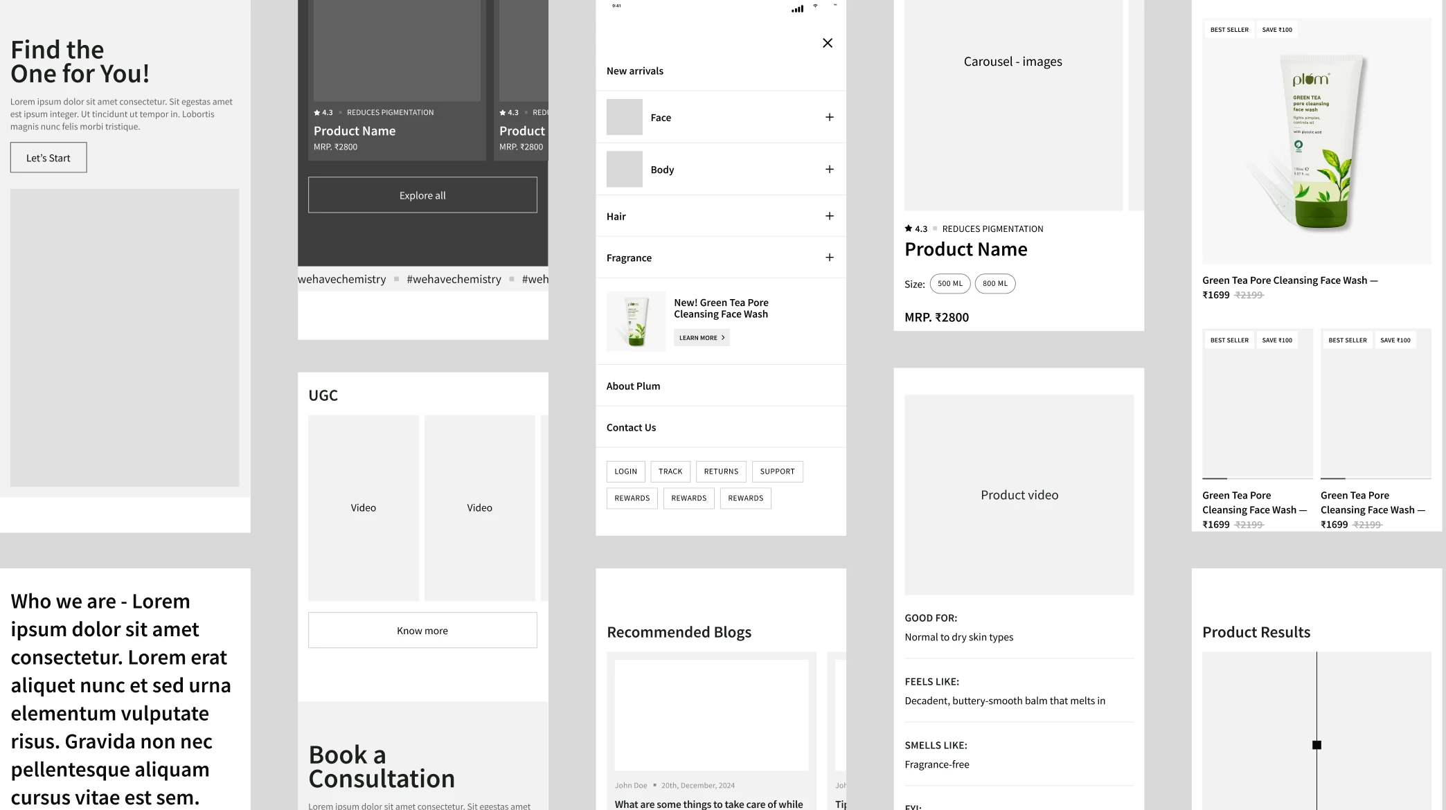
Beginning with wireframes, we refined our concepts through multiple redesigns and feedback rounds. Each iteration helped us simplify interactions, strengthen hierarchy, and ensure visual consistency across devices.
Once the flow felt intuitive and aligned with the brand’s expected tone, we transitioned into high-fidelity designs — integrating typography, illustration, and subtle motion to create a cohesive, polished experience that feels unmistakably Plum.
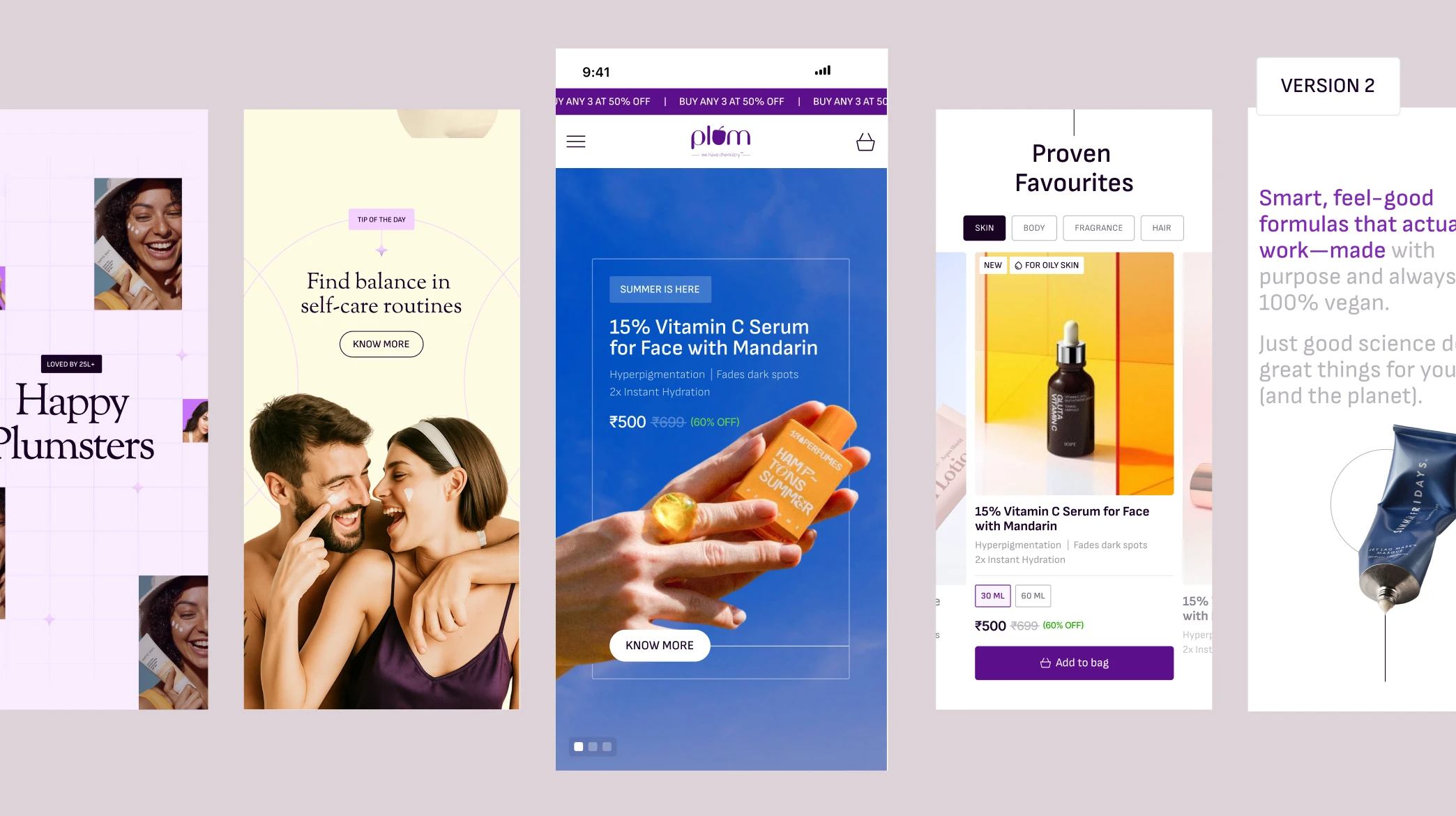
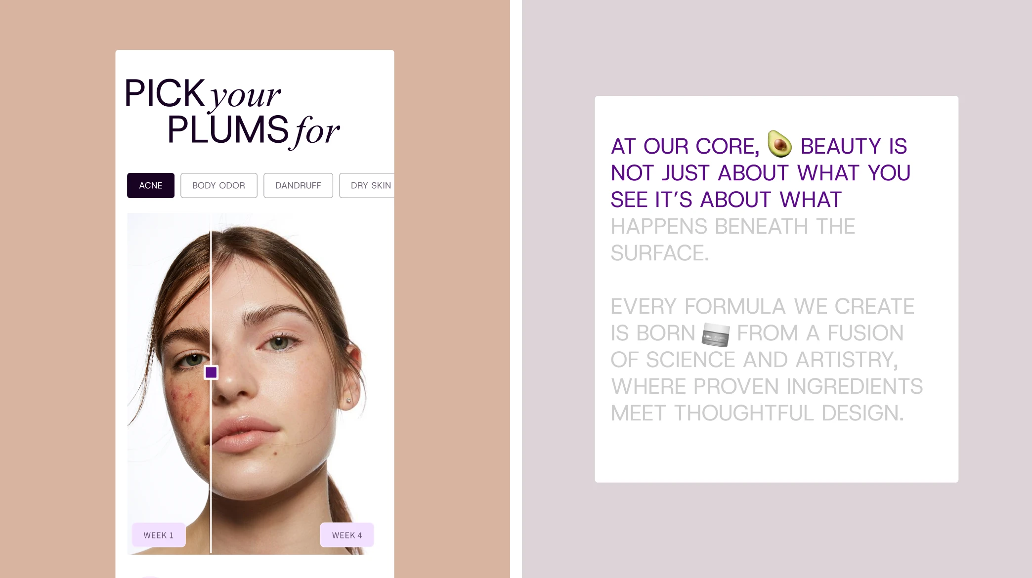
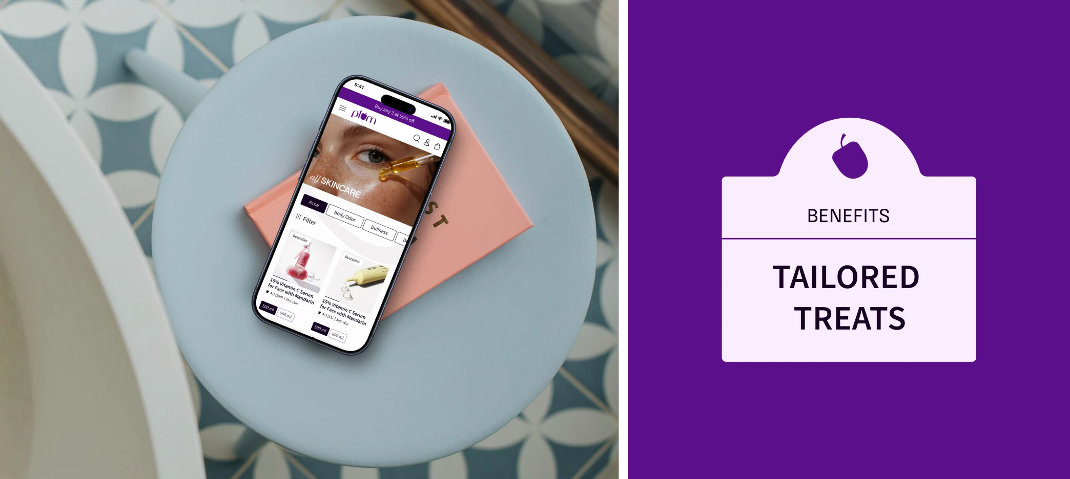

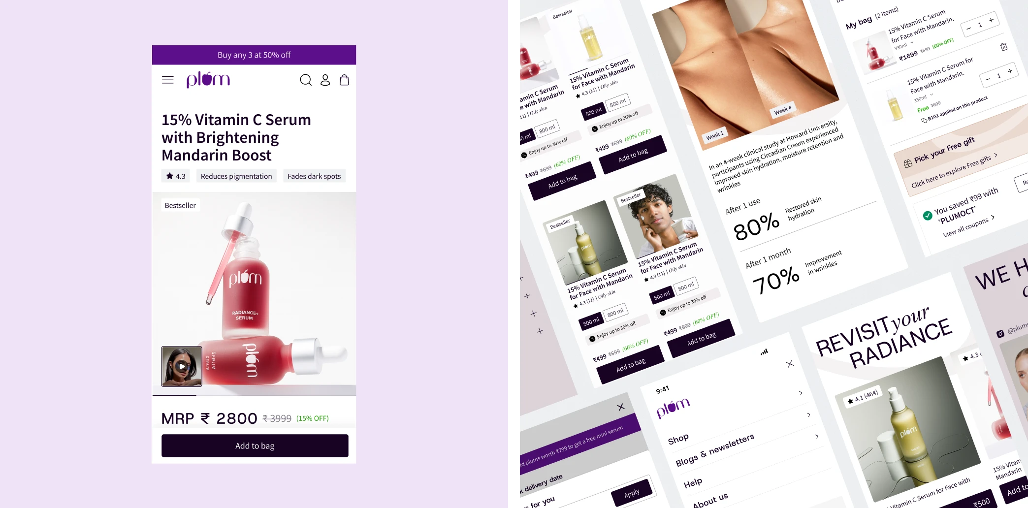
For Plum, we reimagined the digital experience from the ground up, leading the mobile website redesign along with select app interfaces. Our work focused on shaping a cohesive visual language across typography, illustration, and motion, supported by a photography direction that added warmth and authenticity to the brand’s digital presence.
We began by designing for mobile, keeping Plum’s mobile-first audience at the centre of the experience. Once the core flows and interactions were defined, we scaled the design to desktop, ensuring visual consistency and usability across all breakpoints while fully leveraging larger screens. This approach helped maintain a seamless and cohesive experience, regardless of how users chose to browse.
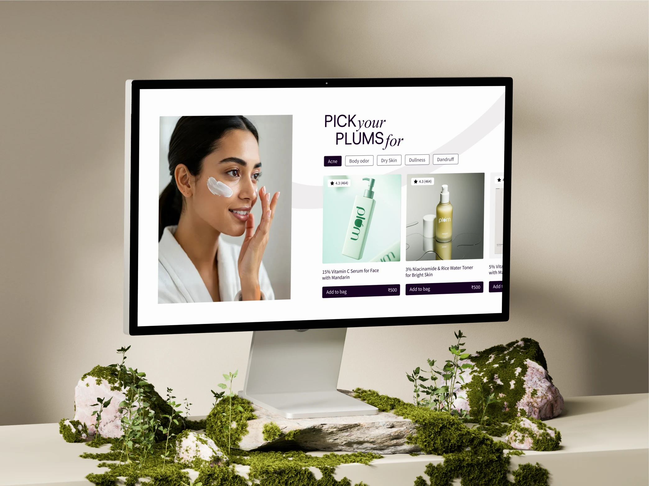
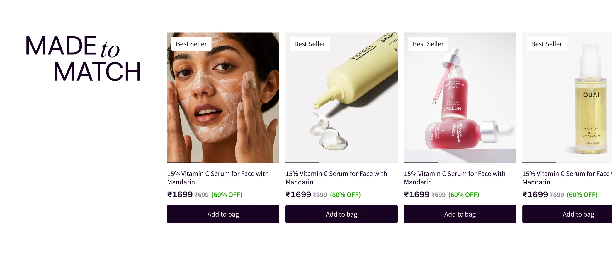
The redesign resulted in a clean, interactive, and premium website that brought Plum’s brand to life in a more thoughtful and engaging way. The experience balanced clarity with exploration, using Plum’s colour palette in a measured, leisurely manner that felt refined rather than overwhelming. Together, the visual language and interactions created a cohesive digital presence that strengthened brand perception while making discovery feel effortless.
Our Role
Our design system was meticulously developed to harmonize with the defined brand colours.
Product Design
Content