Elevating Bigbasket’s event presence with modern and impactful creatives.
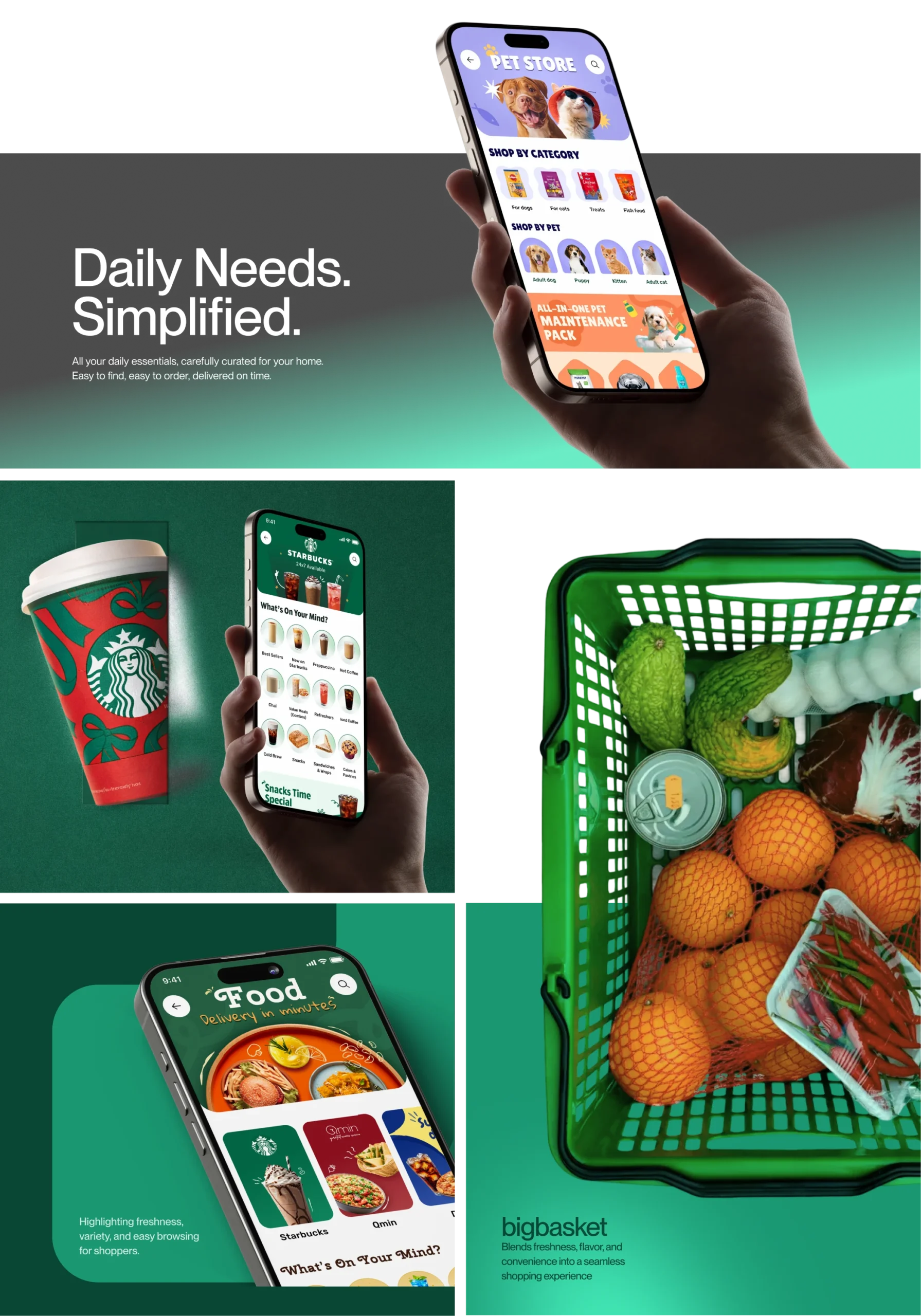
BigBasket is India’s leading online grocery platform, delivering fresh produce, everyday essentials, and household needs through a seamless digital experience, trusted quality, and wide product selection.
- Quick Commerce
- App Design
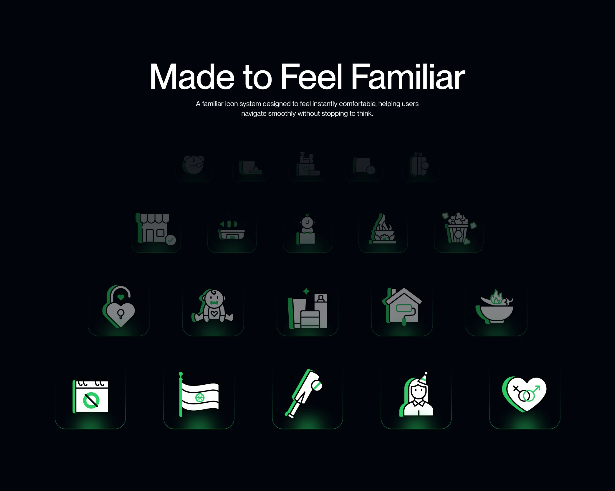
- Illustration and Iconography
- Motion Design System
- Research
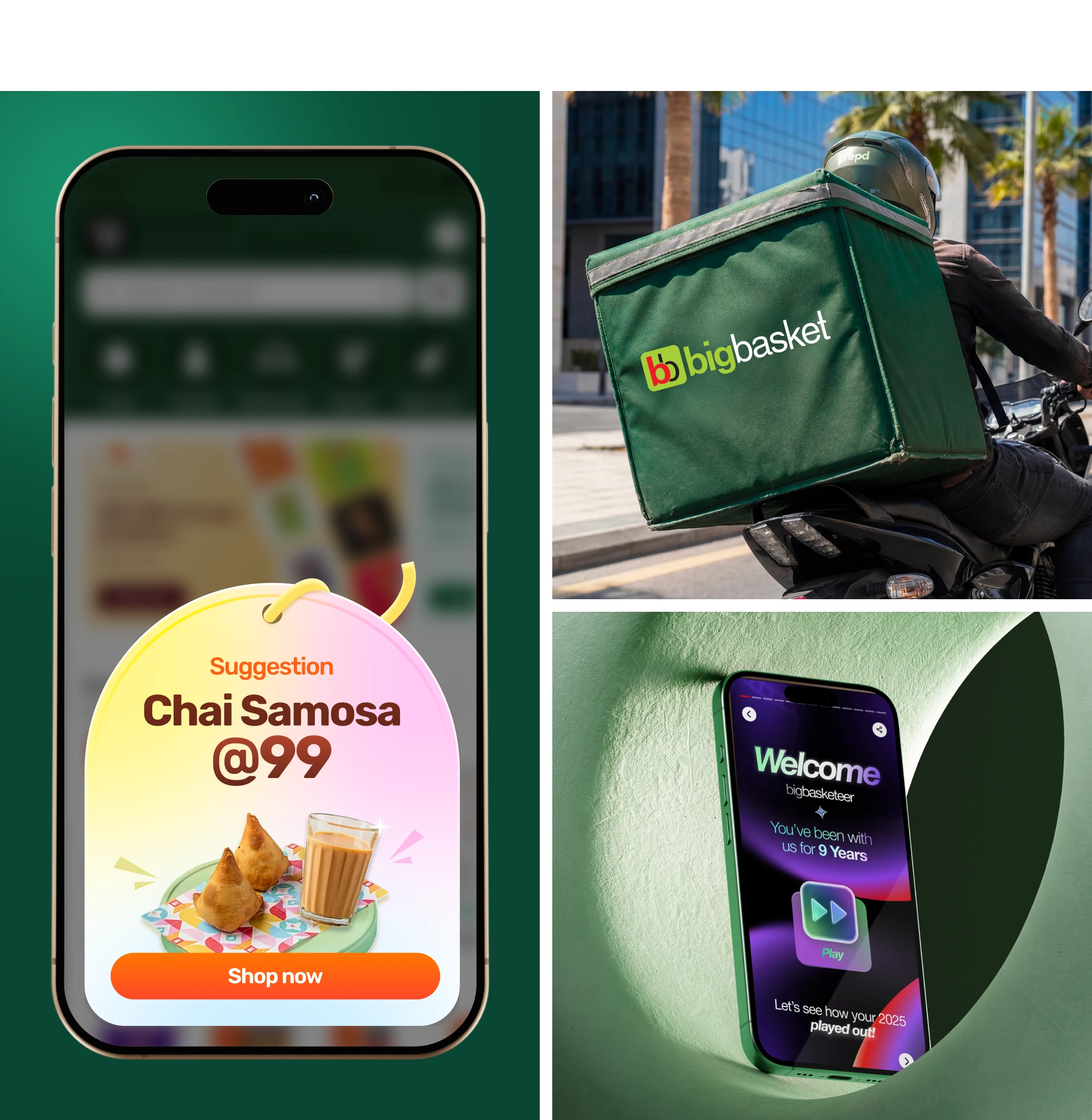
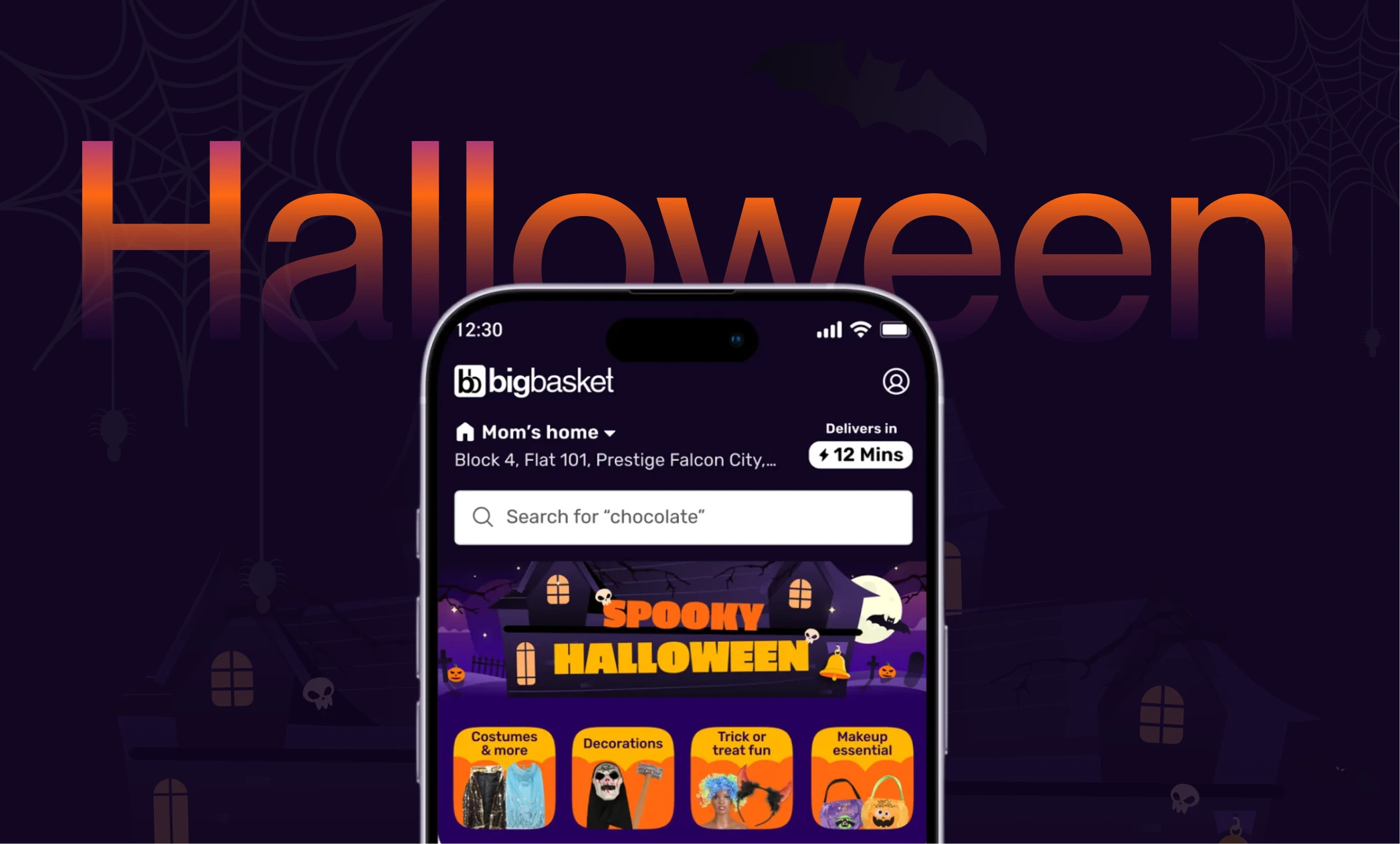
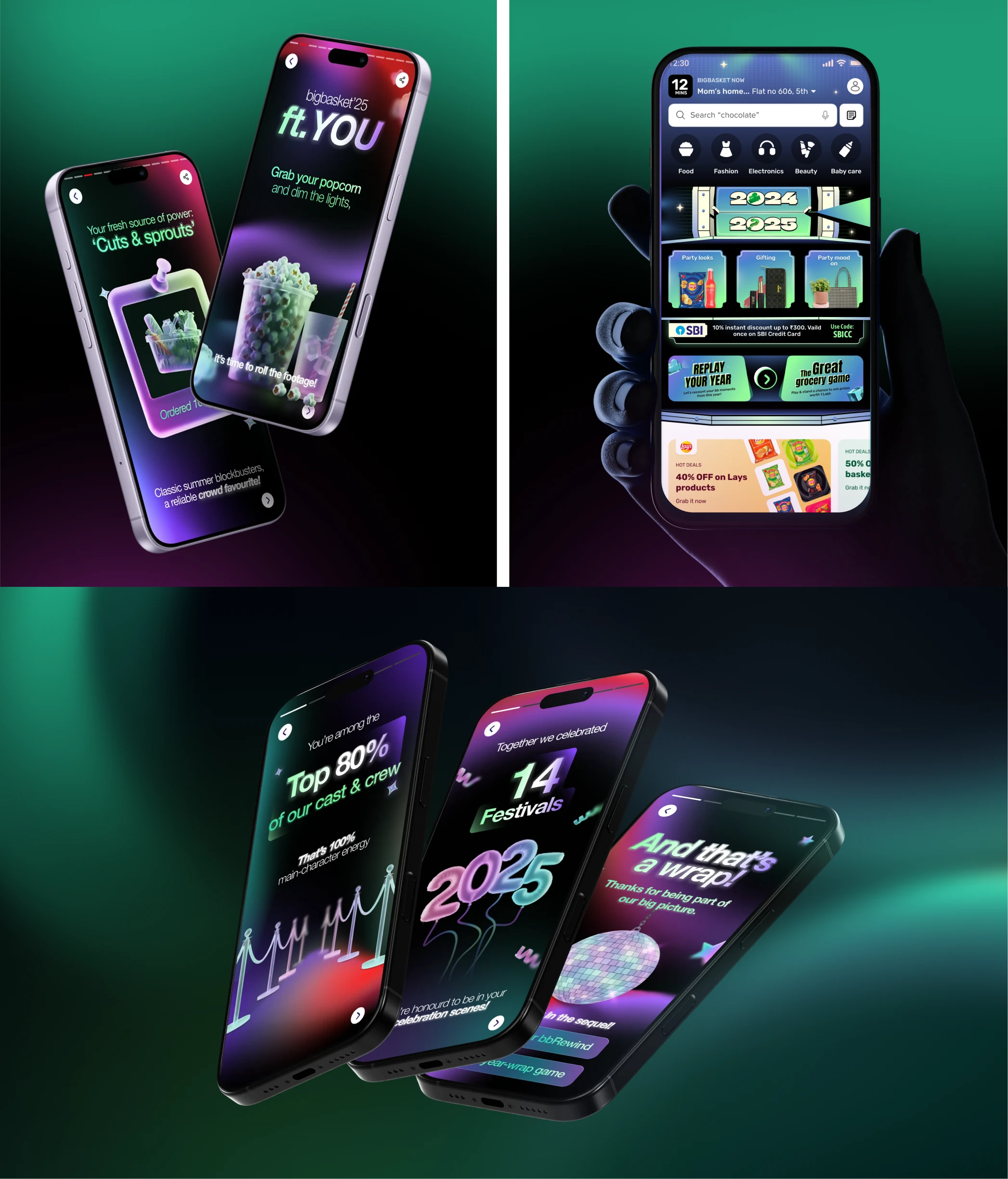
To strengthen its position as a leading online grocer, Bigbasket needed a consistent and engaging brand presence we brought it to life through impactful visuals, motion design, and storytelling across touchpoints.
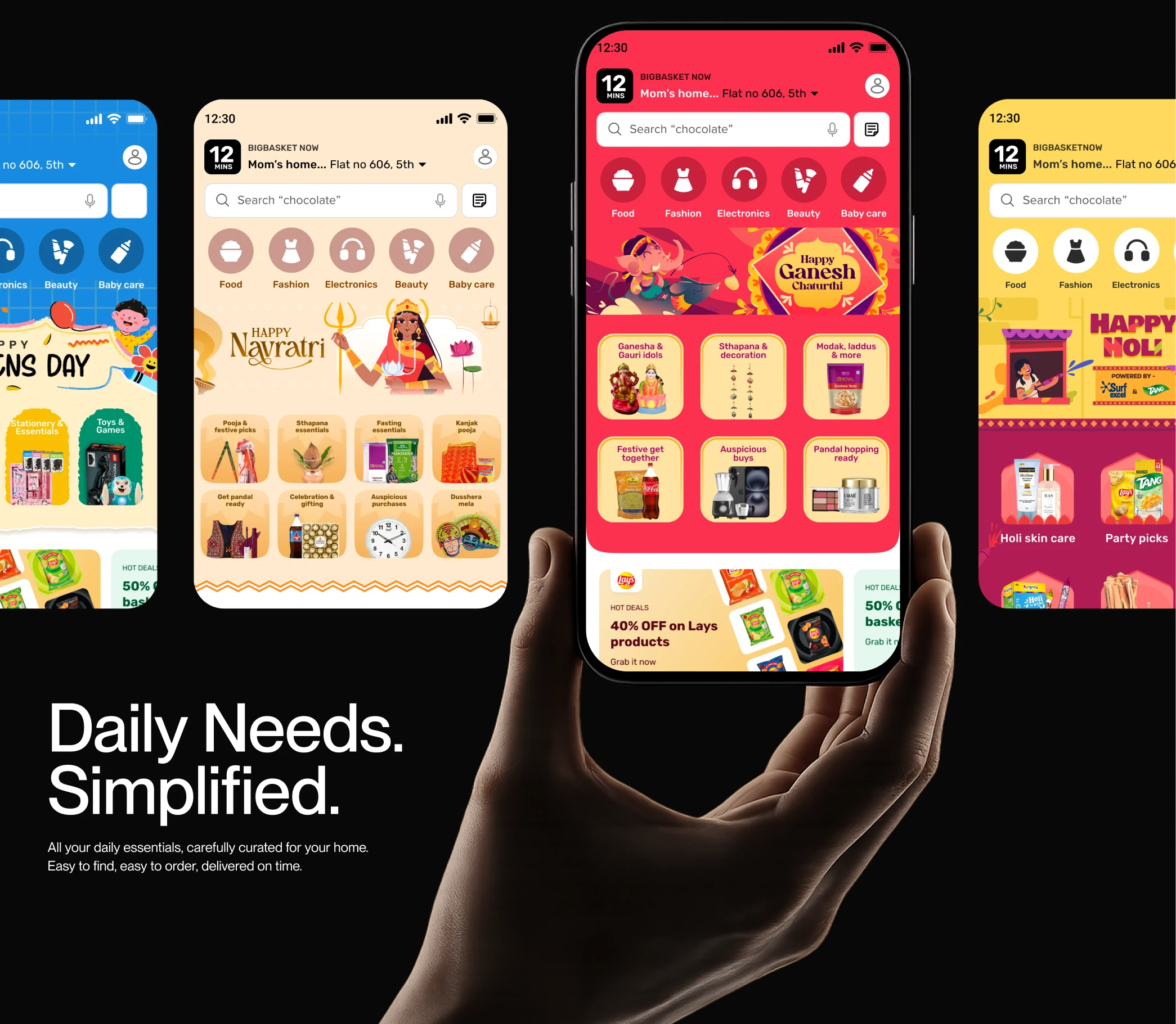
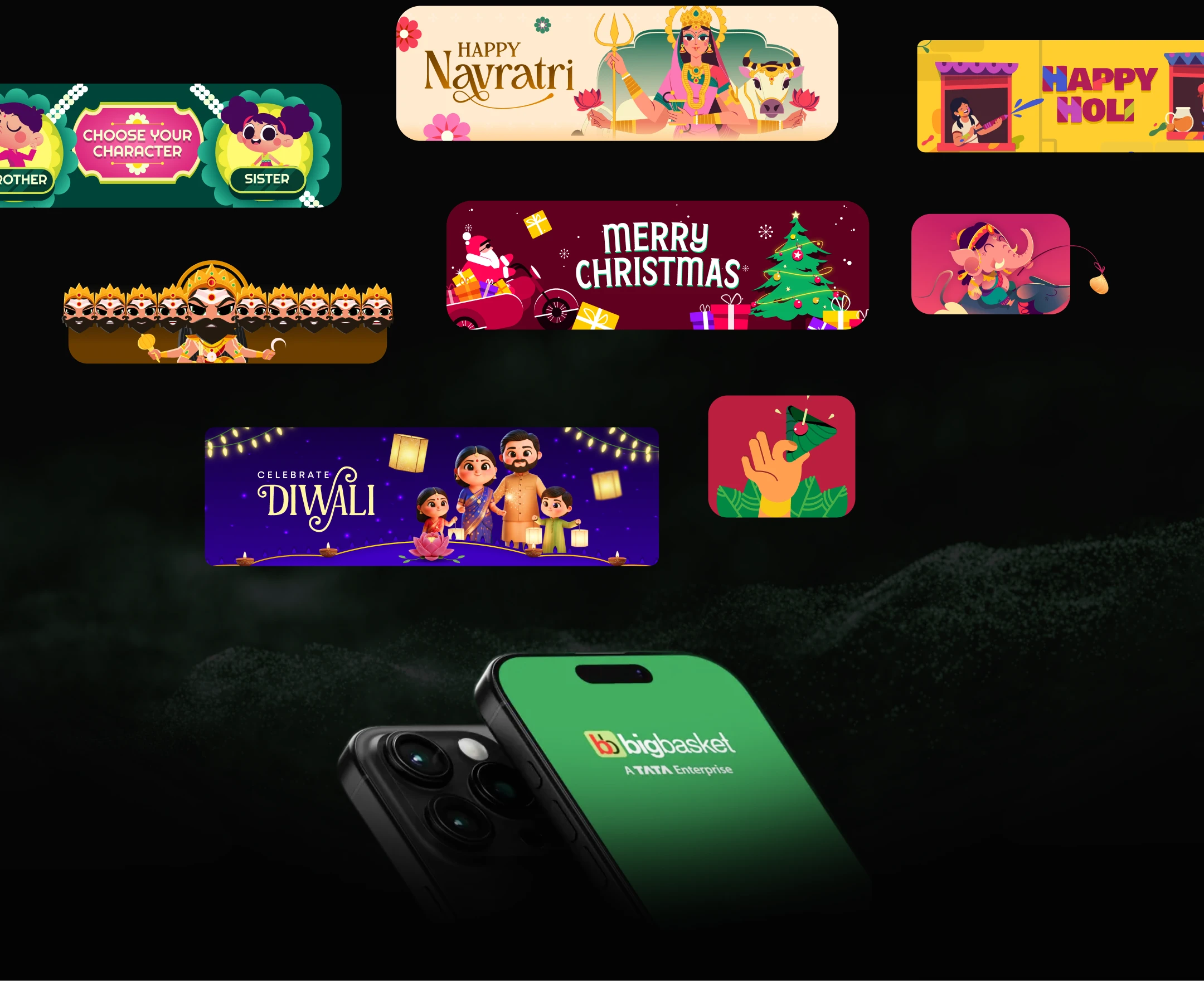
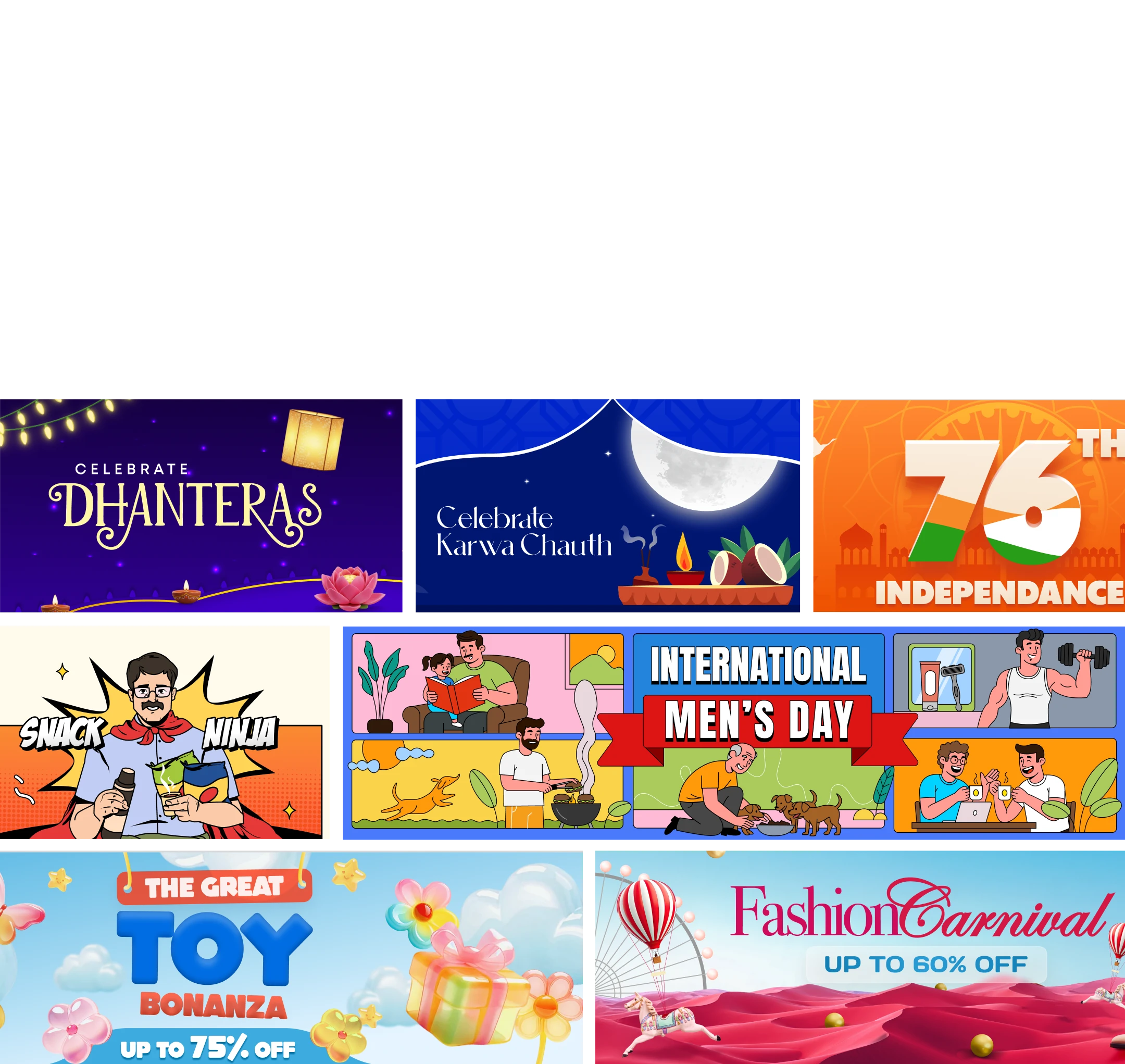
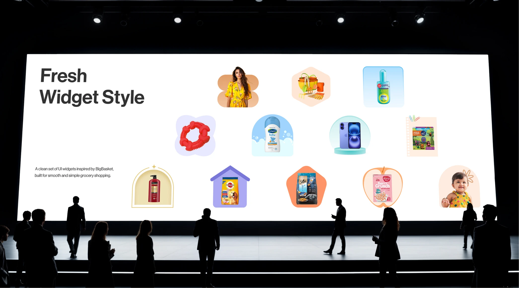
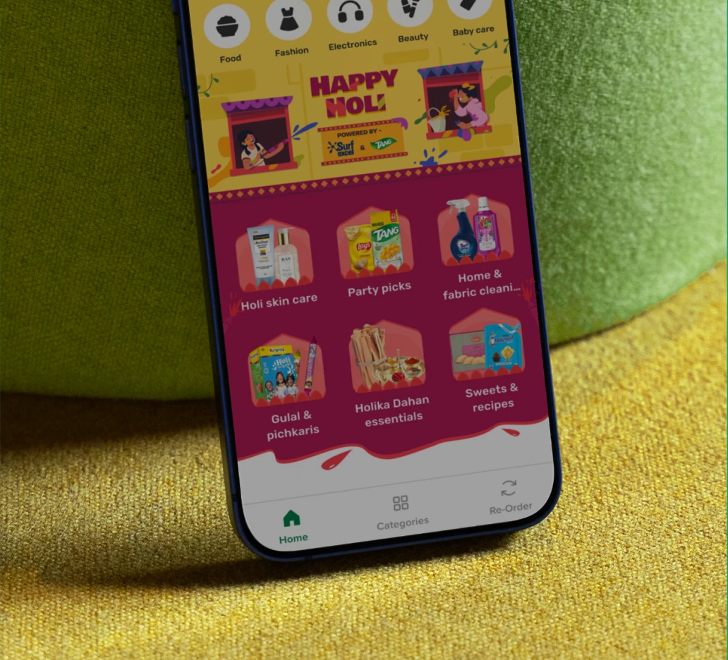
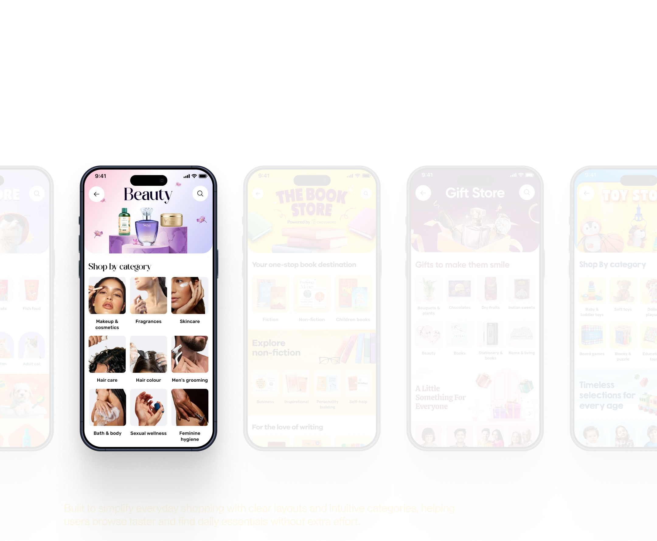
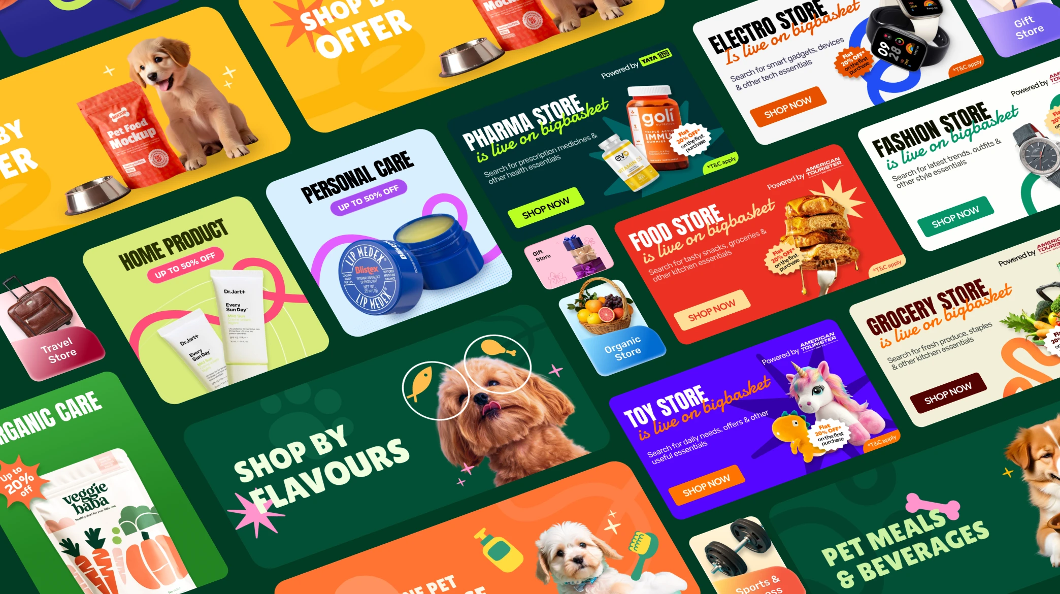
Designing event creatives and category pages for a large-scale platform like BigBasket comes with unique challenges, balancing brand consistency with the festive vibrancy of events, ensuring designs work across diverse regional audiences, and maintaining clarity while promoting multiple offers at once. For category pages, the challenge lies in creating a minimal, modern design language that simplifies navigation for millions of SKUs without overwhelming the user, while still highlighting seasonal priorities and promotional content
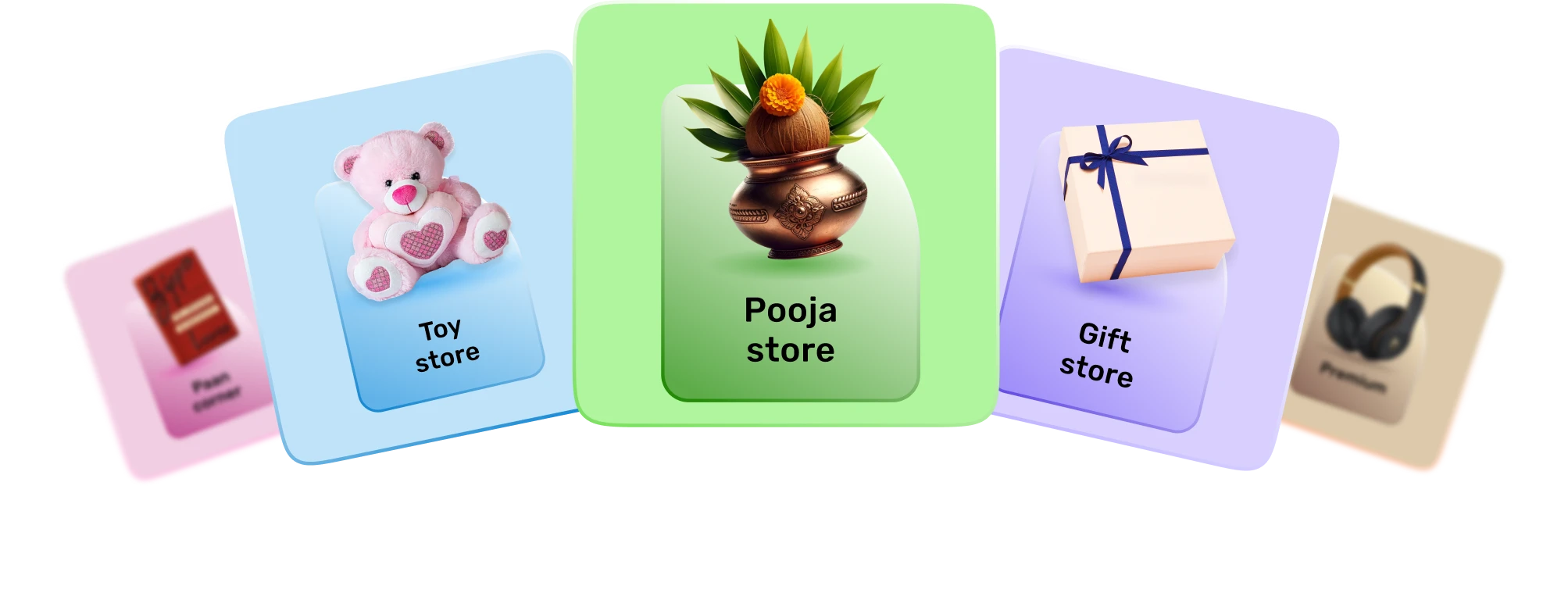
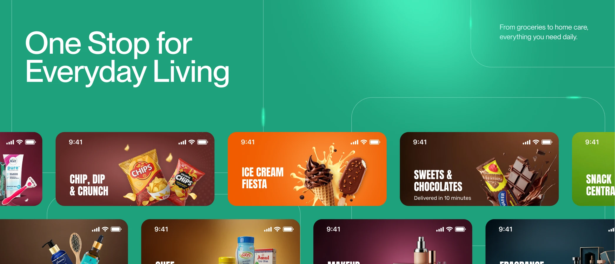
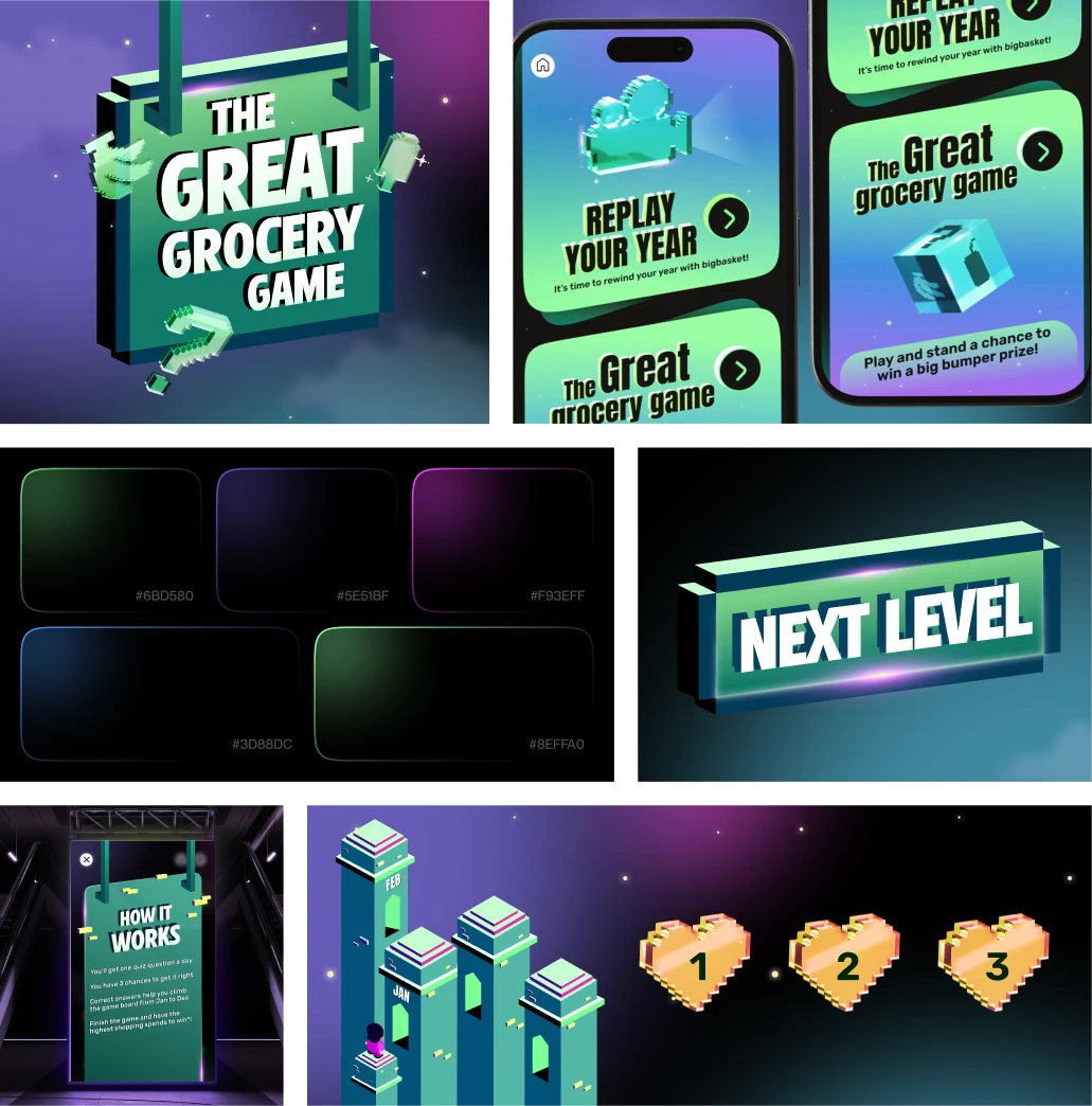
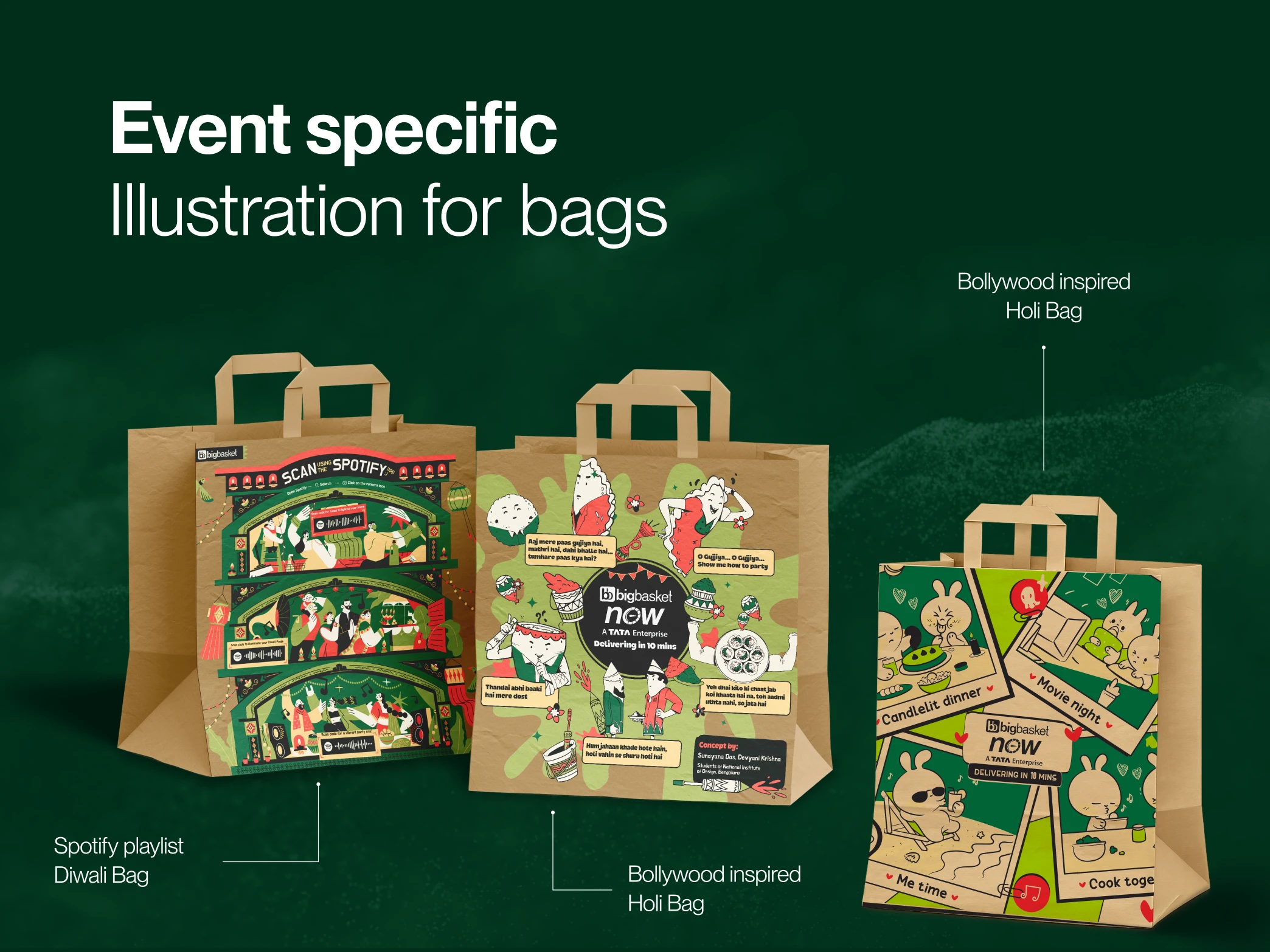
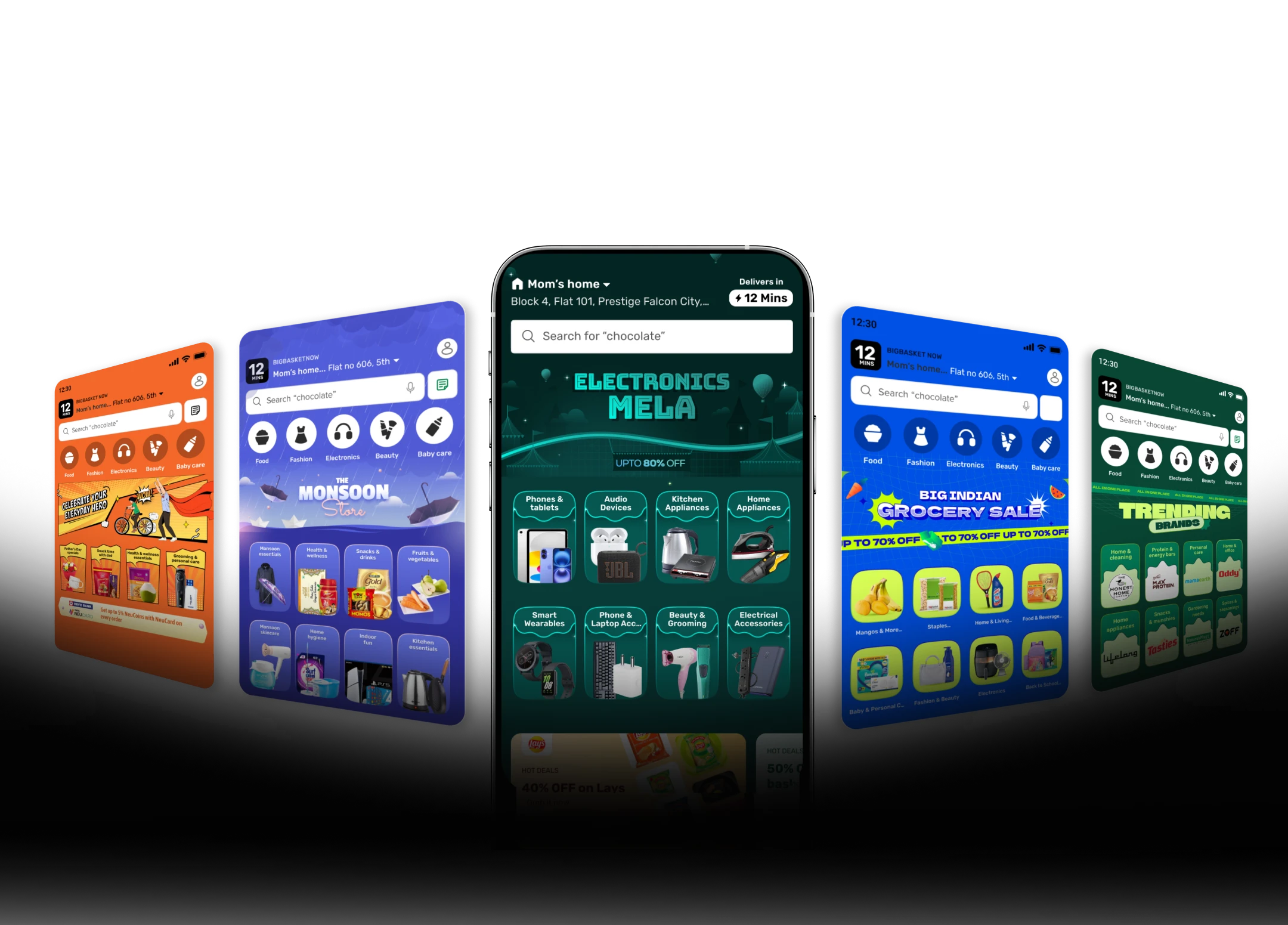
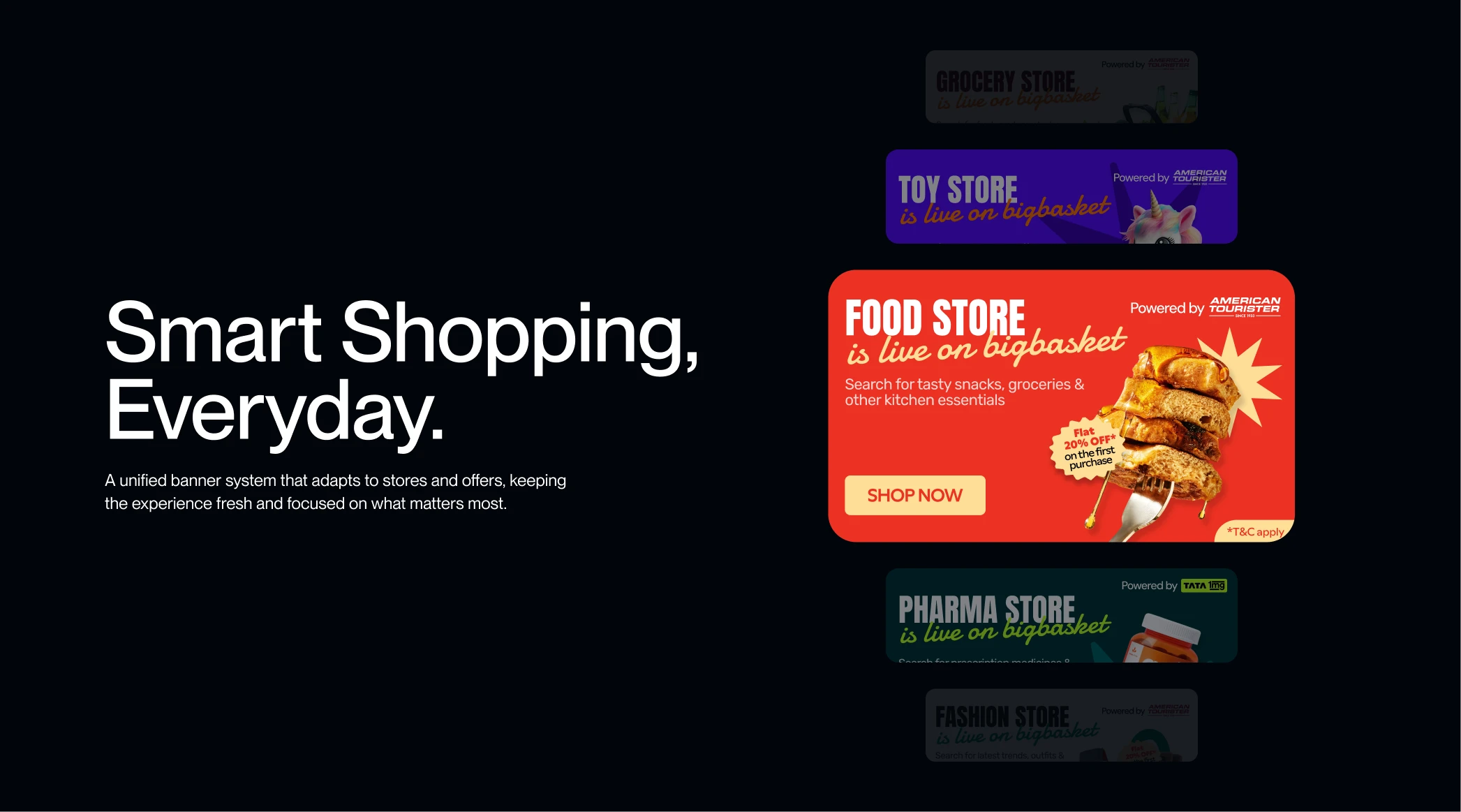
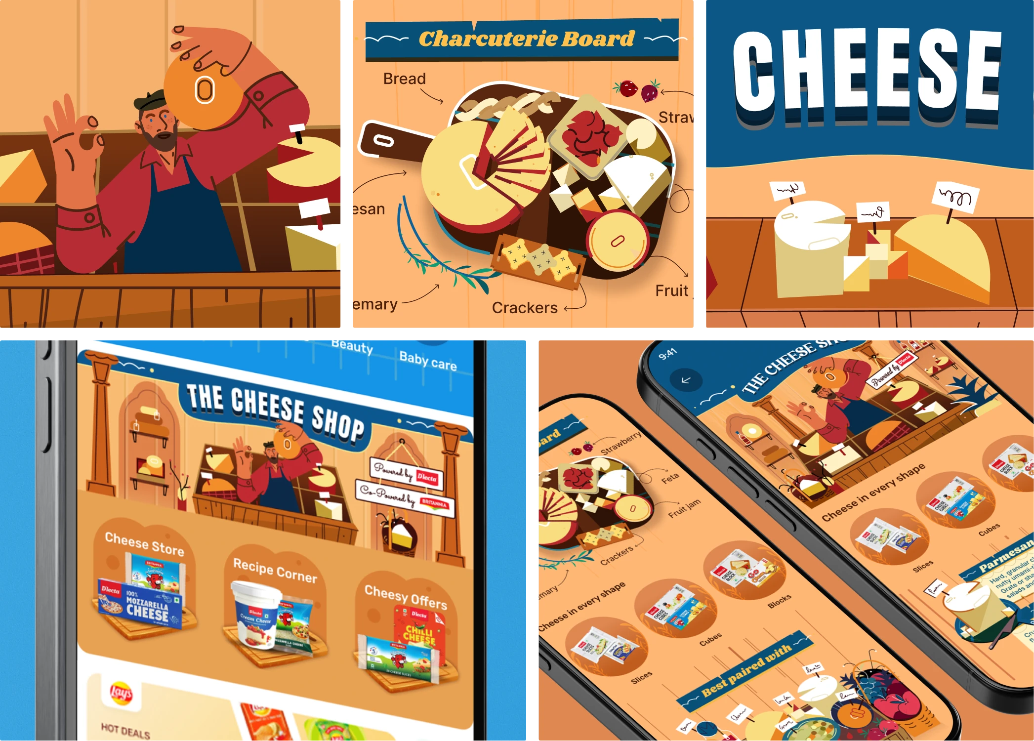
To address these challenges, the event creatives were designed with a flexible visual system one that could adapt to primary and secondary events while keeping BigBasket’s brand identity intact. A balance of festive vibrancy and clean layouts ensured cultural relevance without visual clutter. For category pages, a minimal modern design language was introduced, focusing on intuitive navigation, clear hierarchy, and subtle highlights for promotions. This approach not only improved discoverability across thousands of products but also created a cohesive, engaging, and scalable design framework for future events and categories
The design process for BigBasket went through multiple iterations to achieve the right balance between brand consistency, festive vibrancy, and usability.
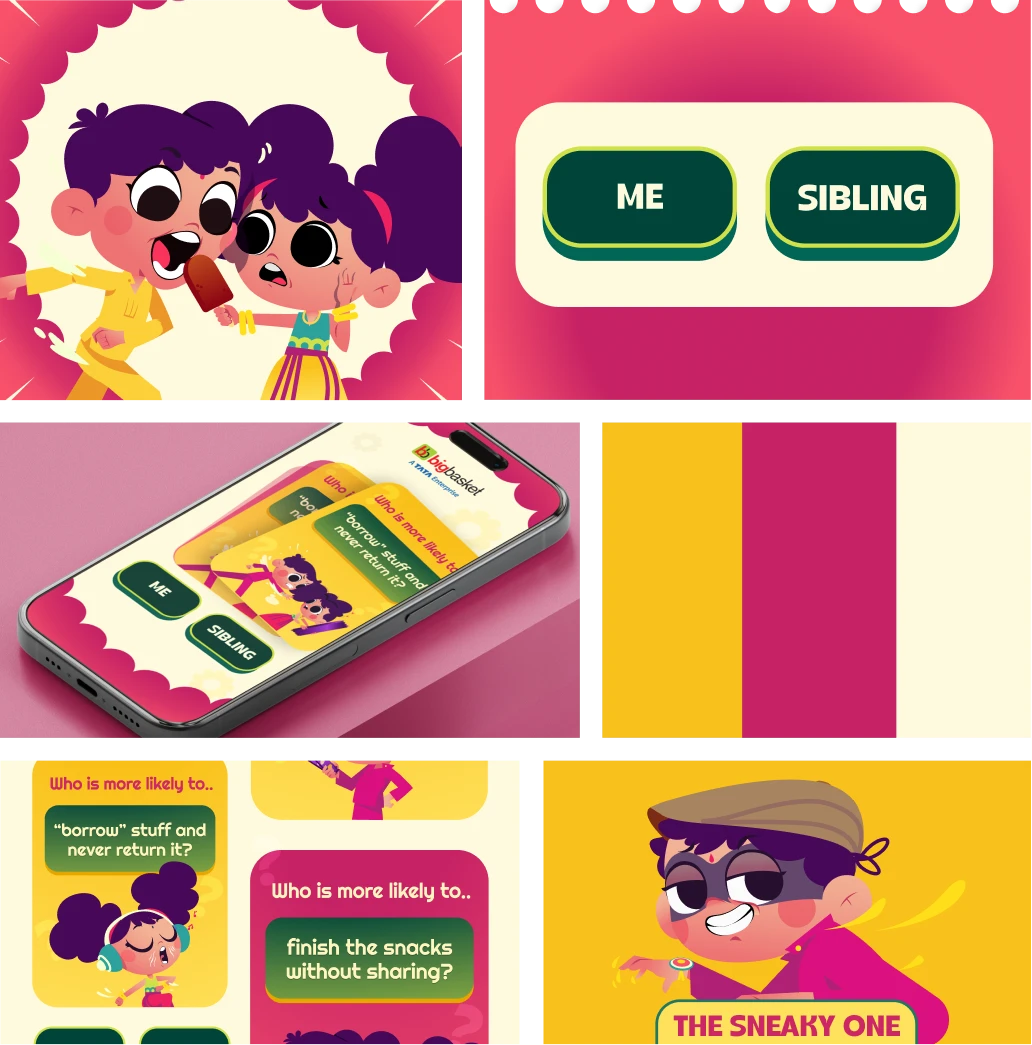
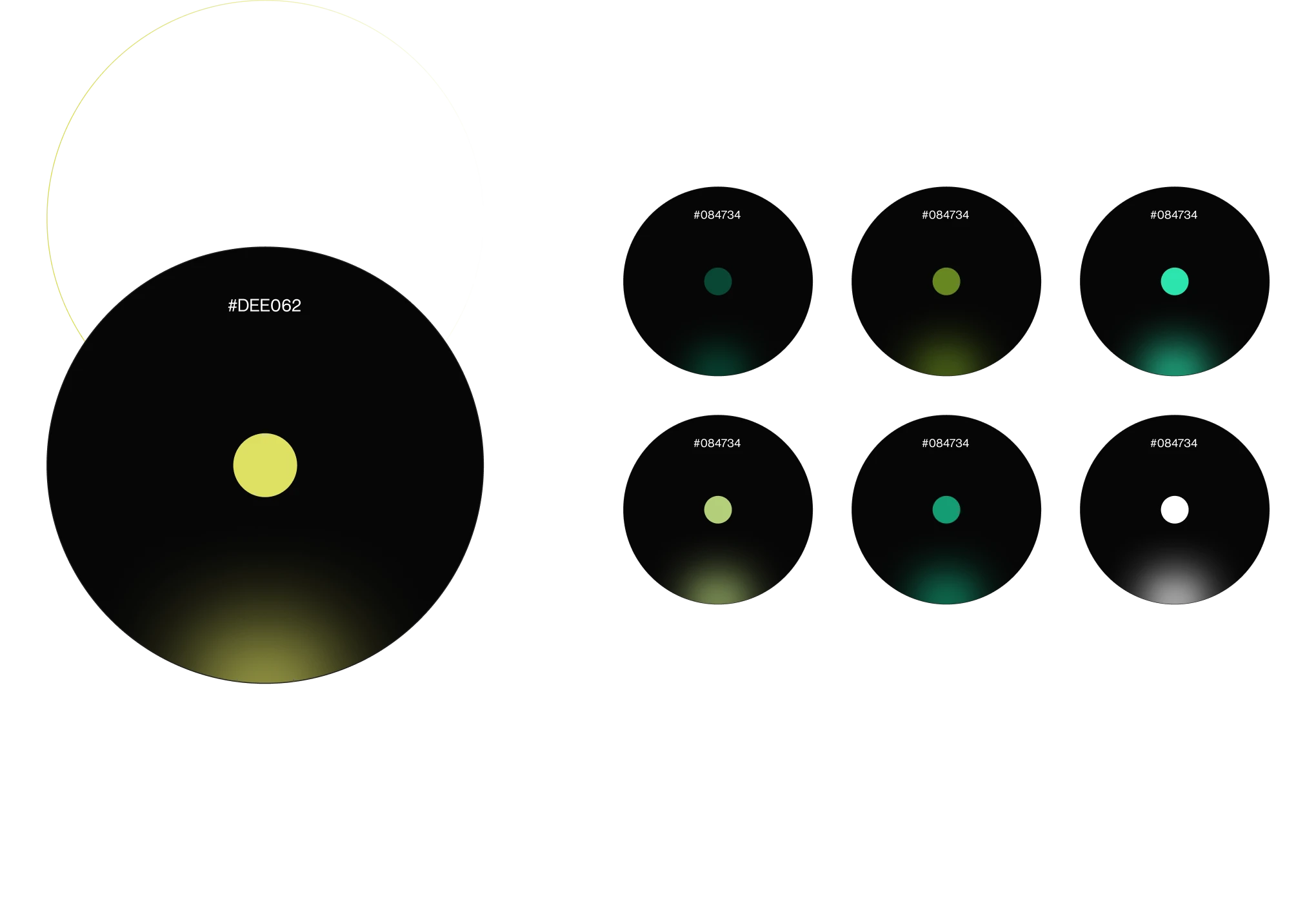
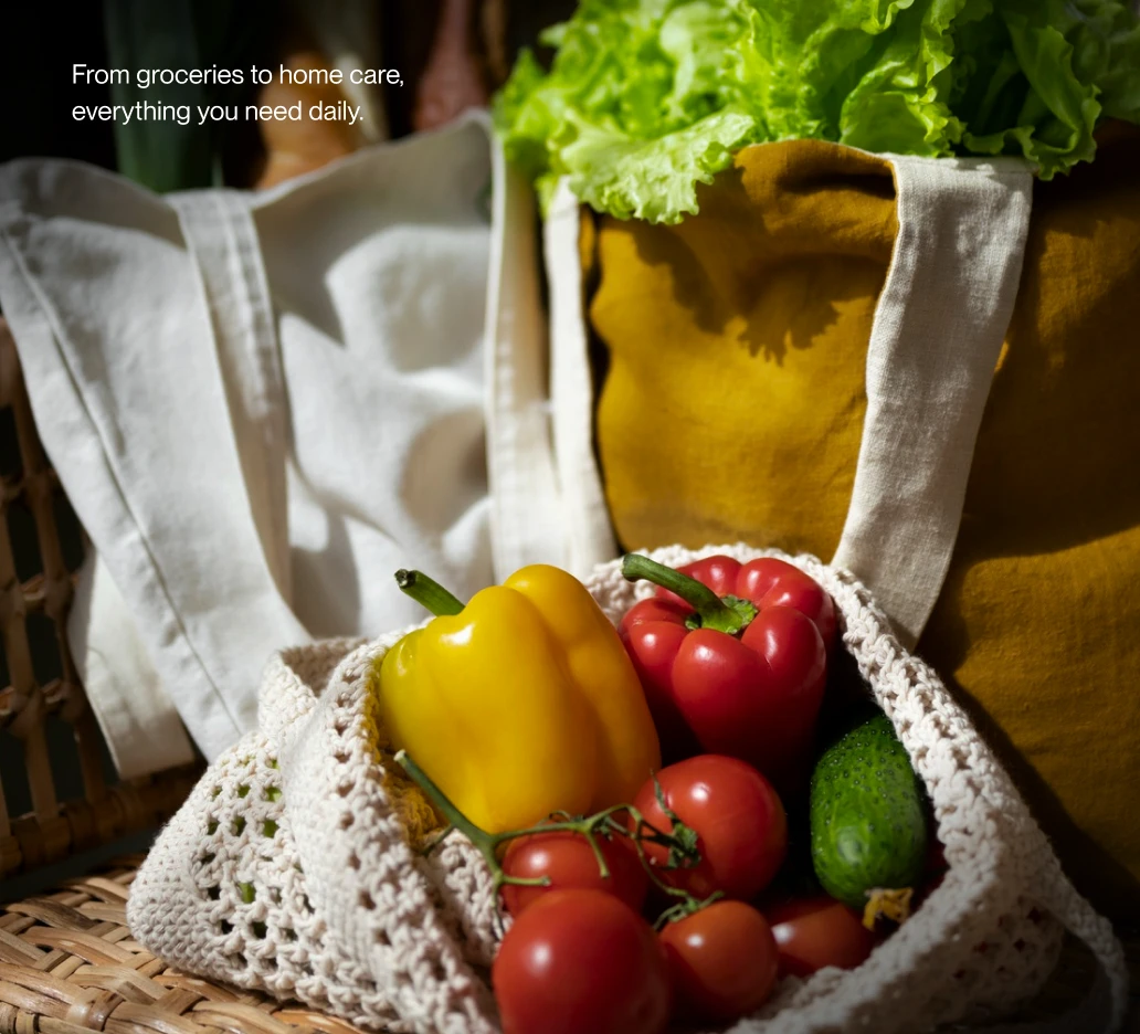
Inspired by freshness and everyday moments, the mood board used bright colors, approachable fonts, and clean visuals. The design direction reflects bigbasket’s effortless and reliable shopping experience.
The design process for BigBasket went through multiple iterations to achieve the right balance between brand consistency, festive vibrancy, and usability. We explored variations in UI elements—fonts, color palettes, and illustration styles to align with both event-specific themes and BigBasket’s core identity. Widgets such as banners, cards, and navigation elements were refined across several cycles to ensure clarity and scalability. Each iteration was tested against user needs and market benchmarks, allowing us to gradually simplify layouts, highlight promotions more effectively, and create a cohesive modern design language. This iterative approach ensured that the final creatives and category pages were not just visually engaging but also functionally intuitive.
Our Role
We partnered with bigbasket to reimagine its platform as a simple, intuitive grocery ecosystem, built through user-first thinking and thoughtful interaction design.
Product Design
Content