Revamping Bolas with seamless product discoverability
Revamping Bolas with seamless product discoverability
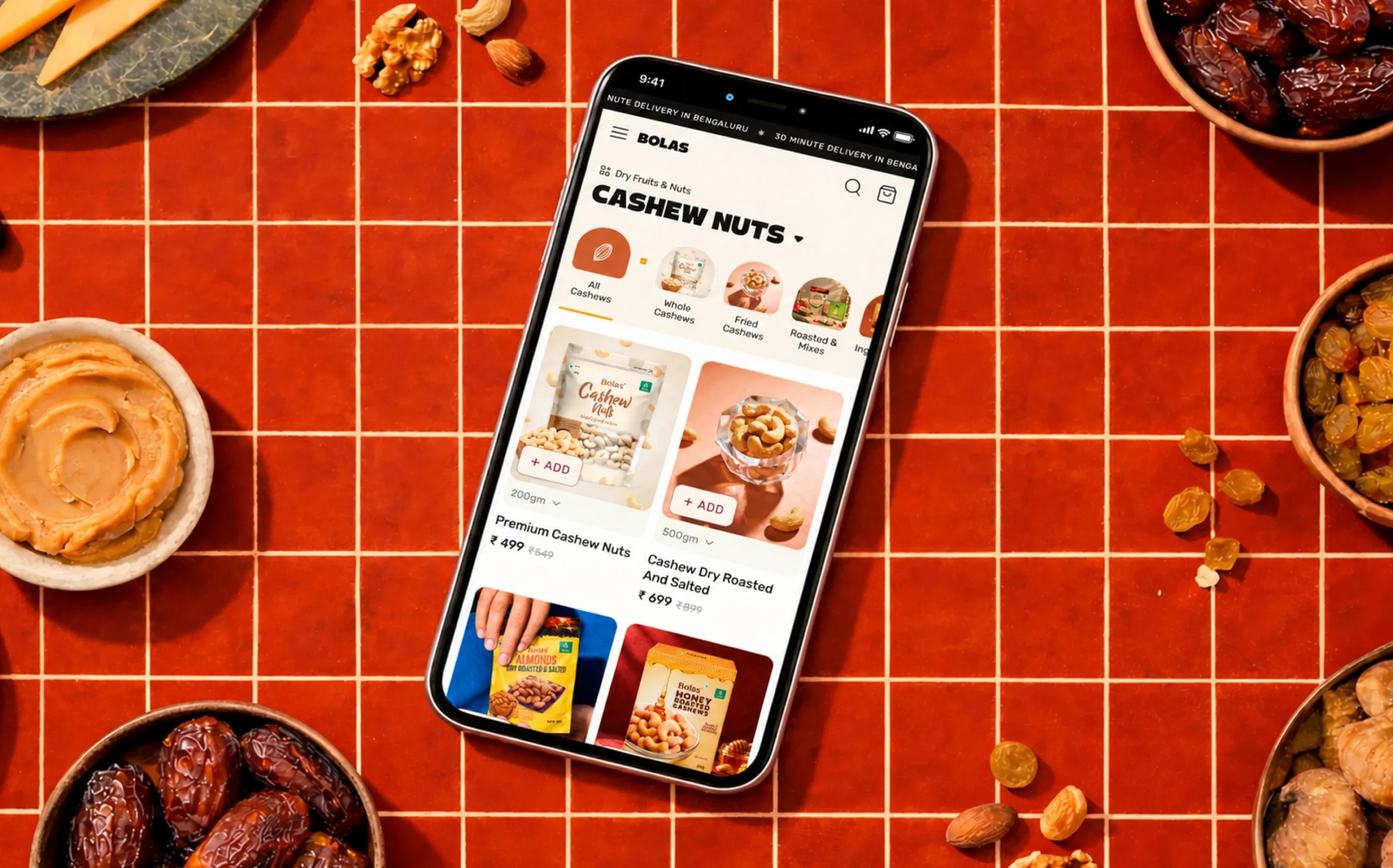
Bolas is a leading importer, processor, and exporter of agricultural commodities like cashews, coffee beans, edible oil, almonds, and dry fruits from India.
- E-Commerce
- Design
- Web App/Website
- Website Design
Bolas, a trusted name in agricultural commodities, sought to modernize its digital presence to better showcase its product range and connect with younger audiences. Brucira reimagined the experience through intuitive navigation and a refreshed visual identity.
Despite Bolas’ strong presence as an agricultural commodity brand, its website did not effectively communicate the scale or diversity of its product range. Users struggled to discover super and sub-categories due to unclear navigation, and the experience lacked the energy needed to connect with a younger, health-conscious audience. The goal was to redesign the experience to improve discoverability while evolving the brand’s digital voice.
Our goal was to create a seamless browsing experience while evolving the brand’s look and feel to appeal to a younger, health-conscious audience. Through collaborative discussions and exploration of visual directions, we introduced a refreshed color palette and visual system that felt modern, energetic, and approachable – allowing Bolas’ digital presence to better resonate with its new target demographic.
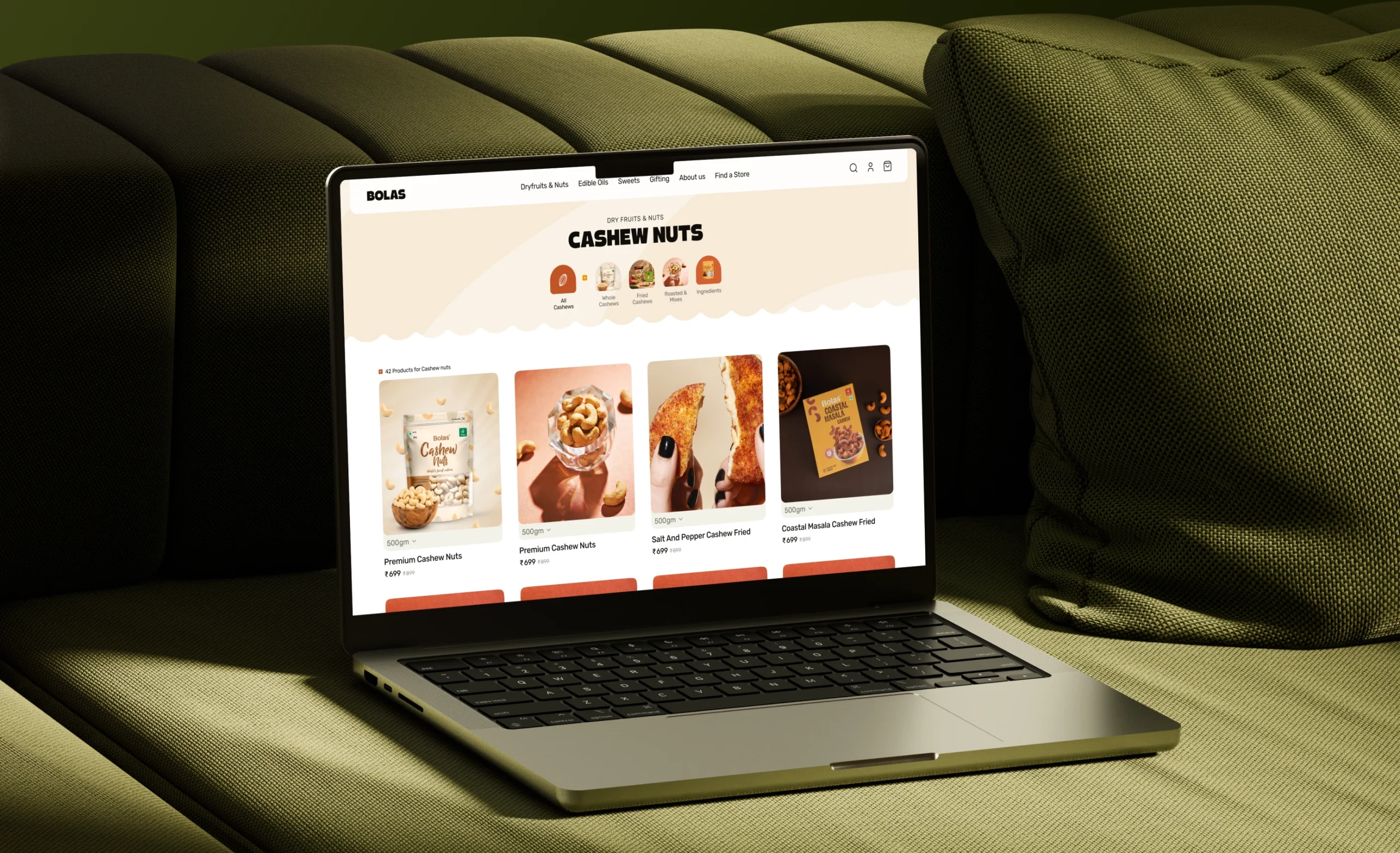
The concept was driven by clarity and freshness – pairing an intuitive navigation system with a youthful visual language to make Bolas’ wide product range easy to explore and engaging for modern, health-conscious users.
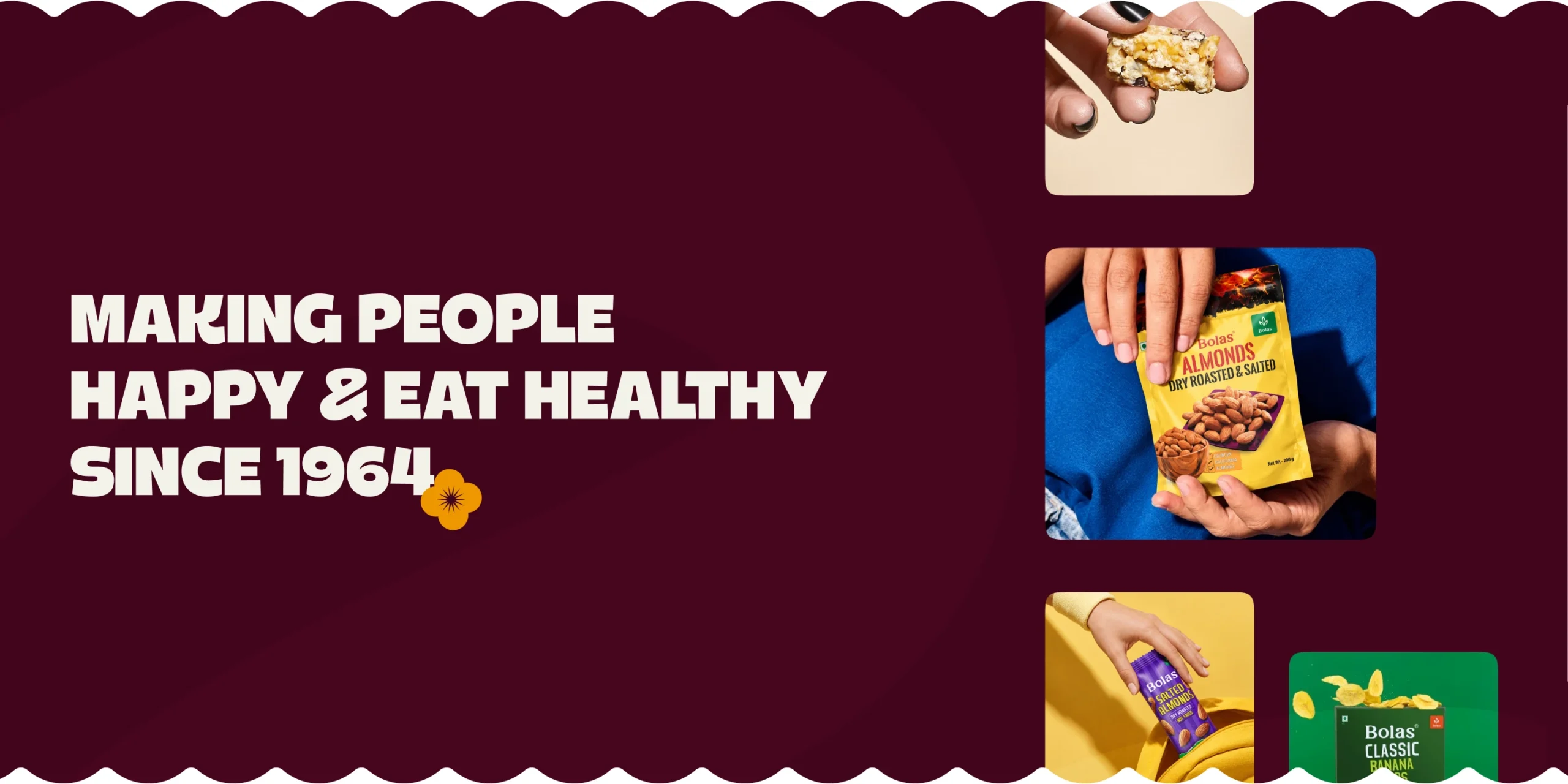
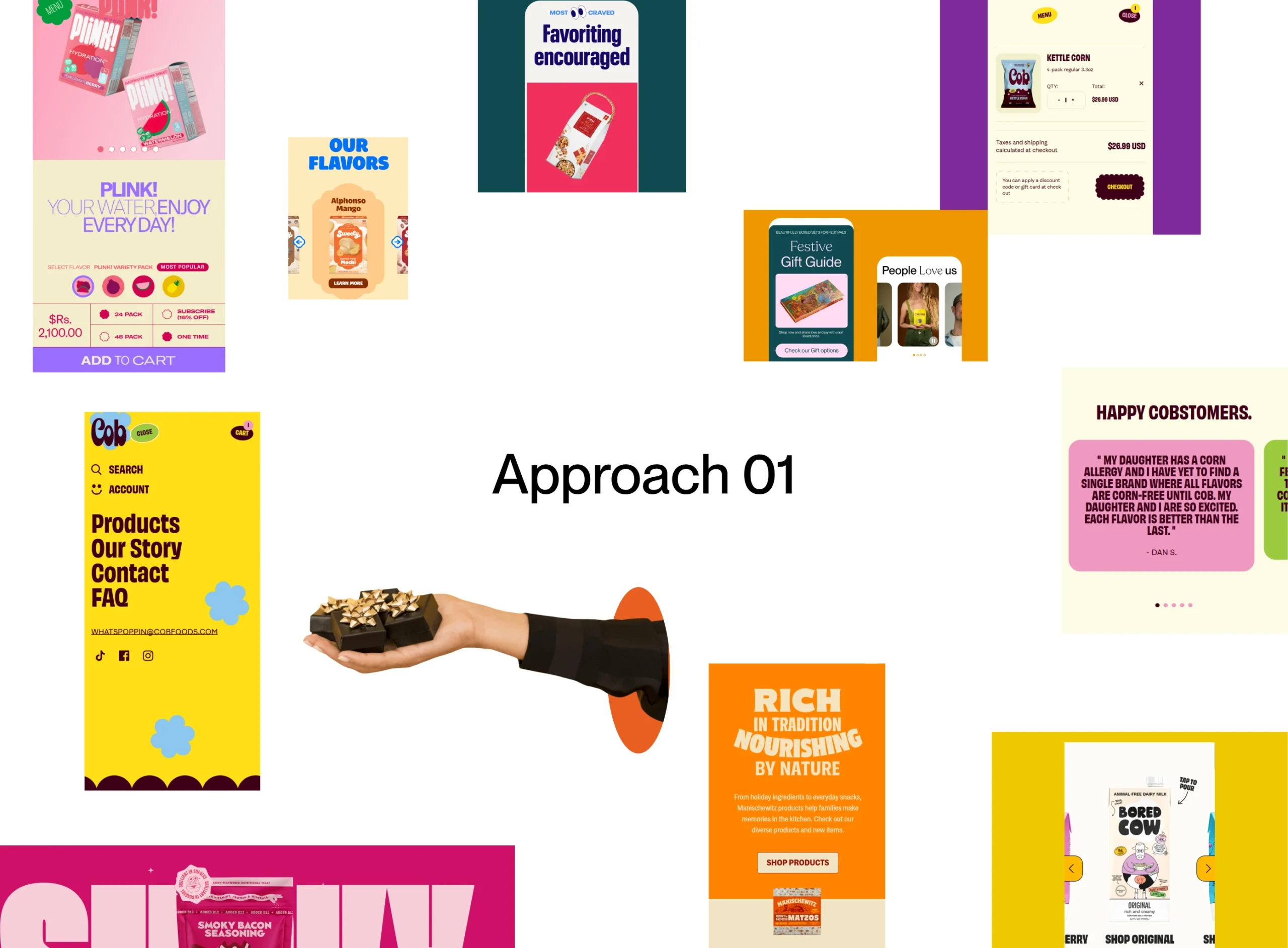
We explored three distinct visual directions that aligned with Bolas’ goals and brand aspirations. From these explorations, we arrived at a clear digital direction – From Farm to Table.
This direction was brought to life through a warm, red-toned color palette and carefully chosen typography that reflected the brand’s desired energy and modern, health-forward positioning.
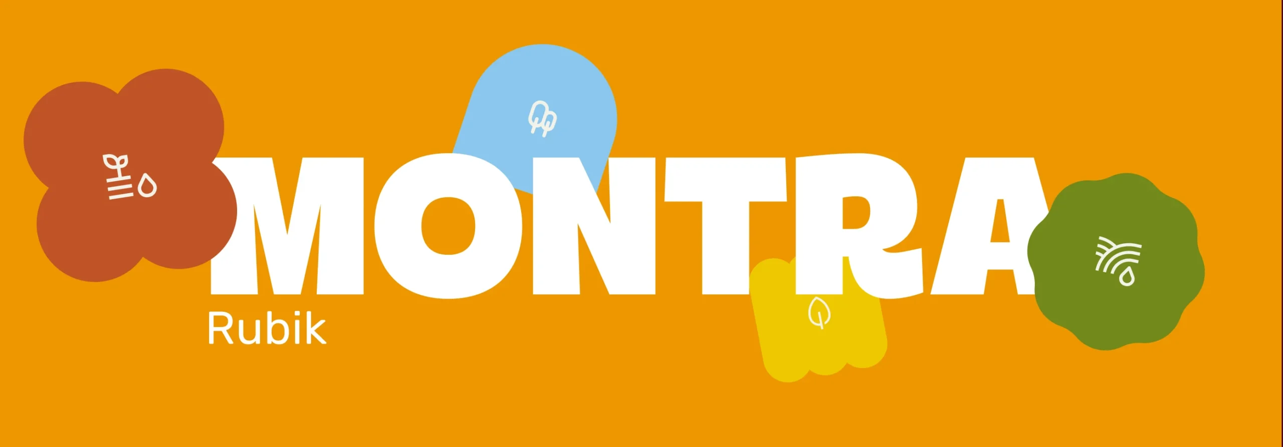
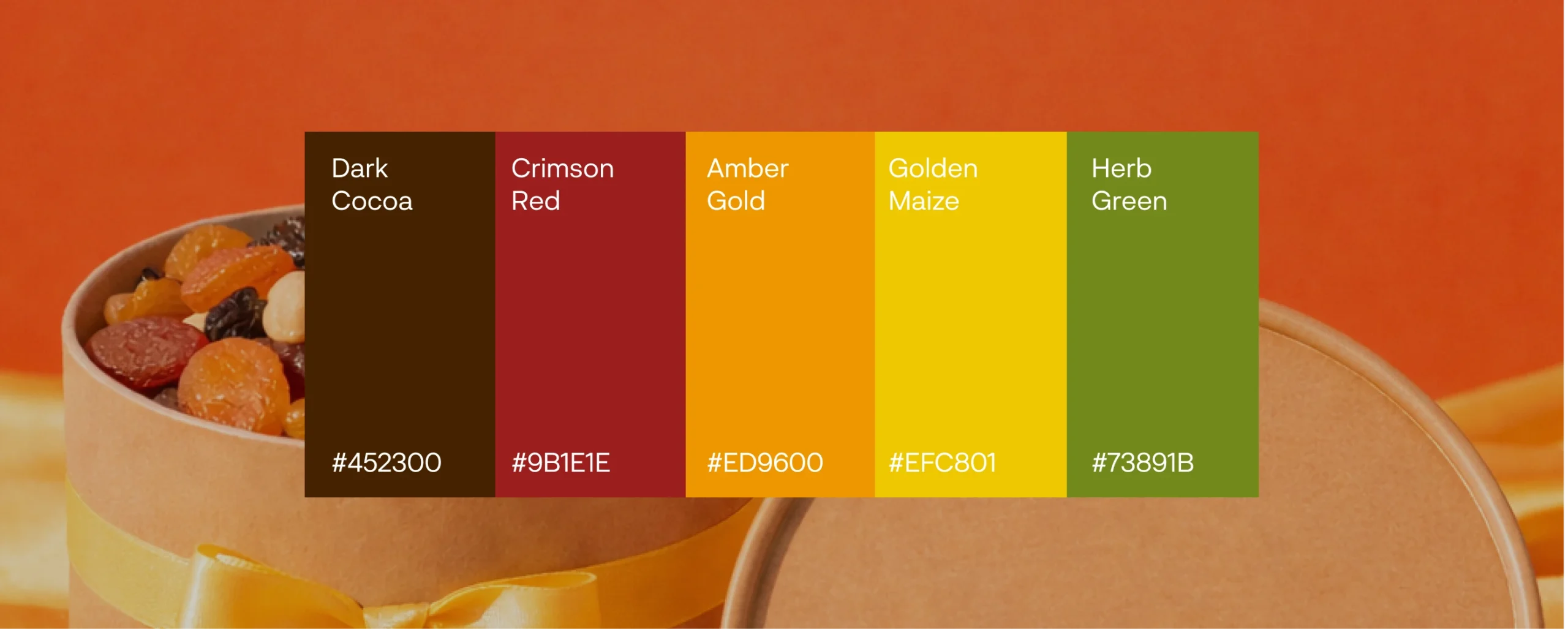
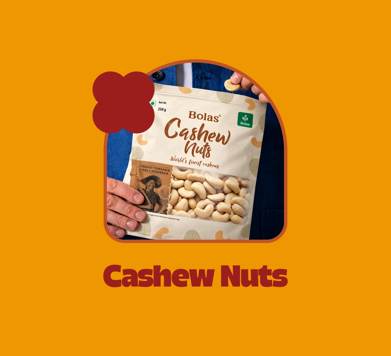
The visual approach was inspired by organic forms found in nature and agriculture – subtle abstractions drawn from nuts, seeds, and natural produce. Soft, flowing shapes were introduced to break rigid layouts and guide users seamlessly through the experience.
The result was a balance of structure and softness that reflected both the brand’s reliability and its health-forward, modern outlook.
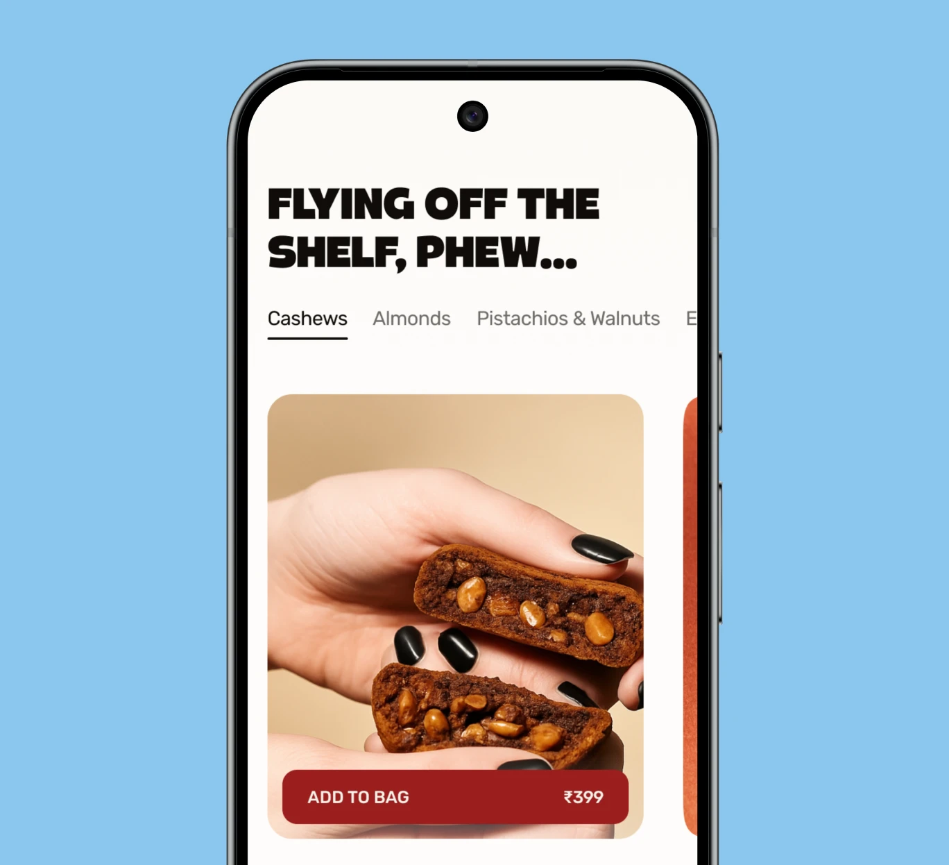
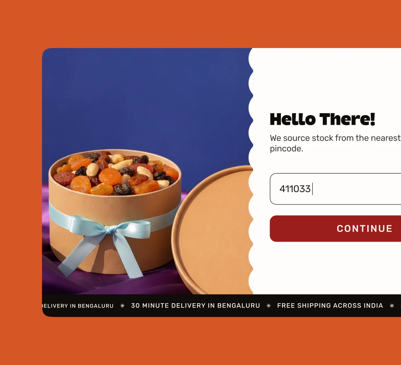
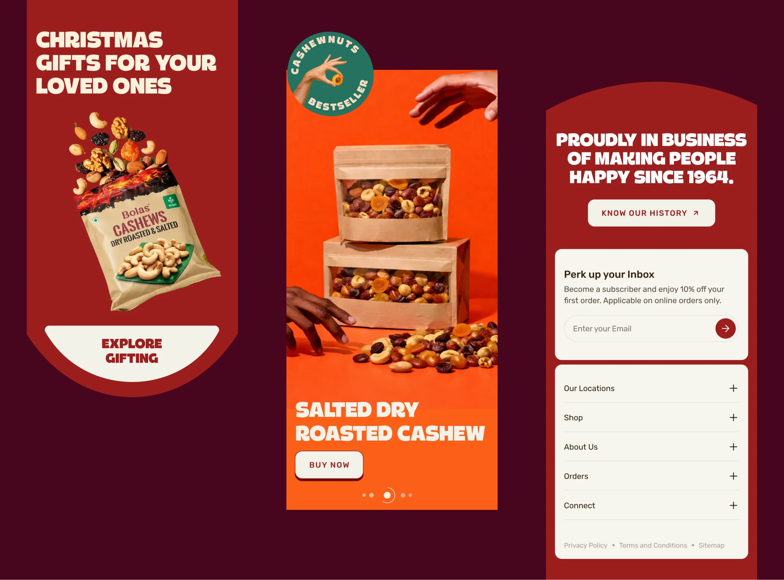
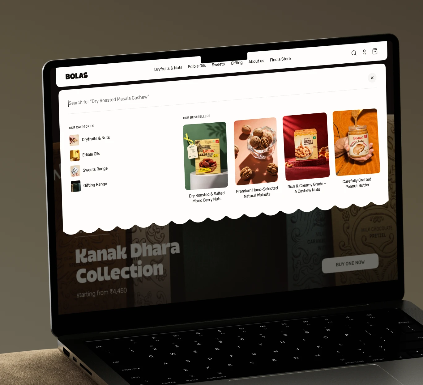
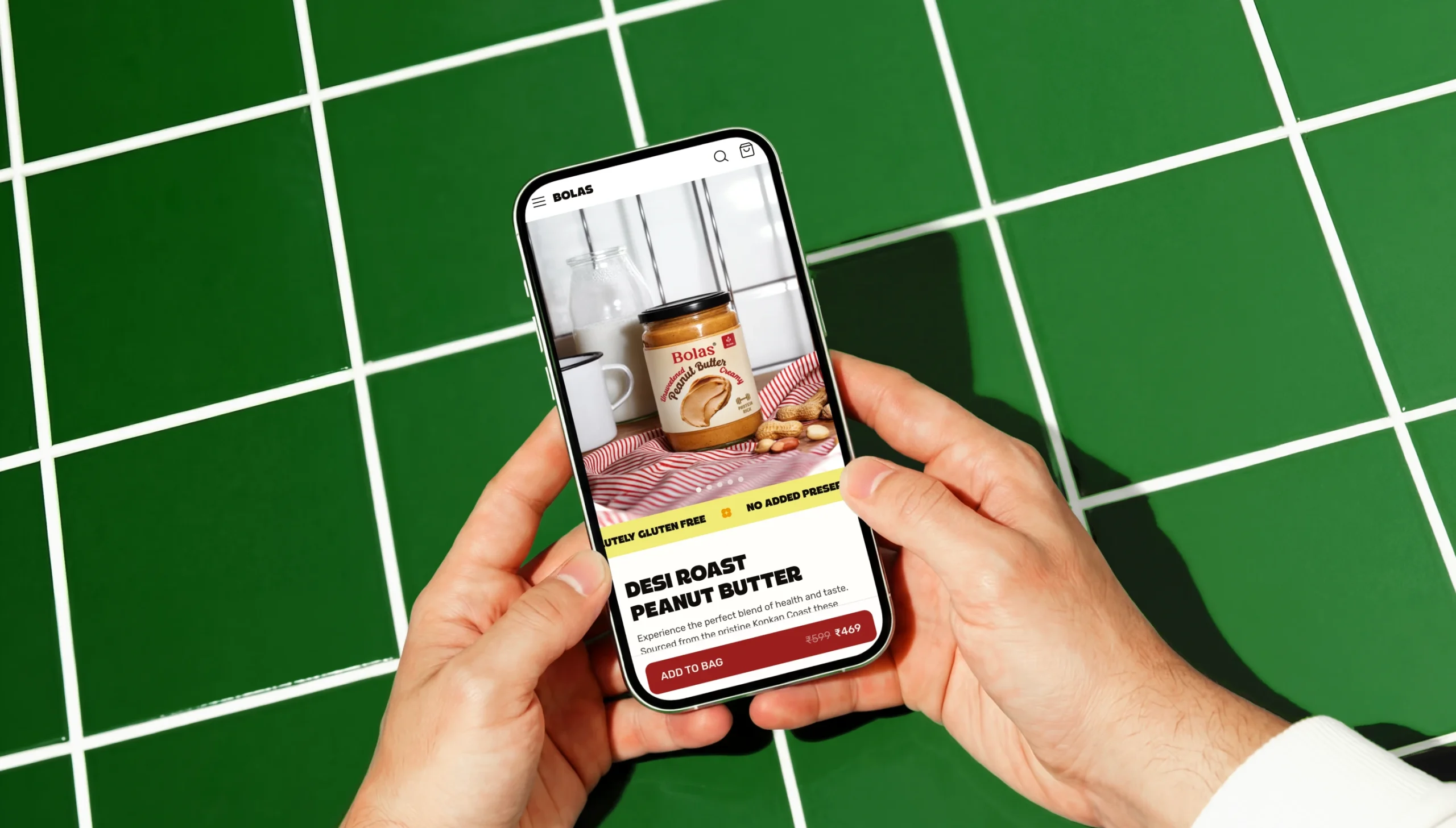
Through multiple iterations, we refined the experience to make navigation intuitive and product discovery effortless, while staying true to Bolas’ modern, health-forward identity.
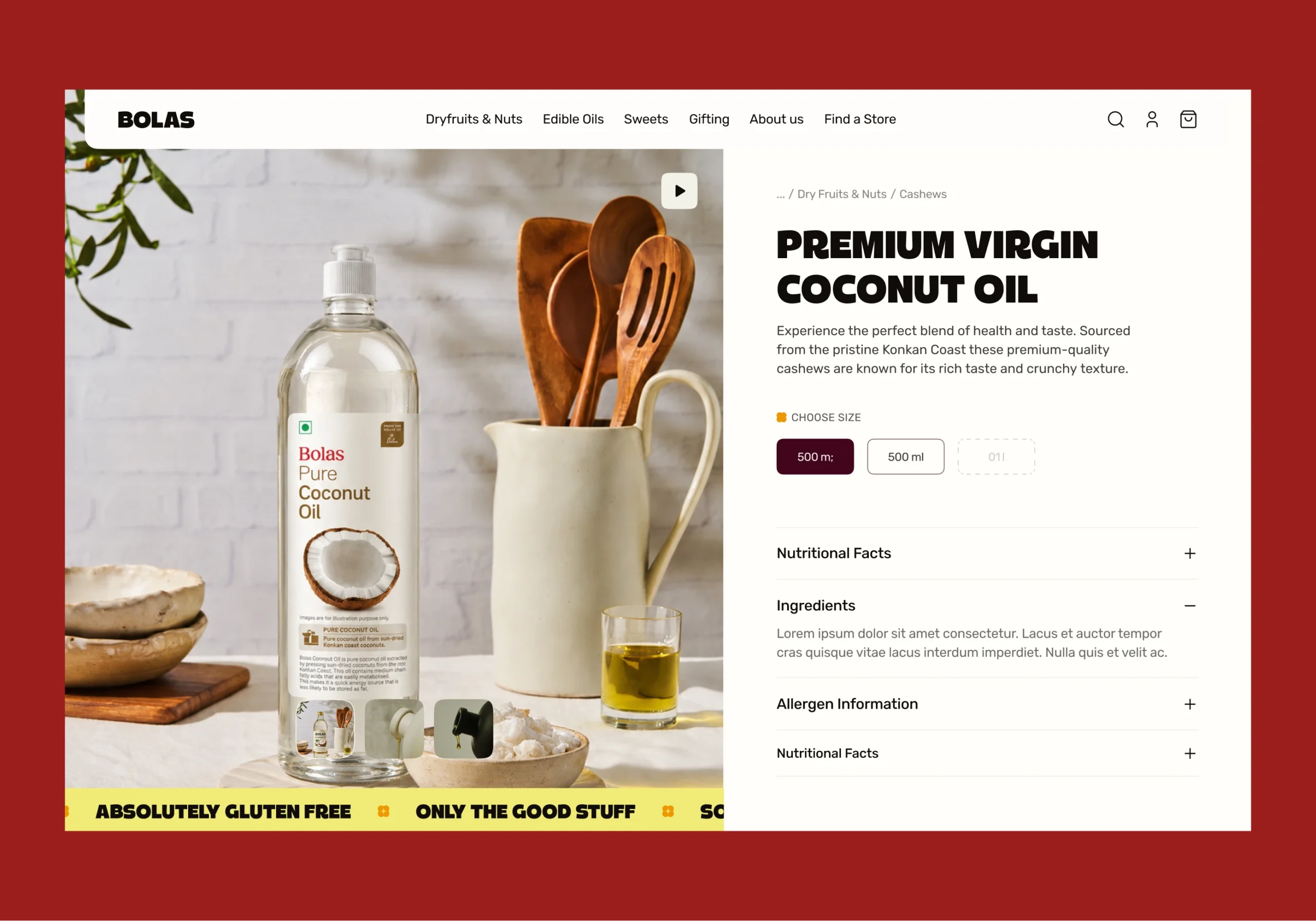
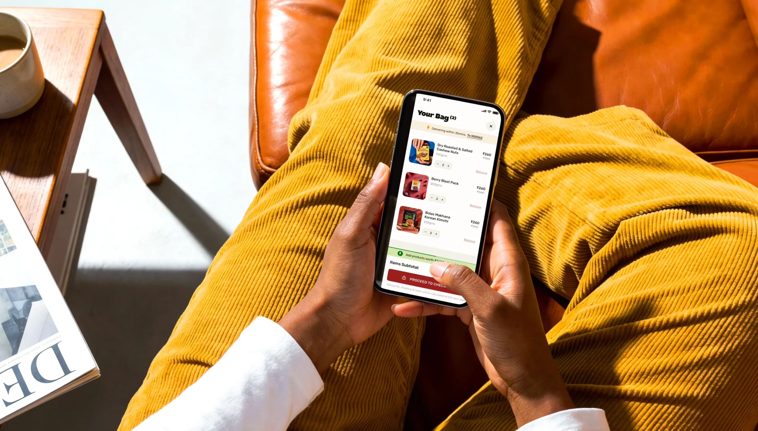
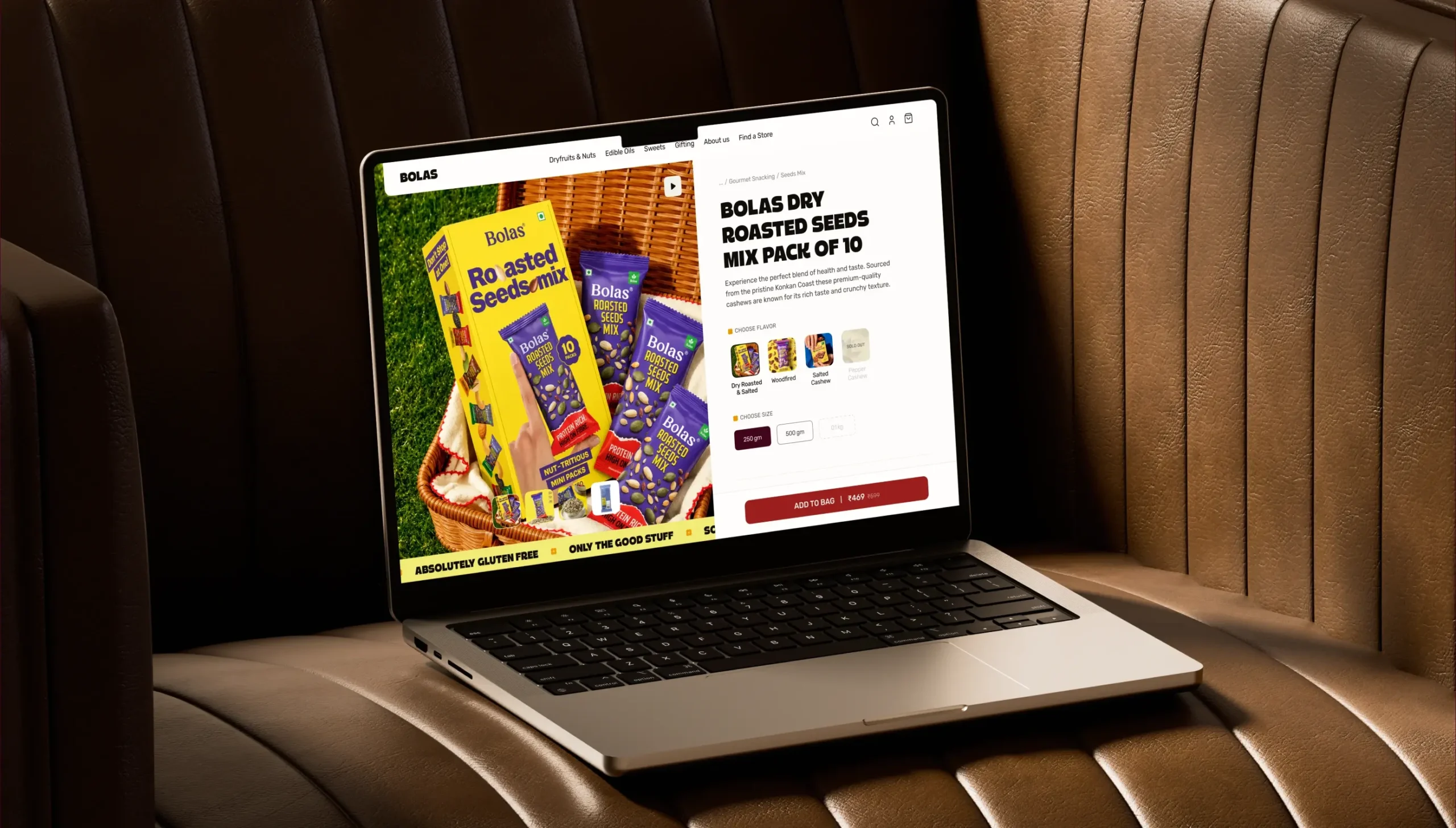
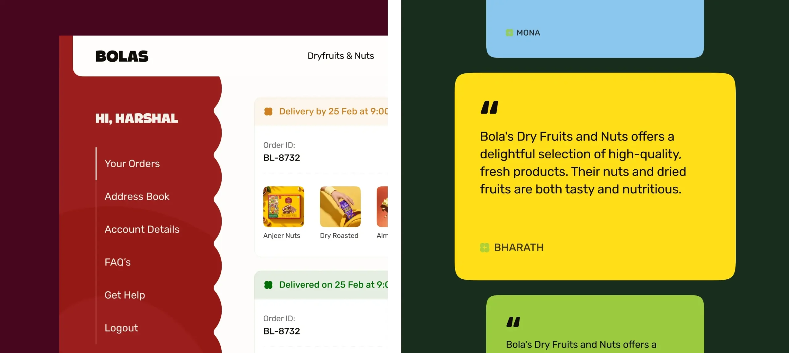
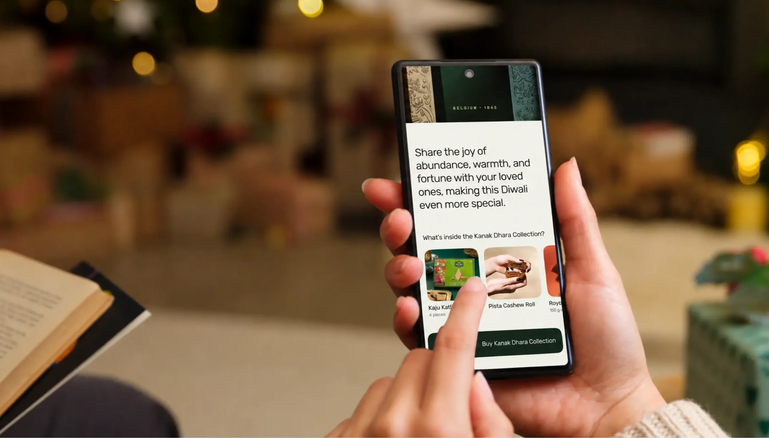
The project spanned 10 weeks, giving us the time to thoughtfully redesign the experience in line with Bolas’ brand direction while significantly improving usability and product discoverability.
Our Role
Product Design
Development
Content