Be more effective & less busy with Aerotime
Aerotime is a productivity platform backed by YCombinator, Nexus, and Sequoia. It helps teams block meetings, focus better, and boost deep work.
- SaaS
- Animation
- Front End Development
- Iconography
- Illustration
- UI/UX Design
- Visual Direction
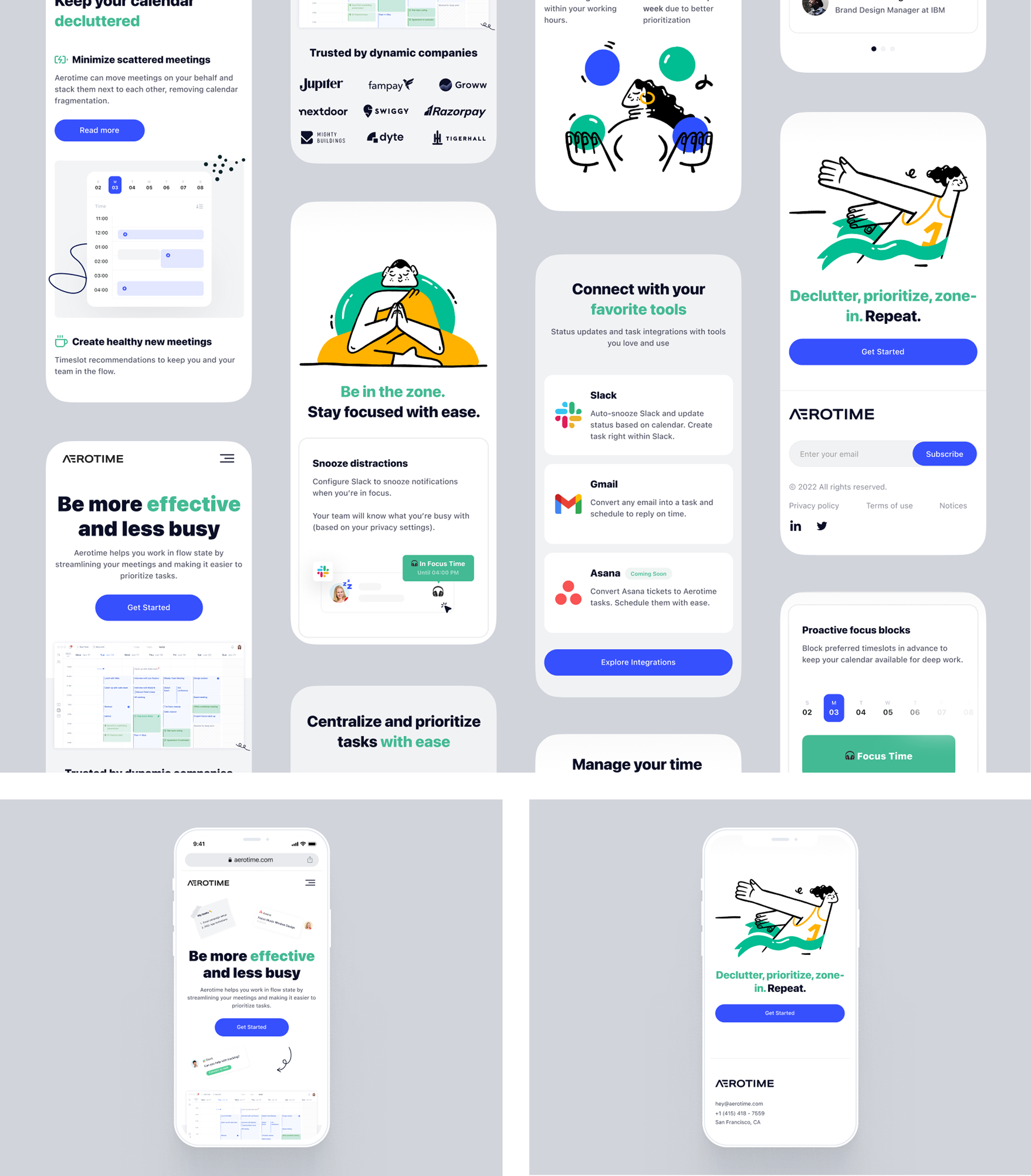
Brucira partnered with Aerotime, a growing productivity platform, to craft a modern digital presence that aligned with their business goals. The redesigned website balances strategy and design—enhancing usability, reflecting their playful brand, and driving higher conversions.
Aerotime has been rapidly growing and aims to become the market leader in their segment. However, their old website was not living up to the contemporary standards and aesthetics. It was not modern, minimal and user friendly. As their need was to increase the conversion rate, we created a modern website for them with a playful aesthetic which could connect directly with their users. We prioritized conversion throughout the process.
One of the main challenges for us was to ensure that our deliverables are crafted with that originality. The landing page, animations, icons and illustrations had to be modern, minimal and playful. The end goal was to increase the conversion rate and strike a better connection with the users to take action.
We redesigned Aerotime’s digital presence with a focus on clarity, conversion, and connection. Every element—from the landing page and animations to icons and illustrations—was crafted to reflect a modern, minimal, and playful personality. By combining strategic UX decisions with a fresh visual language, we enhanced user engagement and streamlined the path to conversion. The result was a cohesive, conversion-driven website that mirrors Aerotime’s vision to lead its category with originality and intent.
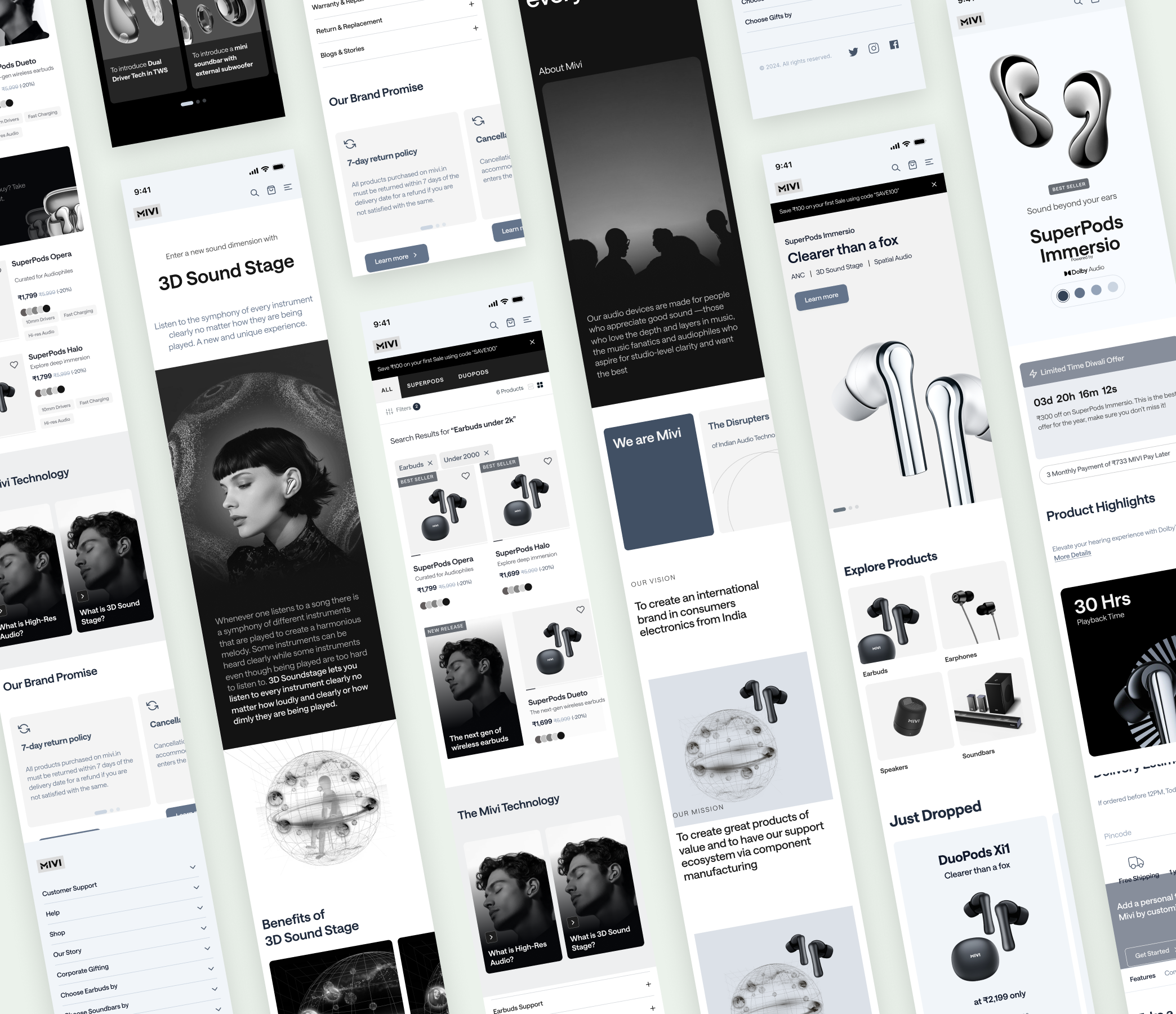
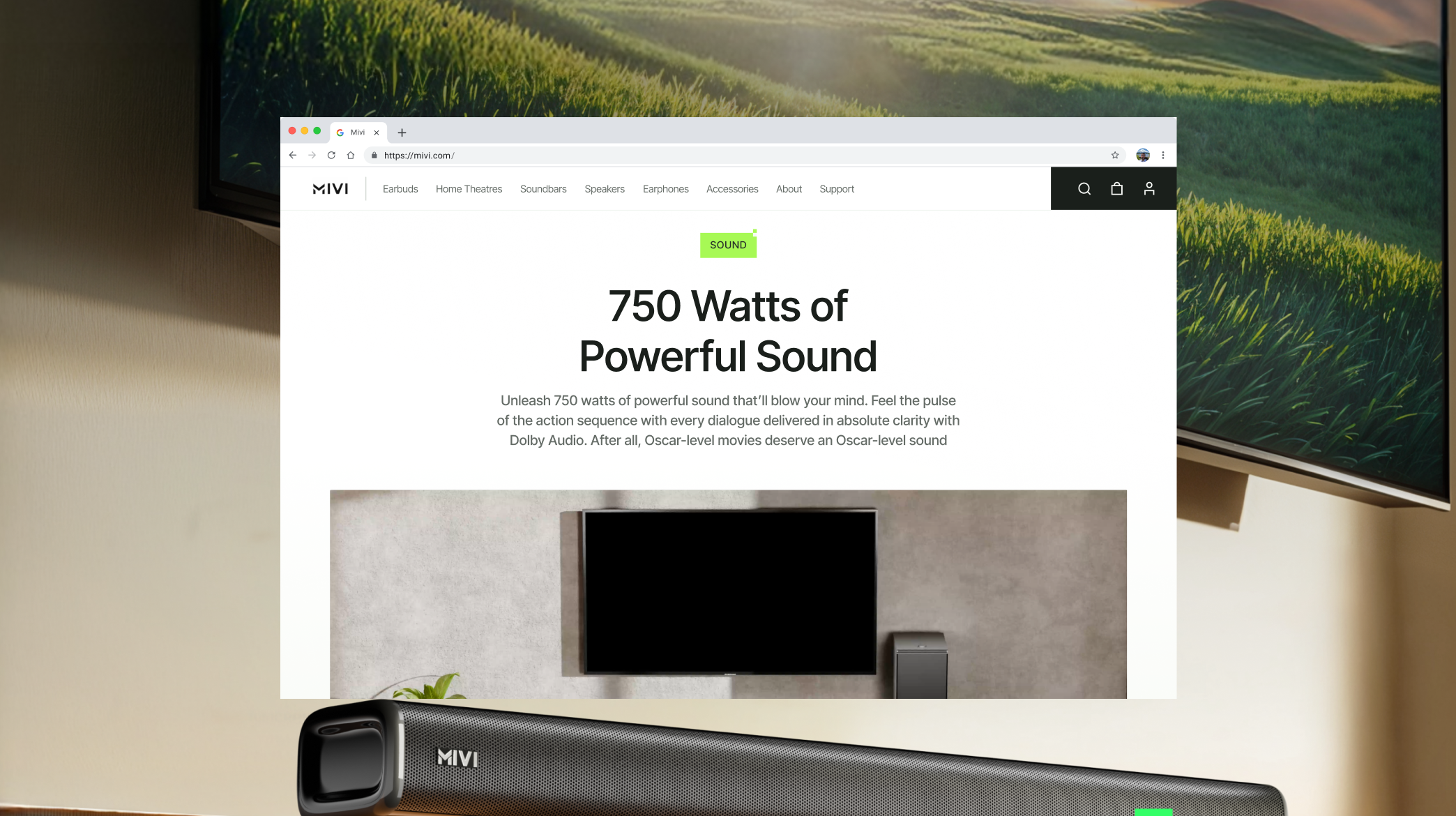
We started with a detailed competitor analysis to identify gaps and opportunities in the market. Using these insights, we planned the homepage as a storytelling journey — one that positioned Mivi’s products in a bold, tech-first light. Each section was crafted to highlight innovation, build trust, and showcase the brand’s commitment to high-quality technology.
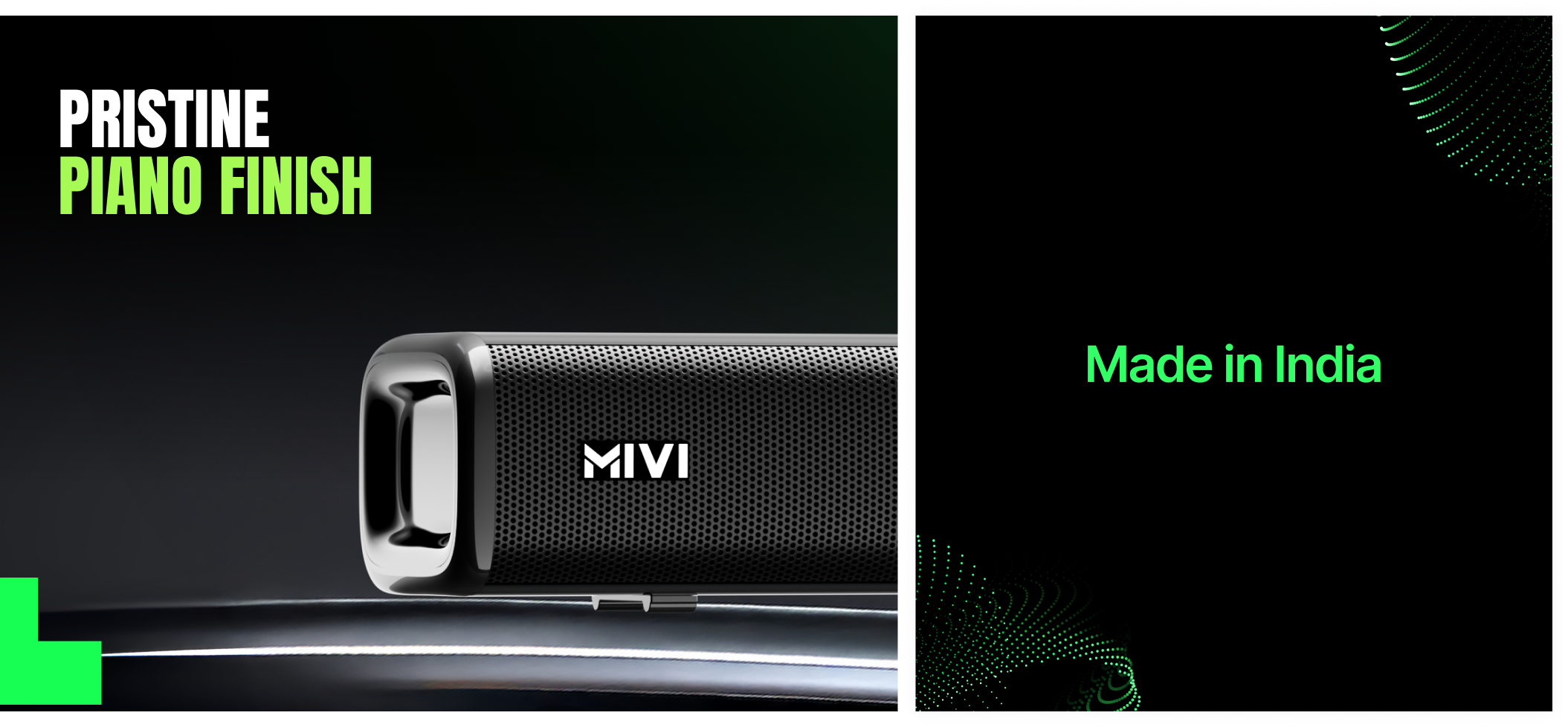
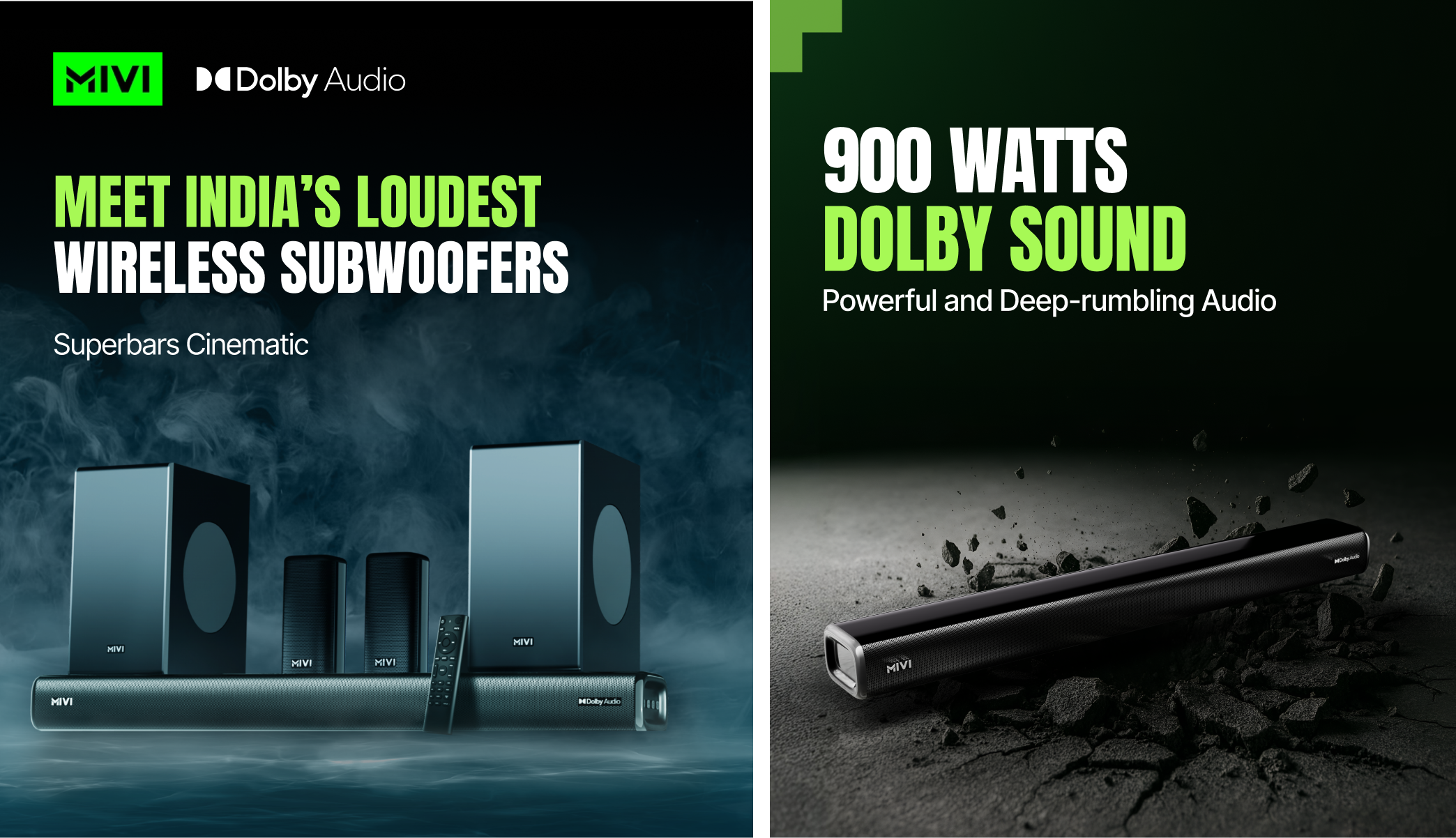
Our moodboard emphasised bold imagery and thick, condensed fonts like Anton to capture Mivi’s energetic, confident, and tech-first identity. The visual direction was designed to leave a strong impression while appealing to a young, dynamic audience.
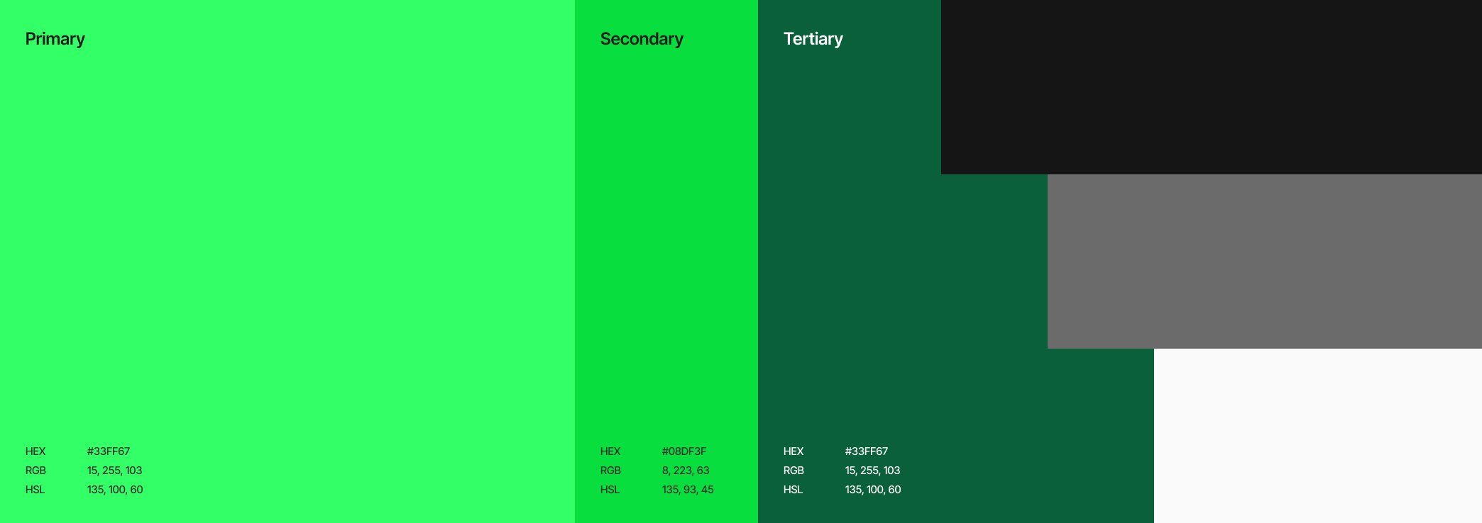
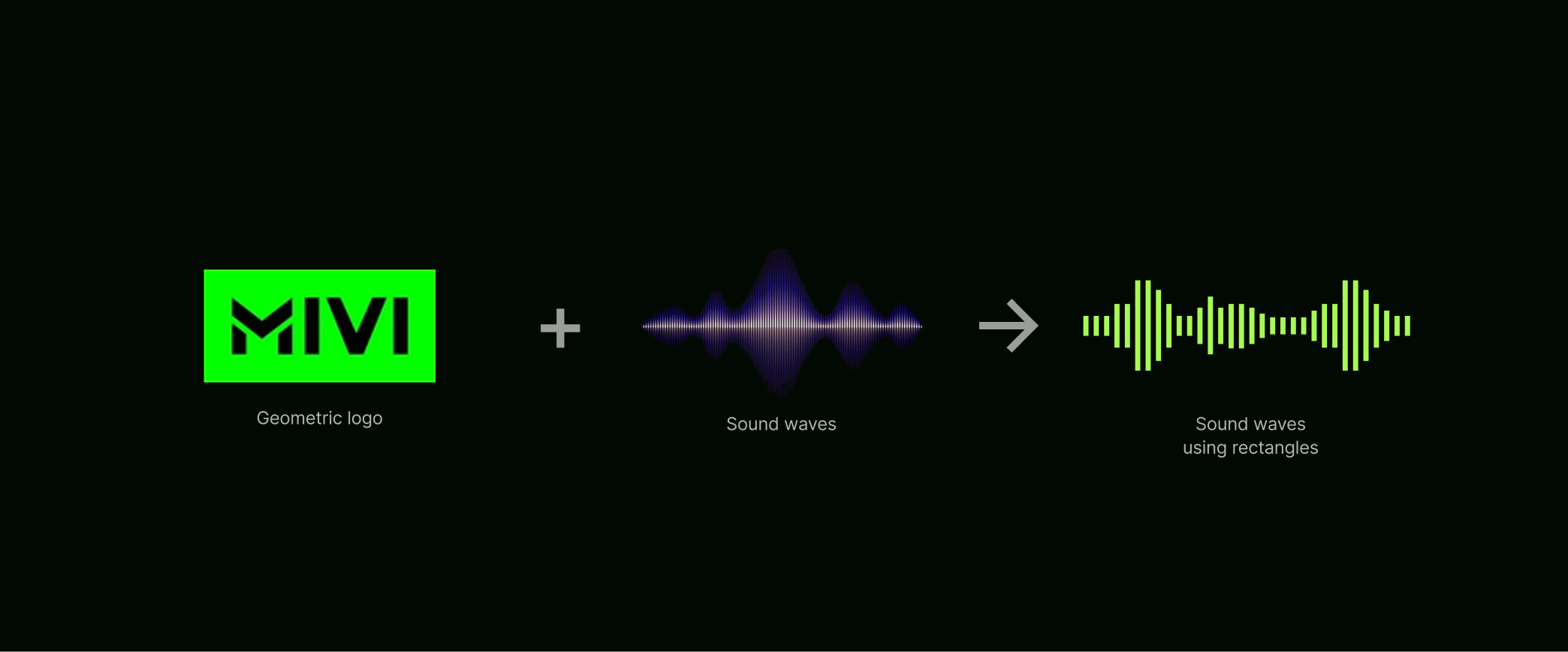
At the heart of Mivi lies sound — dynamic, powerful, and ever-evolving. To bring this essence into the digital space, we drew inspiration from soundwaves and frequency patterns. These became subtle design accents woven through the website, creating a rhythm that echoed Mivi’s expertise in audio technology. The result was a digital identity that didn’t just showcase products but also resonated with the brand’s core — innovation through sound.
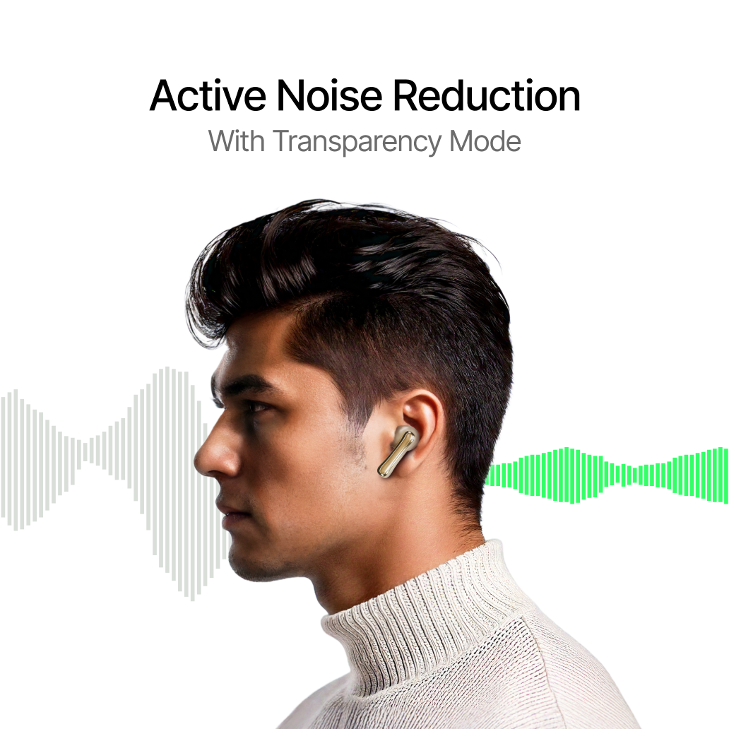
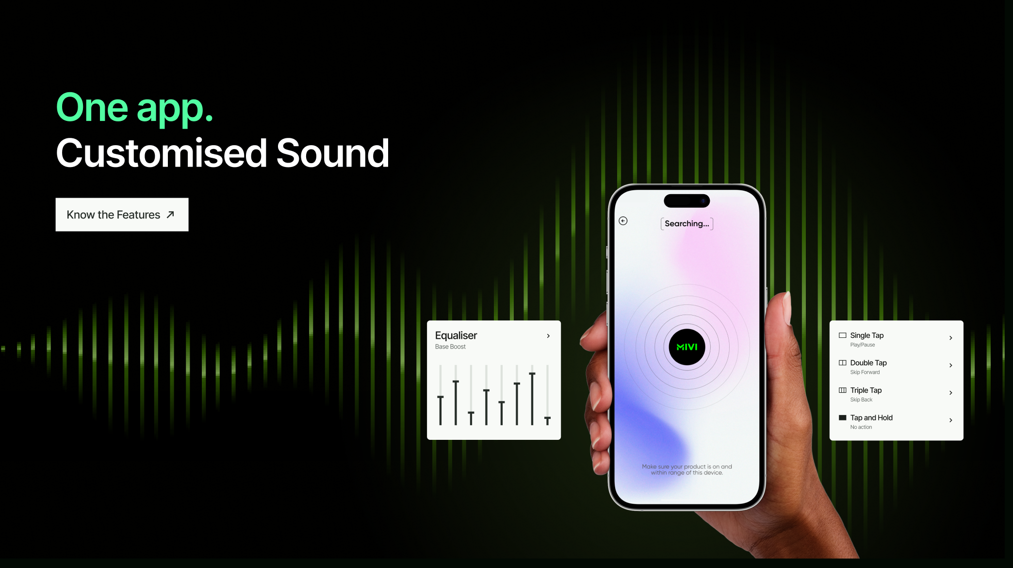
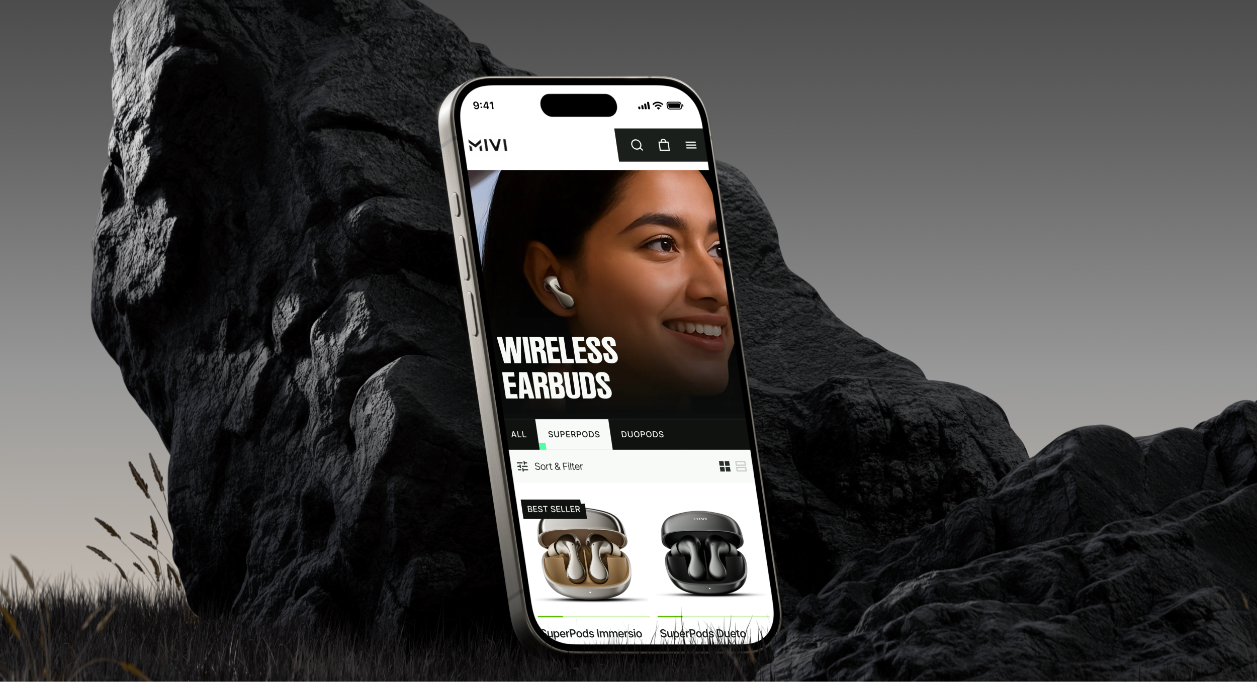
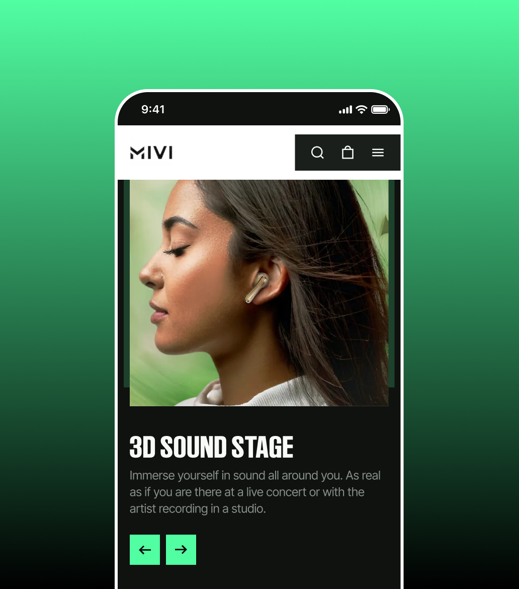
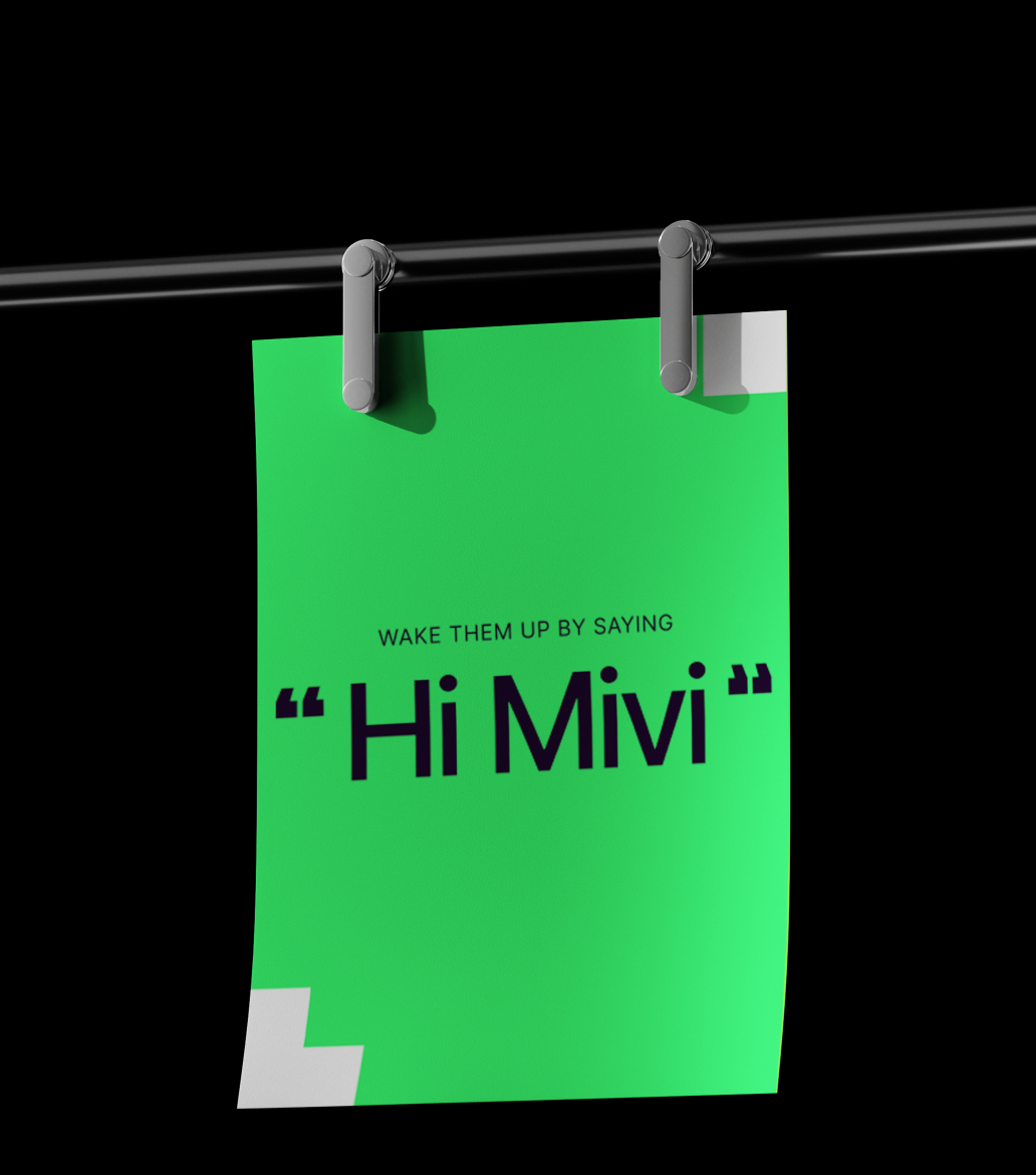
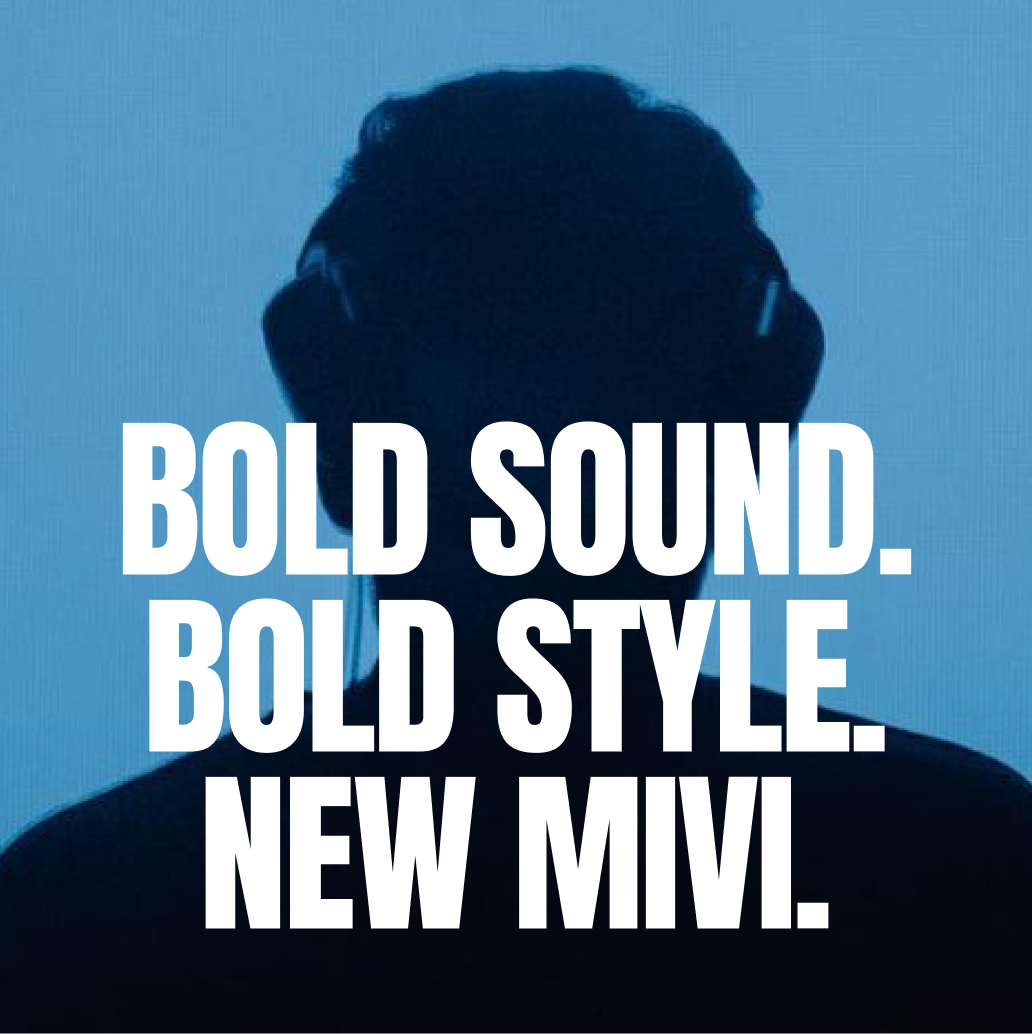
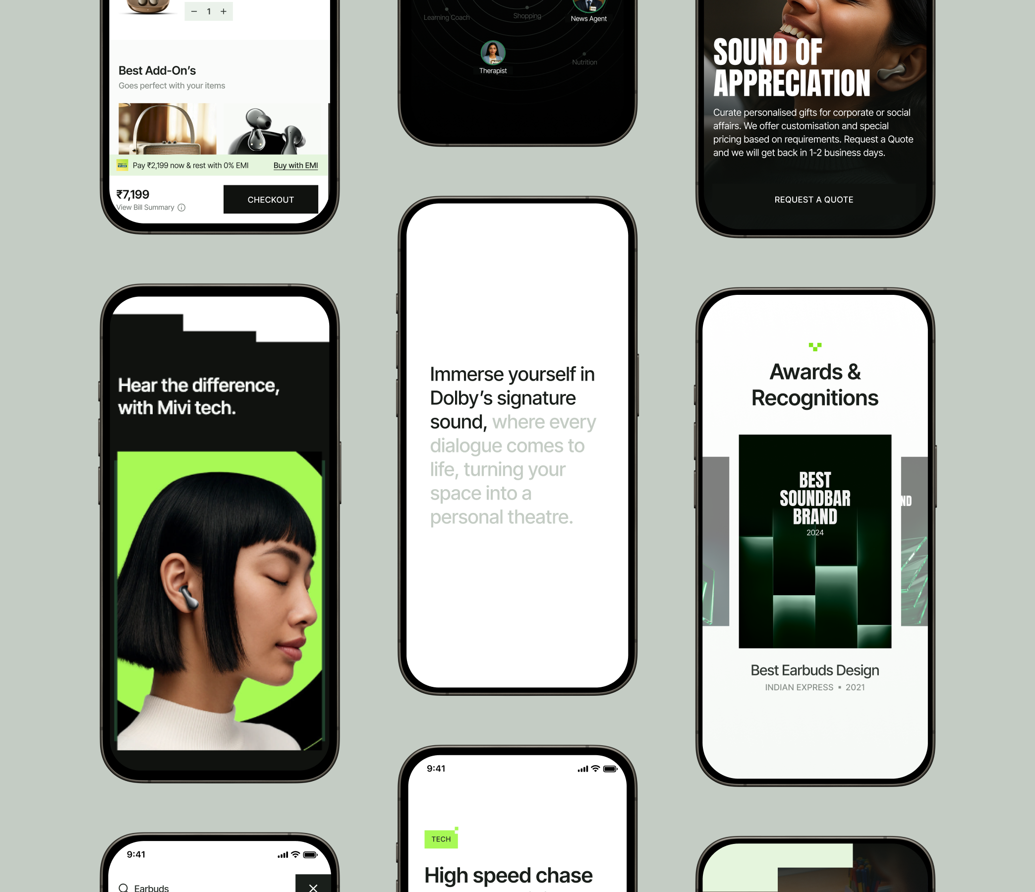
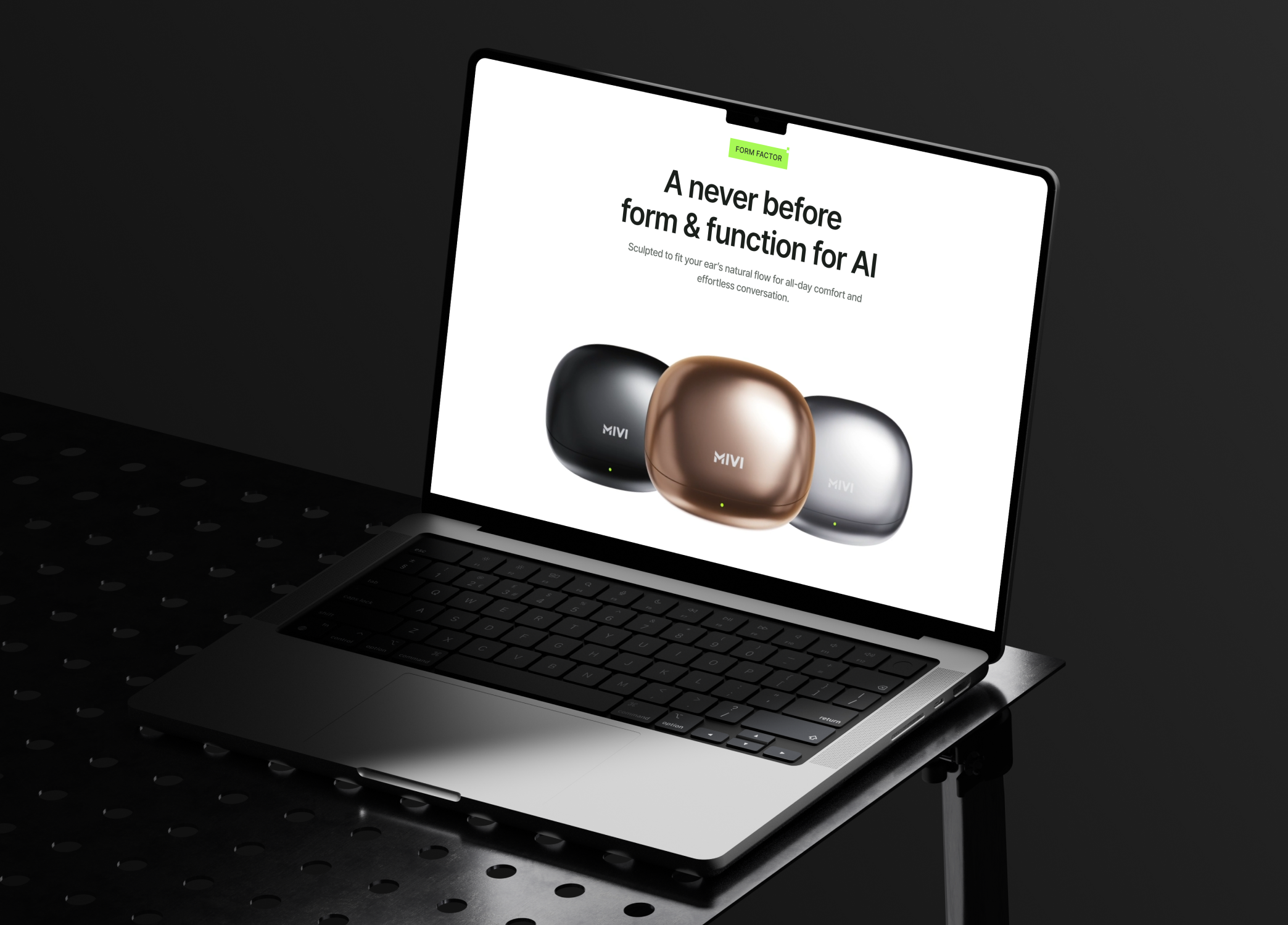
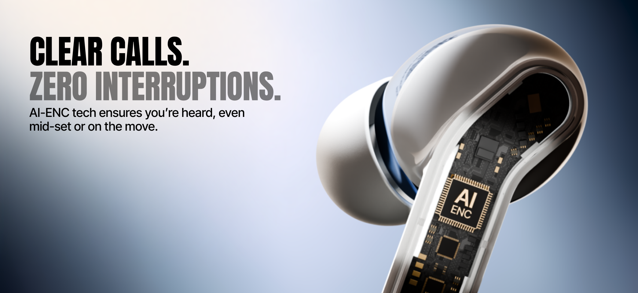
We built a bold, tech-first visual language that leaned into neon tones working beautifully on dark mode. Close-up imagery and graphic accents made the earbuds the true heroes, while condensed typography and clean layouts added clarity and impact. The result was a striking, modern look that resonated with Mivi’s young, dynamic audience.
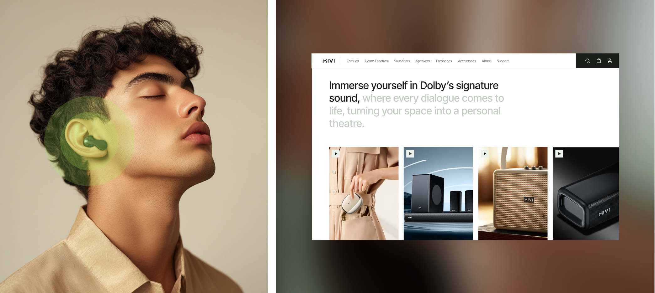
The final website brought together every element of the design process — from strategy and moodboard to visuals and storytelling. The result was a seamless, tech-first platform that highlighted Mivi’s bold identity while making products easy to discover and explore. With striking imagery, neon accents on dark mode, and intuitive navigation, the website not only showcased Mivi’s innovation but also delivered an engaging experience that resonated with its young, dynamic audience.
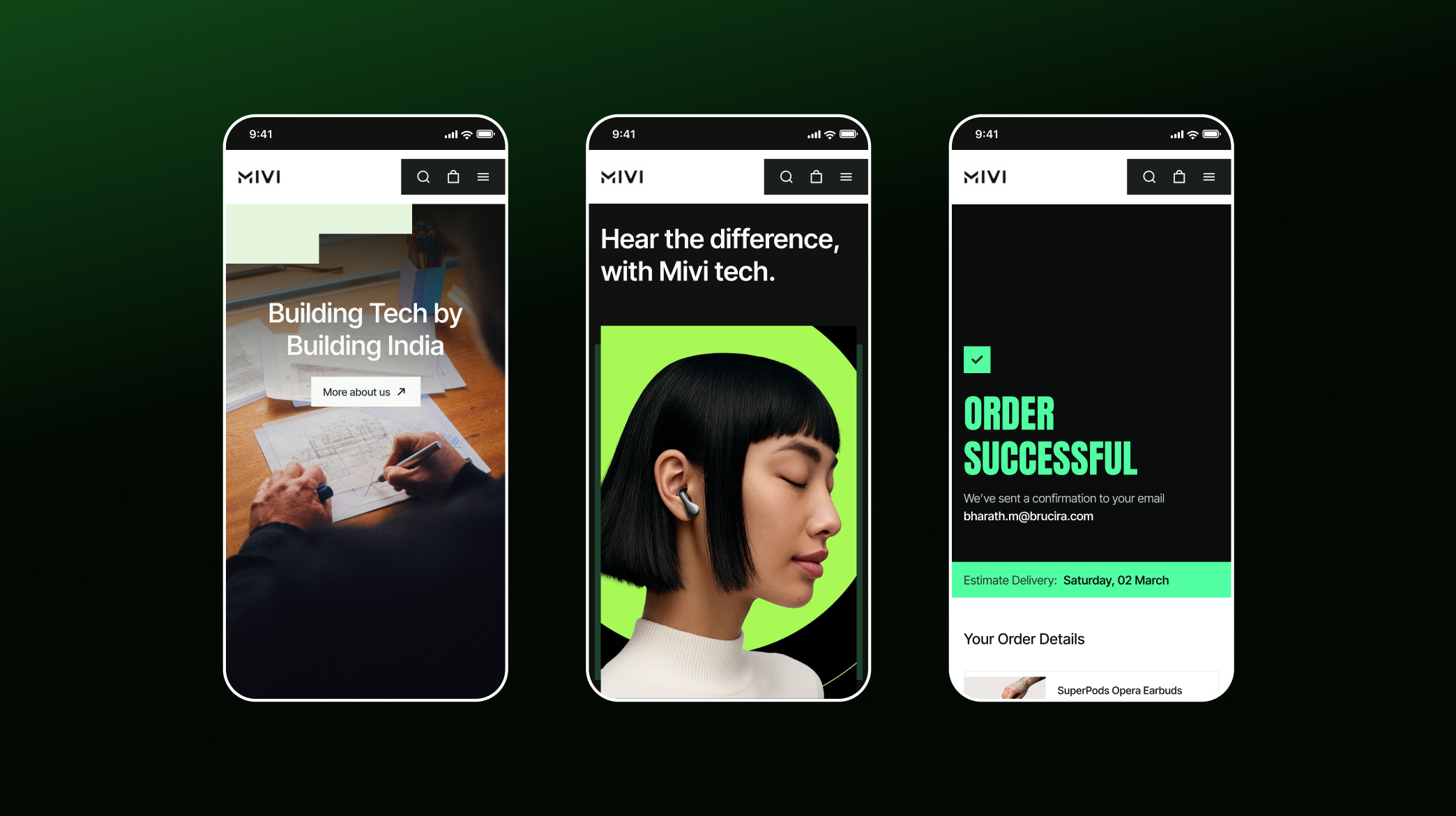
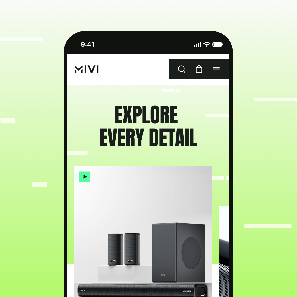
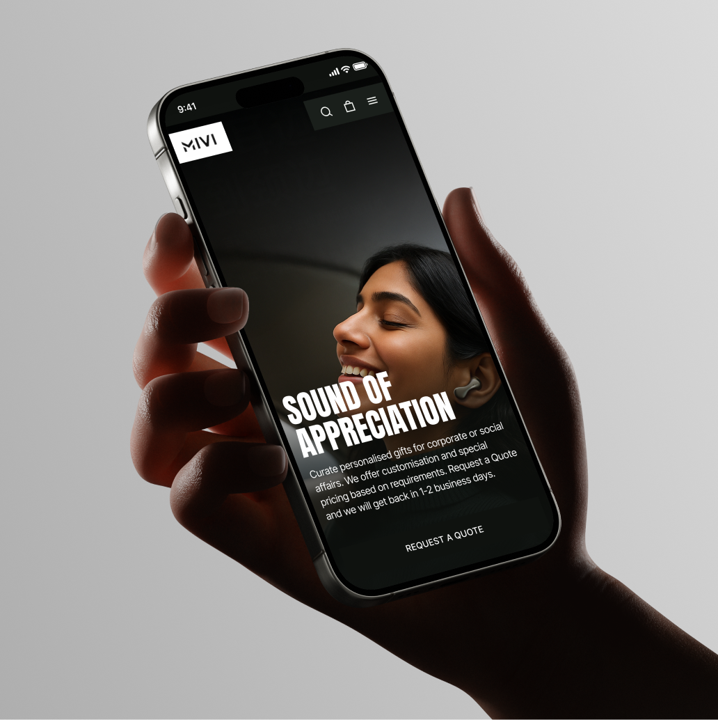
With nearly 84% of Mivi’s users engaging on mobile, we adopted a mobile-first approach to design. The website was crafted for smaller screens first, ensuring bold imagery, neon accents, and product storytelling felt seamless and impactful. From there, we scaled up to desktop, creating a consistent, tech-first experience across all devices.

For this project, we focused on creating a clear, engaging design. The concept centered on using isometric designs and responsive animations to streamline complex information, while staying aligned with Tech Data’s brand identity.
The redesigned digital presence gave Mivi a bold and cohesive identity that stood out in the competitive audio tech market. The new website improved product discoverability, strengthened brand storytelling, and delivered a seamless mobile-first experience for the majority of their audience. Beyond the website, consistent visuals across marketplaces and social platforms amplified Mivi’s recognition as a confident, homegrown innovator in audio technology.
Our Role
We partnered with Mivi to reimagine their digital presence, shaping everything from research and design to marketing assets — all centred on a bold, tech-first identity.
Product Design
Content